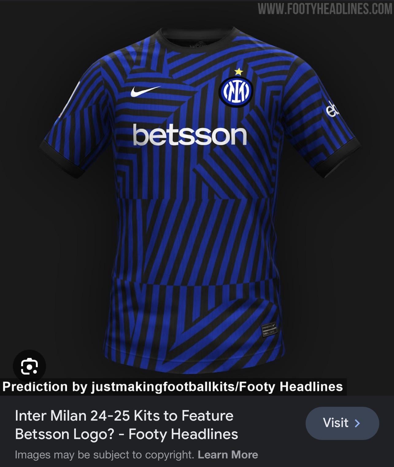
This jersey is original, but disgusting it doesn’t seem to represent our brand properly.
Omg plz no.
No dai, non voglio un marchio indegno sulla nostra maglia… e dai!
That sponsor isn’t all that bad
too radical of a change.
tbh if they want to be radical with design i prefer they use something similar like 21/22 kit that was the best design i’ve ever see that’s not pure black and blue stripe
Y’all people are so picky about your kits. Don’t act like you won’t be getting one if there’s 2 stars on it
Paramount doing good dropping the promo kits
I don’t hate it
hideous, you can’t take aveqy the vertical stripes from an inter kit
The horror
Awful. The only good thing is that it’s a 3D picture: if you stare at it long enough, you can see “Inter – Milan 12:0, 2023”. That’s cool.
Cos’è sta merda?!?
A proper aberration…There are ways to be creative and not end up looking stupid. This isn’t one of them.
Come on, large, big, straight blue and black lines are such a simple and good pattern, why they do those particular patterns that 70% of the fans wont like
I wish for gold logo, sponsor, swoosh and of course ⭐⭐
This is the path has been on for the last couple of years, sadly. Another example of a terrible marketing output, yet I somehow expect many of the people here to start defending it. Loss of identity for the sake of inflated egos. Fuck this shit.
Horrible. Also they can’t outright use “Betsson” because football gambling sponsors are banned
If this is the first kit, it will sell like 100 units
This is lame
Would prefer paramount or Qatar airways
I can’t stand the mountain paramount logo so I don’t mind this tbh . stripes are dumb tho
Assuming we’re getting this second star! Can we not have straight BLUE and BLACK stripes!!!!! What so wrong with keeping it traditional???
Fake. There’s only one star on it.
Pls no
(I’ll still buy it cause ofnthe second star but pls no)
Better be a training kit…
I feel like something’s missing
Ugly as a kitchen rag.
For strip patterns, thick ones are always better than thin ones.
31 comments
Only good as a pre match training kit
You should add the second star 😉
That’s the training kit most prolly
Mi ricorda le vie del Metro.
Unfortunately It will be this one 99%…. not sure about Betsson ( Betsson is the company who owns Starcasinó.Sport) or Starcasinò.sport (that is already “[the infotainment sponsor”](https://www.inter.it/en/news/2020-10-19-starcasino-partnership-inter) since 2020.
This jersey is original, but disgusting it doesn’t seem to represent our brand properly.
Omg plz no.
No dai, non voglio un marchio indegno sulla nostra maglia… e dai!
That sponsor isn’t all that bad
too radical of a change.
tbh if they want to be radical with design i prefer they use something similar like 21/22 kit that was the best design i’ve ever see that’s not pure black and blue stripe
Y’all people are so picky about your kits. Don’t act like you won’t be getting one if there’s 2 stars on it
Paramount doing good dropping the promo kits
I don’t hate it
hideous, you can’t take aveqy the vertical stripes from an inter kit
The horror
Awful. The only good thing is that it’s a 3D picture: if you stare at it long enough, you can see “Inter – Milan 12:0, 2023”. That’s cool.
Cos’è sta merda?!?
A proper aberration…There are ways to be creative and not end up looking stupid. This isn’t one of them.
Come on, large, big, straight blue and black lines are such a simple and good pattern, why they do those particular patterns that 70% of the fans wont like
I wish for gold logo, sponsor, swoosh and of course ⭐⭐
This is the path has been on for the last couple of years, sadly. Another example of a terrible marketing output, yet I somehow expect many of the people here to start defending it. Loss of identity for the sake of inflated egos. Fuck this shit.
Horrible. Also they can’t outright use “Betsson” because football gambling sponsors are banned
If this is the first kit, it will sell like 100 units
This is lame
Would prefer paramount or Qatar airways
I can’t stand the mountain paramount logo so I don’t mind this tbh . stripes are dumb tho
Assuming we’re getting this second star! Can we not have straight BLUE and BLACK stripes!!!!! What so wrong with keeping it traditional???
Fake. There’s only one star on it.
Pls no
(I’ll still buy it cause ofnthe second star but pls no)
Better be a training kit…
I feel like something’s missing
Ugly as a kitchen rag.
For strip patterns, thick ones are always better than thin ones.