Too plain. Black stripes on our white jersey is unimaginative
Got credits from kit archive btw if you want to see yourself
so good. the traditional white black is iconic
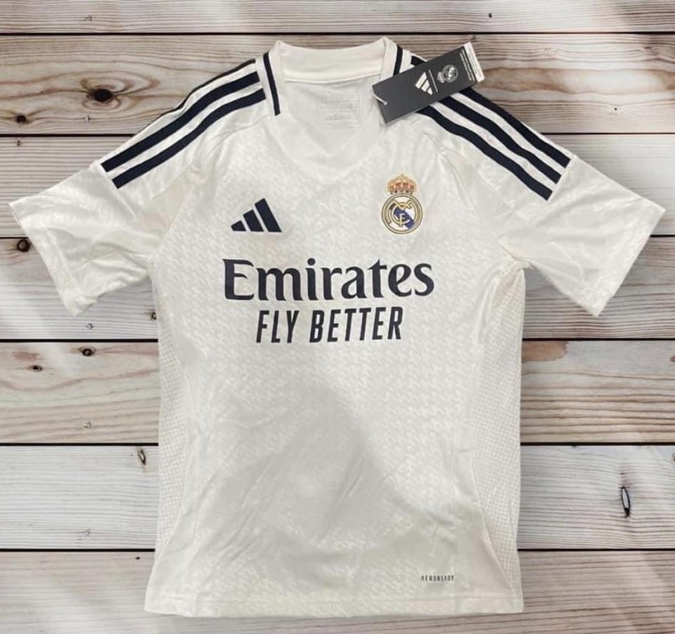
It is white with stripes on the shoulders.
Reminds me of that Bwin jersey
The neck feels to exposed. The V shape to to much in my opinion
Too plain, needs some more black details
not the V neck
We saw our quarter finals draw, and we’ve already decided to focus on 2024/2025….
It’s not bad, but I don’t know if I’ll buy it.
Overall one word: decent
The black strips are whatever…i think it will look good in full sleeve.
But oh god the V shape neck…it’s very bad.
Actually it is not beautiful at all. Better to continue with current season’s kit if nothing interesting comes the next season.
When will u start printing the Mbappe one
Meh
The black details look nice on the home kit but since Real Madrid’s colors are white, blue, and gold and they have used black on a lot of their home kits I wonder what does black have to do with the team.
Reminds me a lot of the bwin era
Very basic honestly. Either have a bit more detailing in black or add a combo like this season of black/gold
Reminds me of Raul and Figo
Apart from that monstrosity of a v neck collar, looks kinda nice tbh
14/15 vibes
Bring back the 2016 collars I loved it
Looks nice! I always like the minimalistic black and white ones
Besides the neck shape, absolutely love the kit. Definitely reminding me of the 18/19, 14/15 and 13/14 home kits. I feel the black with the updated adidas logo with just the shape looks so clean
2003 vibes for sure
I like it
looks like a benfica shirt
Meh
Put a collar on that badboy
Ugly
Wanna know what the font is on a look like for the name and numbers
I hate v-necks. It’s a no for me dawg
i love it, throwback back to the past
I’d give it a 7/10
I wish they would wear the di Stephano eras one year

35 comments
Waiting for kroos to wear it….. Then I’ll judge!
Too plain. Black stripes on our white jersey is unimaginative
Got credits from kit archive btw if you want to see yourself
so good. the traditional white black is iconic
It is white with stripes on the shoulders.
Reminds me of that Bwin jersey
The neck feels to exposed. The V shape to to much in my opinion
Too plain, needs some more black details
not the V neck
We saw our quarter finals draw, and we’ve already decided to focus on 2024/2025….
It’s not bad, but I don’t know if I’ll buy it.
Overall one word: decent
The black strips are whatever…i think it will look good in full sleeve.
But oh god the V shape neck…it’s very bad.
Actually it is not beautiful at all. Better to continue with current season’s kit if nothing interesting comes the next season.
When will u start printing the Mbappe one
Meh
The black details look nice on the home kit but since Real Madrid’s colors are white, blue, and gold and they have used black on a lot of their home kits I wonder what does black have to do with the team.
Reminds me a lot of the bwin era
Very basic honestly. Either have a bit more detailing in black or add a combo like this season of black/gold
Reminds me of Raul and Figo
Apart from that monstrosity of a v neck collar, looks kinda nice tbh
14/15 vibes
Bring back the 2016 collars I loved it
Looks nice! I always like the minimalistic black and white ones
Besides the neck shape, absolutely love the kit. Definitely reminding me of the 18/19, 14/15 and 13/14 home kits. I feel the black with the updated adidas logo with just the shape looks so clean
2003 vibes for sure
I like it
looks like a benfica shirt
Meh
Put a collar on that badboy
Ugly
Wanna know what the font is on a look like for the name and numbers
I hate v-necks. It’s a no for me dawg
i love it, throwback back to the past
I’d give it a 7/10
I wish they would wear the di Stephano eras one year