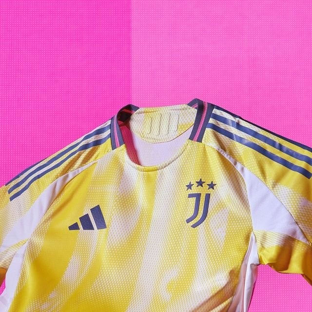
IMO the subtle yellow and white are a good blend of colours but doesnt suit our character . Shouldve gone for a solid dark colour . This kit makes more sense as a 3rd kit
by Flamerion_007
IMO the subtle yellow and white are a good blend of colours but doesnt suit our character . Shouldve gone for a solid dark colour . This kit makes more sense as a 3rd kit
by Flamerion_007
18 comments
It’s not bad, the colors are pleasant to look at.
I will admit, however, that it looks a bit too much like a training jersey rather than an official away kit.
Overall, I’m fine with it.
Training jersey. Looks like a mango & vanilla ice cream. Thank god third kit is so beautiful.
here hoping we dont get a sponsor until the third one is out in the stores
Jesus. This caught me offguard. Not bad though.
Awful IMHO.
Hate it. Looks like someone pissed on a white shirt
Was it take your kid to work day at Adidas?
Not a fan of this Fanta shirt
the expectations were VERY low with the leaks lol. The pattern turned out better than expected, no longer an absolute embarrassment. However i hate the gray.
Not a fan, but I will probably grow into it.
I bought both the home and away shirts. The home shirt is very clean and beautiful. The away shirt is different; it’s not ugly, but it doesn’t evoke the classic Juventus image for me. Since we’re in a transition period, why not try something different like this shirt? I can’t wait for the third kit, though. It looks amazing! 🔥🔥
1.5/5
Meh. Its a training top (its not but looks like it. ) Personally i need a yellow top for a 6 a side team so that solves that
Pretty cool, I wonder what the shorts and socks colour will be
It looks better on body than it did in the leaks. But overall it’s still ugly and garish, imo. Would have preferred a solid yellow kit as opposed to to what they went with. Like others have mentioned, it looks like a training kit. I hope we mainly wear the home kits and the 3rd kits, lol.
One of the worst ever
It’s shit
Isn’t as bad as people say but it really does look like a training jersey