Are you saying some people don’t understand this graph? Hardly dataisbeautiful but it accurately displays the insight behind the data…we’re improving.
Someone doesn’t know how to use Excel!
Accurate graph.
Reasons to have a ole’ good moan about the ireland in the olympics are at an all time low.
Fuck. Should I buy now in the dip or do you think it’s a longer-term drop?
Maybe we all like the misery
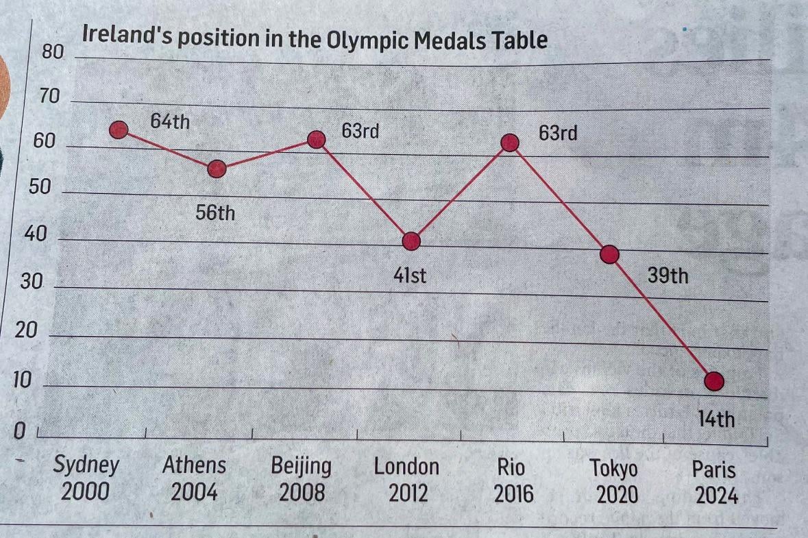
How were we ranked 56th in Athens when we got no medals? Unless they’re counting the gold which was taken back?
And they put this shit behind a paywall…
That would have passed in front of at least 3 editors before going to print.
Surely a newspaper like the Irish Times puts a lot of effort into how they present data? I mean, I don’t expect they have permanent, onsite data scientists. But they must have a “house style”, an agreed approach about how to do this stuff.
It can’t be “Ah sure, sling an aul graph on there, it’ll make it look professional”.
Peak infographics
Summer students running the gaff.
Who came in 0 I wonder.
This has to be made by an intern at the last moment without people reviewing before submission, otherwise I cannot imagine how this could happen
This is just a graph thing. What graph you you know puts the highest number at the bottom of the axis.
I agree it was a poor choice to visualize their point and they should have definitely used another method.
Not only is the presentation awful, but it’s wrong too. We finished 19th on the medal table this year.
All those saying there is nothing wrong with it. Technically thats true but as an analyst I find it extremely unsettling. Please read this article by The Economist published some time ago.
Edit: It’s an excel combination chart, just inverted the bars so smallest is at the top.
I mean its technically correct
But visually unappealing…….
Unless you’re irish and you love when we are doing badly and can moan about it
Aside from starting the Y axis at 0 when it is outside the set of possible values, this chart is fine. It is about as easy to understand as you’re going to get
I understand exactly what the IT is trying to convey with that graph. What is the problem?
Even the position of the numbers, 64th is hovering between sydney and athens, 63rd to the right (on both), and 39th is too low. Such basic graphic design errors, lazy stuff. Going out out a limb and suggesting someone from a “noice family” got the little design job instead of a person with qualifications. Ireland may get better in medals, but when it comes to handing out “noice” jobs it’s 1989 forever.
Wait according to the current Olympic table we are 19th (still incredible) not 14th, any ideas?
What’s the objective of this graph maker? To complain about Ireland doing badly? Therefore they’re cross because the complaint factor is low.
The upside down thing doesn’t bother me much, but it took me way longer than I’d like to realize they’re skipping every second olympic games here.
Are we that much worse at the winter ones?

Lol it’s very possible that my ex made this graph
Why skip Atlanta?
Isn’t that upside down?
It’s being edited by ChatGPT
That’s such a strange way to present improvement/success.
43 comments
Profits are down 🙁
Like most things in The Irish Times, you’d probably get more sense out of it by reading it upside down.
[We were 19th](https://en.wikipedia.org/wiki/2024_Summer_Olympics_medal_table#Medal_table), not 14th. It’s still a great result, but how did they get that wrong?
How does a graph like this pass through editors?
At this rate we’ll be -10th place in 2028
Are you saying some people don’t understand this graph? Hardly dataisbeautiful but it accurately displays the insight behind the data…we’re improving.
Someone doesn’t know how to use Excel!
Accurate graph.
Reasons to have a ole’ good moan about the ireland in the olympics are at an all time low.
Fuck. Should I buy now in the dip or do you think it’s a longer-term drop?
Maybe we all like the misery
How were we ranked 56th in Athens when we got no medals? Unless they’re counting the gold which was taken back?
And they put this shit behind a paywall…
That would have passed in front of at least 3 editors before going to print.
Surely a newspaper like the Irish Times puts a lot of effort into how they present data? I mean, I don’t expect they have permanent, onsite data scientists. But they must have a “house style”, an agreed approach about how to do this stuff.
It can’t be “Ah sure, sling an aul graph on there, it’ll make it look professional”.
Peak infographics
Summer students running the gaff.
Who came in 0 I wonder.
This has to be made by an intern at the last moment without people reviewing before submission, otherwise I cannot imagine how this could happen
This is just a graph thing. What graph you you know puts the highest number at the bottom of the axis.
I agree it was a poor choice to visualize their point and they should have definitely used another method.
Not only is the presentation awful, but it’s wrong too. We finished 19th on the medal table this year.
All those saying there is nothing wrong with it. Technically thats true but as an analyst I find it extremely unsettling. Please read this article by The Economist published some time ago.
https://medium.economist.com/mistakes-weve-drawn-a-few-8cdd8a42d368
I’m trying to become a data analyst and seeing visualisations like this gives me confidence that I’m more competent than I sometimes feel.
China and USA fighting for 0
Why would they do the graph like that?
I think most likely somebody made it up in Excel and didn’t bother to invert the numbers and everyone was like “good enough”
No chance of a medal for the Irish Times anyway…
It’s all downhill from here lads
This looks like one of my statistics’ class exam questions… can almost see “What would be a more appropriate graph to represent the below data?”
Ah sure that’s good enough
A stacked bar chart with #countries, with an indicator for our place would have been fine
https://preview.redd.it/h5lmzuptlfid1.png?width=546&format=png&auto=webp&s=aa9ee0018a0433aab382408e21679e4074108bc4
Edit: It’s an excel combination chart, just inverted the bars so smallest is at the top.
I mean its technically correct
But visually unappealing…….
Unless you’re irish and you love when we are doing badly and can moan about it
Aside from starting the Y axis at 0 when it is outside the set of possible values, this chart is fine. It is about as easy to understand as you’re going to get
I understand exactly what the IT is trying to convey with that graph. What is the problem?
Even the position of the numbers, 64th is hovering between sydney and athens, 63rd to the right (on both), and 39th is too low. Such basic graphic design errors, lazy stuff. Going out out a limb and suggesting someone from a “noice family” got the little design job instead of a person with qualifications. Ireland may get better in medals, but when it comes to handing out “noice” jobs it’s 1989 forever.
Wait according to the current Olympic table we are 19th (still incredible) not 14th, any ideas?
What’s the objective of this graph maker? To complain about Ireland doing badly? Therefore they’re cross because the complaint factor is low.
The upside down thing doesn’t bother me much, but it took me way longer than I’d like to realize they’re skipping every second olympic games here.
Are we that much worse at the winter ones?

Lol it’s very possible that my ex made this graph
Why skip Atlanta?
Isn’t that upside down?
It’s being edited by ChatGPT
That’s such a strange way to present improvement/success.
We should be ashamed of ourselves.
Great news! Trends are looking down.