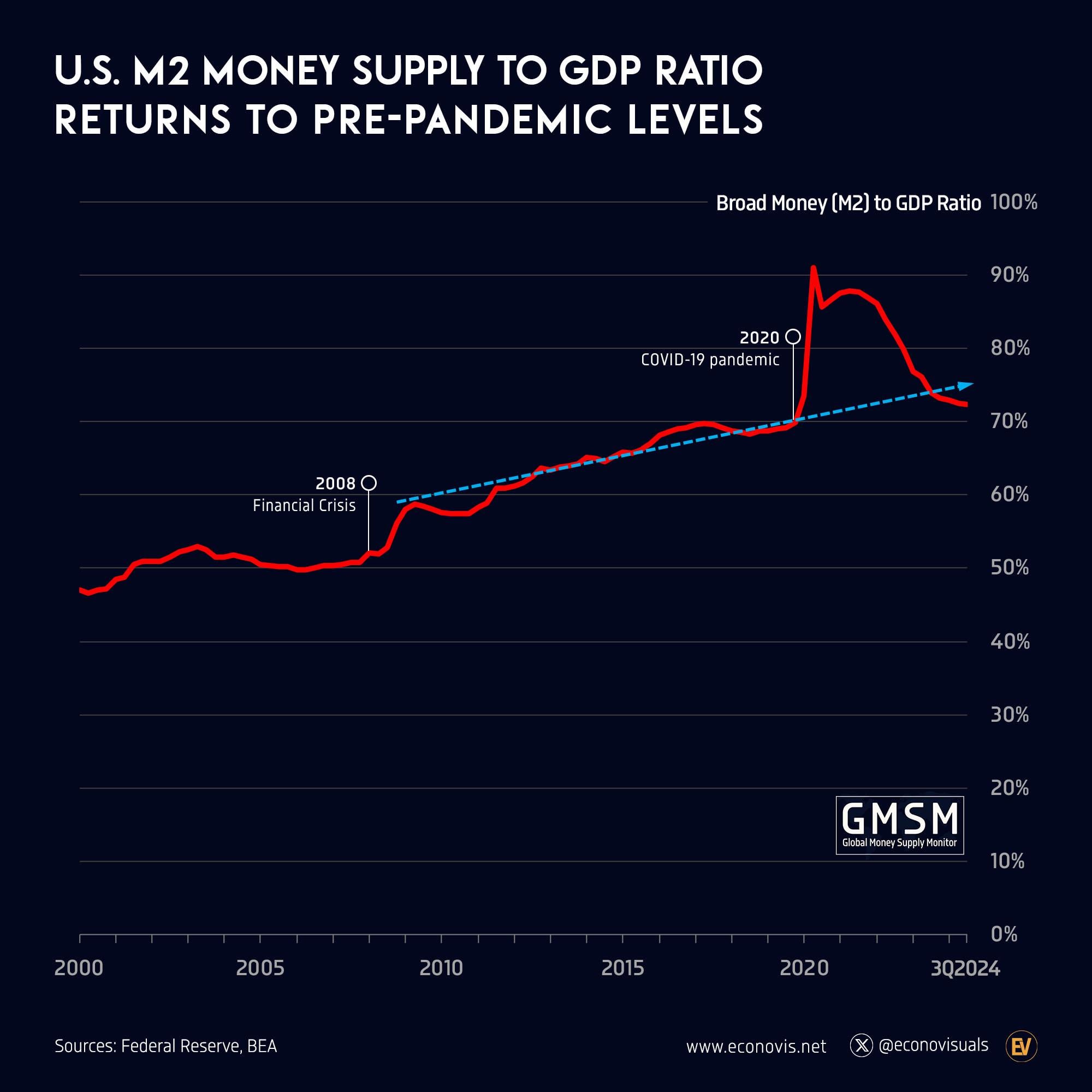
U.S. M2 Money Supply to GDP Ratio Returns to Pre-Pandemic Levels
https://i.redd.it/mrrg9bel893e1.jpeg
by EconomySoltani

U.S. M2 Money Supply to GDP Ratio Returns to Pre-Pandemic Levels
https://i.redd.it/mrrg9bel893e1.jpeg
by EconomySoltani
7 comments
Political situation is so ironic when considering this chart lmao
and it’s only going lower
This is actually a good thing
Why is this chart showing an upward trend line like it is the normal. The trend should be flat. No wonder we’ve had so much inflation.
Absolutely phenomenal job by the Fed and the administration. This scenario was once considered practically improbable, yet here we are. The electorate has chosen not to invest the time to understand the fundamentals of how our economy functions and we all get to experience the find out phase.
Were out of dough. Turn on the bread machine. 🤑
This chart is _fucking hilarious._ Like, the idiocy on display by positing that this chart says “Mission Accomplished” is _staggering._
For starters, the chart BEGINS in the year 2000 and the “trend line” conveniently placed atop it _doesn’t even fucking start until AFTER_ the GFC. So hey fuck the trend line before we started propping up the entire system right?! Blue line go above red line, this good for my chosen political tribe! HURR DURR.
Second, all this chart proves is that a) QE and ZIRP are over and thanks to _SIX TRILLION FUCKING IMAGINARY DOLLARS_ being handed out thanks to COVID, GDP go up bigly!!! Yay we did it mission accomplished, right?
Lunacy. Absolute madness and lunacy to try to say anything good has been happening since ZIRP and QE began. Everything is worse today than it was five years ago and if you didn’t own assets then, you are now DOUBLE fucked.
What a silly post. The comments are absolutely flabberghastingly awful too. OP delete this propaganda lol.
Comments are closed.