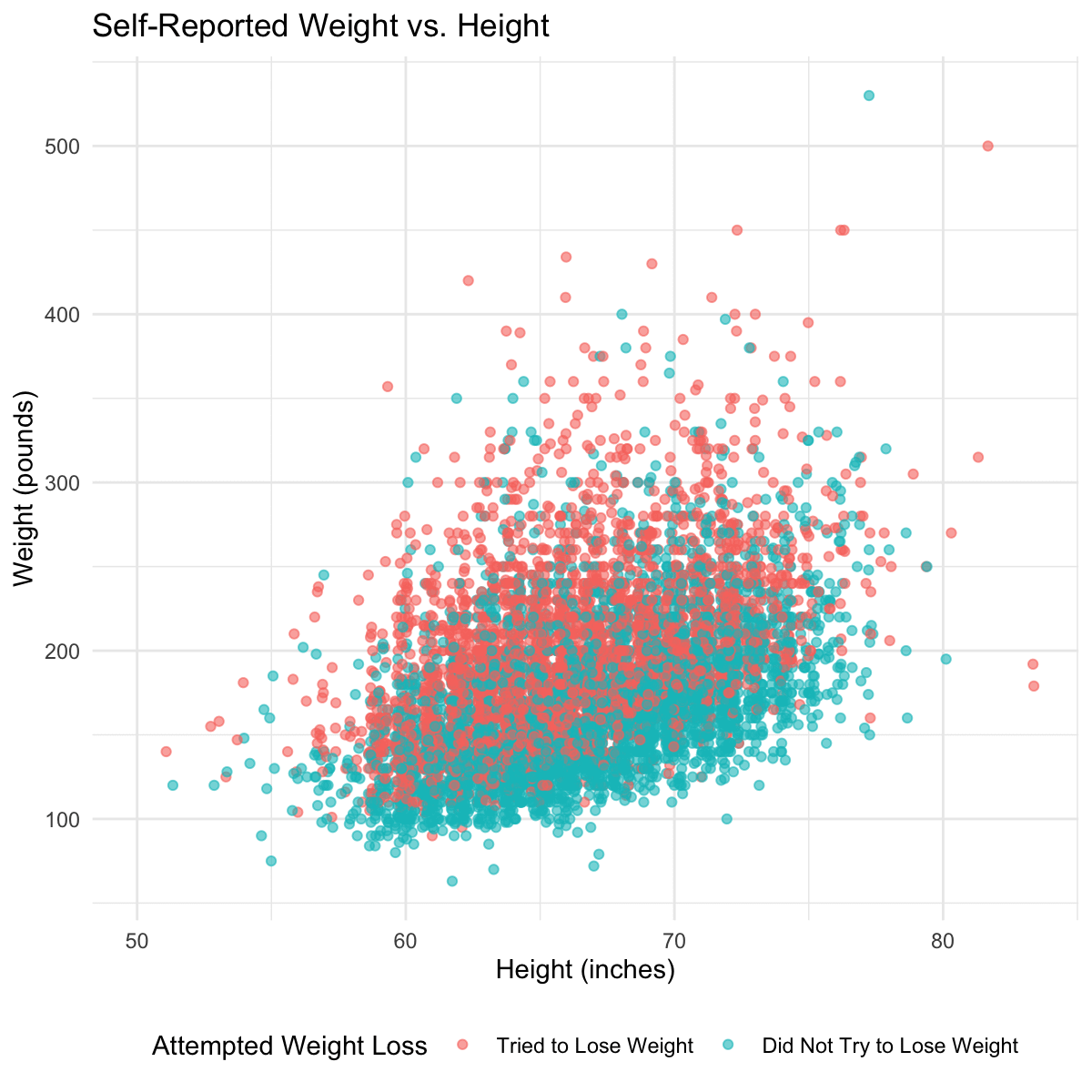
[OC] Self Reported Height and Weight colored by whether the individual tried to lose weight in the past year
Posted by Ksiolajidebthd
![[OC] Self Reported Height and Weight colored by whether the individual tried to lose weight in the past year](https://www.europesays.com/wp-content/uploads/2024/12/nvhyrb75hw4e1-1200x1024.png)
[OC] Self Reported Height and Weight colored by whether the individual tried to lose weight in the past year
Posted by Ksiolajidebthd
14 comments
Data source is [NHANES questionairre data](https://wwwn.cdc.gov/nchs/nhanes/search/datapage.aspx?Component=Questionnaire&Cycle=2021-2023), this specific dataset is the [Weight History](https://wwwn.cdc.gov/Nchs/Nhanes/2021-2022/WHQ_L.htm) dataset which asks individuals (aged 16+) their self reported height, weight, weight one year ago, and whether they tried to lose weight. Body dysmorphia plagues a lot of us and I thought it was interesting seeing this distribution. Generated quickly in R with a horizontal jitter of 0.4 since originally the data was aligned on the inch marks.
Who’s that 6’7” x 520 lbs person ? That person is wilding
Not sure what the take away is supposed to be here. Looks like the Did Not Try to Lose Weight group weighs less on average, so yeah is more likely to not be trying to lose weight.
It would be more interesting to see these groups overall change from the beginning of a year to the end. We could answer more clearly if people who dont try are simply able to maintain stable weight, what the distribution of people who tried succeeded at losing weight, etc.
[deleted]
No offence but who the hell thought it was a good idea to put height on the x axis and weight (width) on the y axis?
Pretty clear trendline here. What BMI does that seem to match?
People say this info has no meaning but I disagree. It’s says something about how people **think** if they are overweight and it’s a problem or not.
At a glance I would guess the BMI “line” there is probably at the top end of the healthy range.
Ok so skinny people don’t try to lose weight?
I think people who aren’t trying to lose weight tend to underestimate their actual weight.
This is just my own personal experience, but I was sure for years I’m around 230 pounds, but didn’t measure it. Then last year I weighed myself for some reason and turned out I was over 260.
Imperial is not beautiful
Wouldn’t this be better summarized by two box plots for BMI and a couple of dashed lines showing the healthy BMI range?
All this shows is ‘heavier people try to lose weight’
What about those trying to gain weight?
Lines of constant weight / height ^2 would have been helpful to visualize
Would be interested to see this split out by gender. Would guess you see more women in the normal range trying to lose weight
Comments are closed.