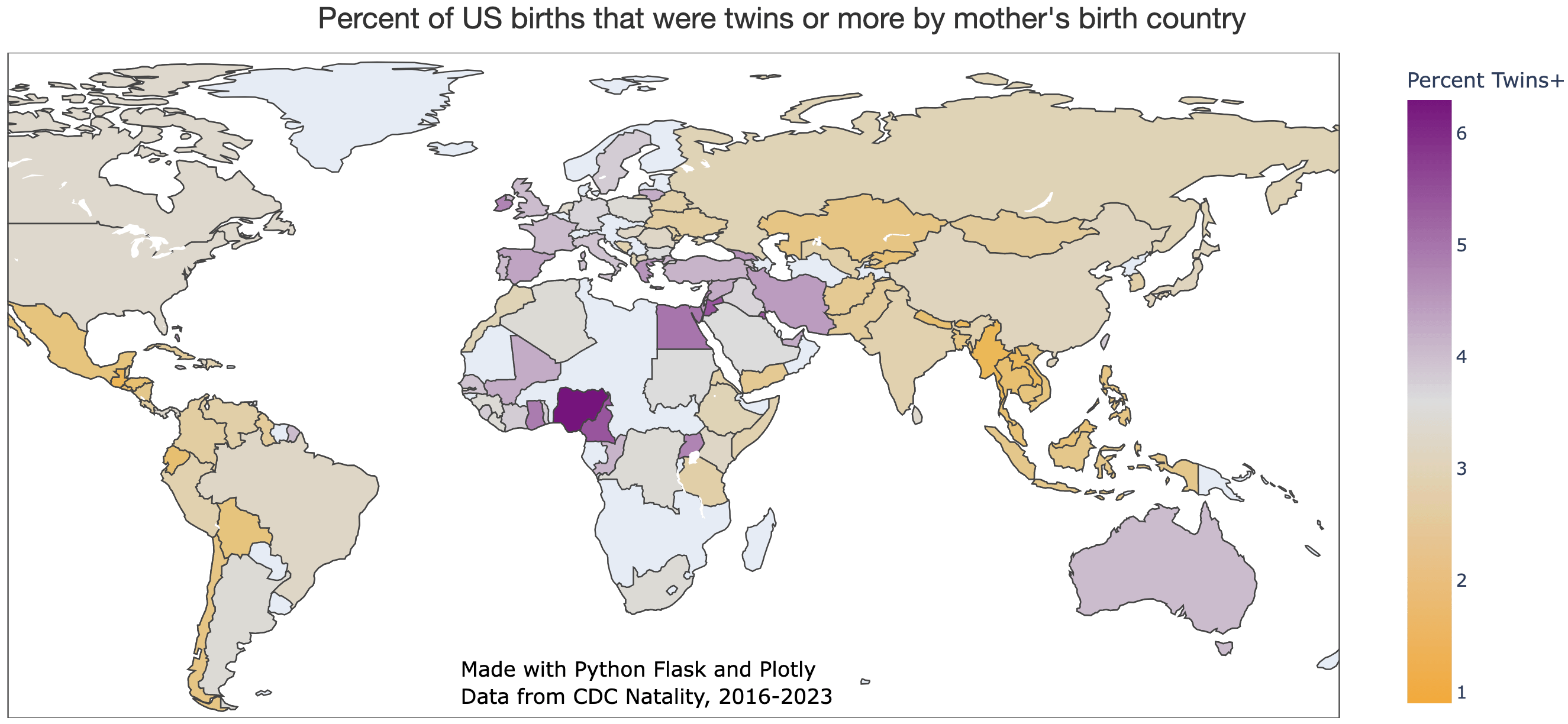
To head off confusion, I want to stress that this data is organized by the *mother’s birth country*. In other words, this is mostly tracking twin percentages among US immigrants (although US citizens are occasionally born abroad, also).
The neutral color at the center of the scale is 3.4%, which is the percentage of twin+ births among US-born mothers.
Seeing this I kinda think “okay but why?”, but it is interesting to see some countries stand out
![[OC] Percent of US births that were twins or more by mother's birth country](https://www.europesays.com/wp-content/uploads/2024/12/1a6k2yenpa5e1-1920x1024.png)
3 comments
Tools: Python Flask Plotly, Data: CDC Wonder Natality Database.
To head off confusion, I want to stress that this data is organized by the *mother’s birth country*. In other words, this is mostly tracking twin percentages among US immigrants (although US citizens are occasionally born abroad, also).
The neutral color at the center of the scale is 3.4%, which is the percentage of twin+ births among US-born mothers.
Seeing this I kinda think “okay but why?”, but it is interesting to see some countries stand out
You had me at “twins or more”. Heh.
Comments are closed.