########################
# Use this for Cohorts, that are in most recent data set only
cohorts <-
dat_fert_cohort |>
filter(yr == max(yr) ) |>
distinct(cohort)
########################
# Use this for ALL Cohorts
#
# cohorts <-
# tibble(cohort_youngest = seq(2008, 1900, by = -5),) |>
# mutate(cohort_oldest = cohort_youngest – 4,
# cohort = glue(‘{cohort_oldest}-{cohort_youngest}’)) |>
# distinct(cohort)
p_dat <-
dat_fert_cohort |>
filter(cohort %in% cohorts$cohort)
p_dat |>
ggplot(aes(x = as.integer(age_group), y = value, color = as.integer(cohort), , fill = as.integer(cohort)
)) +
geom_point() +
geom_line(mapping = aes(
#x = as.integer(age_group)-0.5,
group = cohort,
linetype = as.character(cohort)
) )+
geom_label_repel(data = p_dat_cohort_lbl, mapping = aes (label = cohort), nudge_x = 0.2, hjust = 0, color = ‘white’) +
scale_color_viridis(option = ‘E’) +
scale_fill_viridis(option = ‘E’) +
scale_x_continuous(breaks = sort(unique(as.integer(p_dat$age_group))),
labels = (.x){
levels(p_dat$age_group)[.x]
}) +
labs(
x = glue(‘Age Group of Mother’),
y = glue(‘Births Per 1000 Females’),
title = glue(‘Fertility In Canada, by Cohort of Mother’),
subtitle = glue(‘Fertility by Age group and Cohort of Mother (Year Mother Born)’),
) +
guides(color = ‘none’, linetype = ‘none’, fill = ‘none’) +
theme(
panel.grid.major.y = element_line(color = ‘lightgrey’, linewidth = 0.01, linetype = ‘solid’),
panel.grid.minor.y = element_line(color = ‘lightgrey’, linewidth = 0.01, linetype = ‘solid’),
panel.grid.major.x = element_line(color = ‘lightgrey’, linewidth = 0.01, linetype = ‘solid’),
axis.text.x = element_text(angle = 90, size = 10, hjust = 0, vjust = 0, )
)
I’d like to see this with cumulative rather than incremental.
This graph is remarkably difficult to understand.
I think it’s a great graph. It feels complicated because there’s a lot of info, but the comparisons are easy to make between cohorts for the same age groups.
It shows a clear decline in birth rates from previous generations
This probably isn’t the most beautiful data but I thought it was understandable and a great representation of how successive generations are having fewer and fewer kids, starting with the ’89-’93 generation most prominently.
People not understanding the graph is the reason why they should teach basic demographic analysis in stats class.
Thats a nice visualisation.
It’s not fertility, it’s birthrate.
Graphical suggestions:
* X-axis labels should be horizontal, not vertical
* Don’t use two terms for the cohort (Females on y-axis, Mother on x-axis and title)
* I don’t like the theme_minimal() but then re-adding gridlines. That makes no aesthetic sense. Either use theme_bw() or theme_minimal().
* Use labs(caption = ‘Stats Canada data table 13-10-0418’) to include data source in the figure
* X-axis title should be age range rather than group?
* Title should be ‘Declining birth rates in Canada’ or something that actually describes the story, rather than reiterating the axis titles. Especially since this isn’t evidence that fertility is declining – birthrates are declining, but the cause of that is more likely economic and birth-control related. Either way, you aren’t showing fertility – you are showing birth rates by age.
* I think the linewidths are too small and the points are redundant.
Code comments:
* scale_fill_viridis is useless for a line and point plot
* since you define your aes variables in ggplot(), you don’t need to state them again in geom_line()
* I don’t understand why you don’t just add the label column via mutate instead of creating p_dat_cohort_lbl for geom_label_repel()
* your code is overly complicated for a simple plot and extremely verbose for what it is doing. Being concise is typically better than using complicated regex for string extraction and unneeded calls to glue()
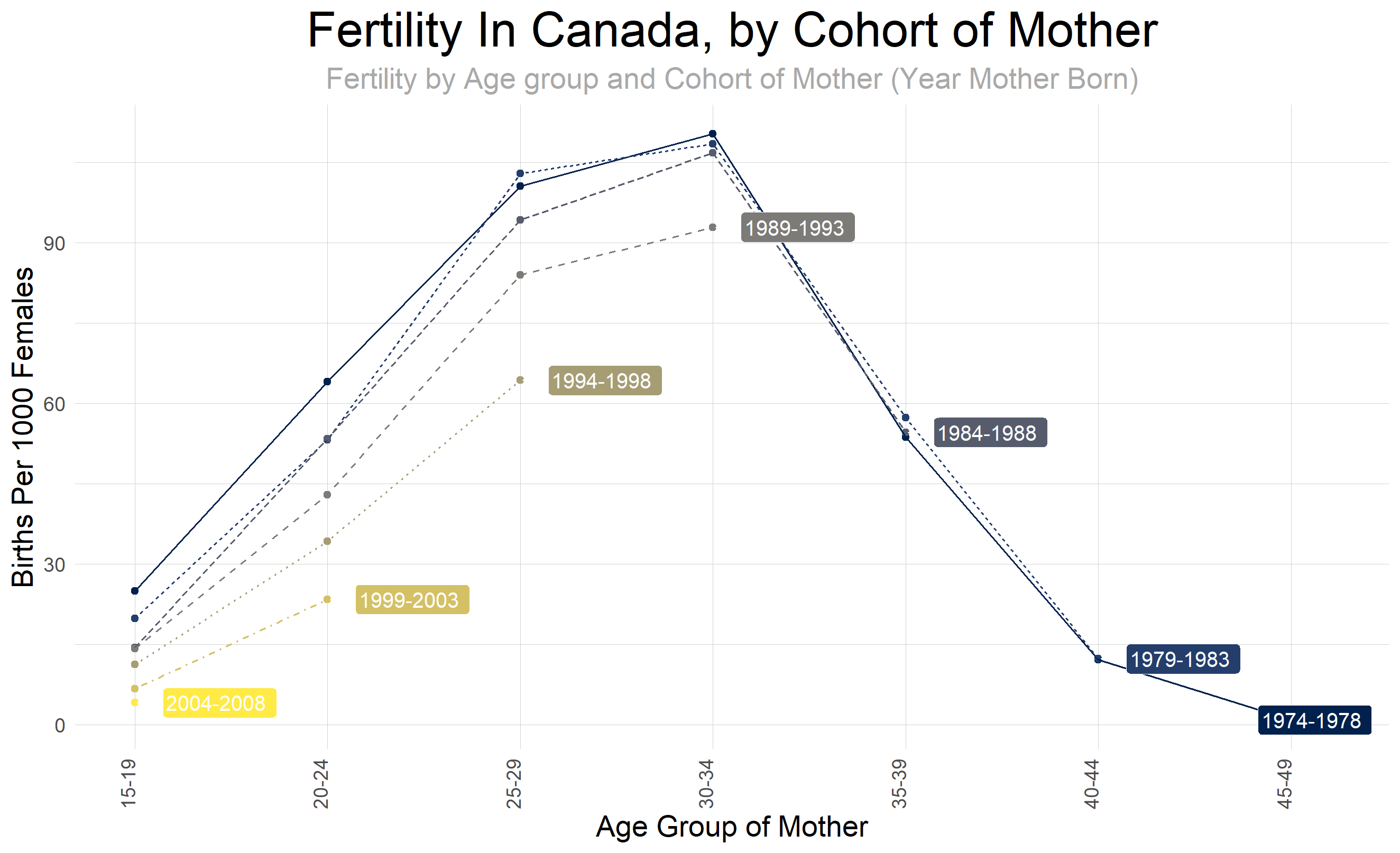
![[OC] Cohort Analysis of Fertility in Canada Mothers born in 1974-2008](https://www.europesays.com/wp-content/uploads/2024/12/5q00wnxni95e1-1920x1024.png)
9 comments
Cohort analysis of Fertility in Canada by Age of Mother, Data comes from Statscan [data table 13-10-0418](https://www150.statcan.gc.ca/t1/tbl1/en/tv.action?pid=1310041801) Tools are R Code is below.
library(scales)
library(cansim)
library(tidyverse)
library(ggplot2)
library(janitor)
library(lubridate)
library(glue)
library(feasts)
library(fpp3)
library(ggrepel)
library(magrittr)
library(viridis)
tlb_nm_fer <- ’13-10-0418′
fer_dat_raw <- get_cansim(tlb_nm_fer) |> clean_names()
theme_set(theme_minimal() +
theme(
axis.text.y = element_text(size = 10),
axis.text.x = element_text(angle = 90, size = 10, hjust = 0.5),
axis.title = element_text(size = 15),
panel.grid = element_blank(),
strip.background = element_blank(),
strip.text = element_blank(),
plot.title = element_text(hjust = 0.5, size = 25, color = ‘black’),
plot.subtitle = element_text(hjust = 0.5, size = 15, color = ‘darkgrey’),
legend.title = element_text(color = ‘black’, size = 15),
legend.text = element_text(color = ‘black’, size = 10)
))
dat_fert_all <-
fer_dat_raw |>
filter(geo == ‘Canada, place of residence of mother’ &
(
str_detect(characteristics, ‘Age-specific fertility rate, females’) # |
#str_detect(characteristics, ‘Crude birth rate, live births per 1,000 population’)
)
) |>
mutate(yr = as.integer(ref_date)) |>
mutate(age_group = str_squish(str_replace(str_remove(str_remove(characteristics, ‘Age-specific fertility rate, females’), ‘years’), ‘\s+to\s+’,’-‘))) |>
#filter(yr %in% range(yr)) |>
select(yr, value, age_group)
dat_fert_cohort <-
dat_fert_all |>
mutate(age_group_min = as.integer(str_extract(age_group, ‘^([0-9]+)\-([0-9]+)$’, group = 1) ) ,
age_group_max = as.integer(str_extract(age_group, ‘^([0-9]+)\-([0-9]+)$’, group = 2) )
) |>
mutate(
cohort_youngest = yr – age_group_min ,
cohort_oldest = yr – age_group_max
) |>
mutate(
cohort = glue(‘{cohort_oldest}-{cohort_youngest}’)
) |>
mutate(age_group = factor(fct_relevel(age_group, sort(unique((age_group)))), ordered = TRUE)) |>
mutate(cohort = factor(fct_relevel(cohort, sort(unique((cohort)))), ordered = TRUE))
########################
# Use this for Cohorts, that are in most recent data set only
cohorts <-
dat_fert_cohort |>
filter(yr == max(yr) ) |>
distinct(cohort)
########################
# Use this for ALL Cohorts
#
# cohorts <-
# tibble(cohort_youngest = seq(2008, 1900, by = -5),) |>
# mutate(cohort_oldest = cohort_youngest – 4,
# cohort = glue(‘{cohort_oldest}-{cohort_youngest}’)) |>
# distinct(cohort)
p_dat <-
dat_fert_cohort |>
filter(cohort %in% cohorts$cohort)
p_dat_cohort_lbl <-
p_dat |>
filter(age_group_max == max(age_group_max), .by = cohort) |>
select(cohort, age_group, value)
p_dat |>
ggplot(aes(x = as.integer(age_group), y = value, color = as.integer(cohort), , fill = as.integer(cohort)
)) +
geom_point() +
geom_line(mapping = aes(
#x = as.integer(age_group)-0.5,
group = cohort,
linetype = as.character(cohort)
) )+
geom_label_repel(data = p_dat_cohort_lbl, mapping = aes (label = cohort), nudge_x = 0.2, hjust = 0, color = ‘white’) +
scale_color_viridis(option = ‘E’) +
scale_fill_viridis(option = ‘E’) +
scale_x_continuous(breaks = sort(unique(as.integer(p_dat$age_group))),
labels = (.x){
levels(p_dat$age_group)[.x]
}) +
labs(
x = glue(‘Age Group of Mother’),
y = glue(‘Births Per 1000 Females’),
title = glue(‘Fertility In Canada, by Cohort of Mother’),
subtitle = glue(‘Fertility by Age group and Cohort of Mother (Year Mother Born)’),
) +
guides(color = ‘none’, linetype = ‘none’, fill = ‘none’) +
theme(
panel.grid.major.y = element_line(color = ‘lightgrey’, linewidth = 0.01, linetype = ‘solid’),
panel.grid.minor.y = element_line(color = ‘lightgrey’, linewidth = 0.01, linetype = ‘solid’),
panel.grid.major.x = element_line(color = ‘lightgrey’, linewidth = 0.01, linetype = ‘solid’),
axis.text.x = element_text(angle = 90, size = 10, hjust = 0, vjust = 0, )
)
I’d like to see this with cumulative rather than incremental.
This graph is remarkably difficult to understand.
I think it’s a great graph. It feels complicated because there’s a lot of info, but the comparisons are easy to make between cohorts for the same age groups.
It shows a clear decline in birth rates from previous generations
This probably isn’t the most beautiful data but I thought it was understandable and a great representation of how successive generations are having fewer and fewer kids, starting with the ’89-’93 generation most prominently.
People not understanding the graph is the reason why they should teach basic demographic analysis in stats class.
Thats a nice visualisation.
It’s not fertility, it’s birthrate.
Graphical suggestions:
* X-axis labels should be horizontal, not vertical
* Don’t use two terms for the cohort (Females on y-axis, Mother on x-axis and title)
* I don’t like the theme_minimal() but then re-adding gridlines. That makes no aesthetic sense. Either use theme_bw() or theme_minimal().
* Use labs(caption = ‘Stats Canada data table 13-10-0418’) to include data source in the figure
* X-axis title should be age range rather than group?
* Title should be ‘Declining birth rates in Canada’ or something that actually describes the story, rather than reiterating the axis titles. Especially since this isn’t evidence that fertility is declining – birthrates are declining, but the cause of that is more likely economic and birth-control related. Either way, you aren’t showing fertility – you are showing birth rates by age.
* I think the linewidths are too small and the points are redundant.
Code comments:
* scale_fill_viridis is useless for a line and point plot
* since you define your aes variables in ggplot(), you don’t need to state them again in geom_line()
* I don’t understand why you don’t just add the label column via mutate instead of creating p_dat_cohort_lbl for geom_label_repel()
* your code is overly complicated for a simple plot and extremely verbose for what it is doing. Being concise is typically better than using complicated regex for string extraction and unneeded calls to glue()
Comments are closed.