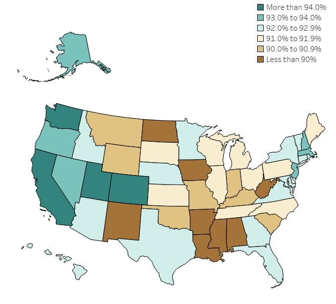
This visualization was built using data from the 2023 American Community Survey 1-year estimates. I utilized Python to access the Census Bureau API and Tableau to do the visualization. To explore more of my work, check out my [Tableau Public profile](https://overflowdata.com/state-data/) or learn more about the 2023 [American Community Survey](http://census.gov/acs) at the Census Bureau’s [website](http://census.gov/).
That thumbnail is kind of misleading when there’s only a difference of 5%.
further dissection by broader % groupings would have been more telling of rural community access impacting each state’s categorization.
3 comments
This visualization was built using data from the 2023 American Community Survey 1-year estimates. I utilized Python to access the Census Bureau API and Tableau to do the visualization. To explore more of my work, check out my [Tableau Public profile](https://overflowdata.com/state-data/) or learn more about the 2023 [American Community Survey](http://census.gov/acs) at the Census Bureau’s [website](http://census.gov/).
That thumbnail is kind of misleading when there’s only a difference of 5%.
further dissection by broader % groupings would have been more telling of rural community access impacting each state’s categorization.
Comments are closed.