Interesting, I wonder how it compares to other countries.
Also, Whatever you do, don’t make cities walkable or tax sugary drinks, that would be communism.
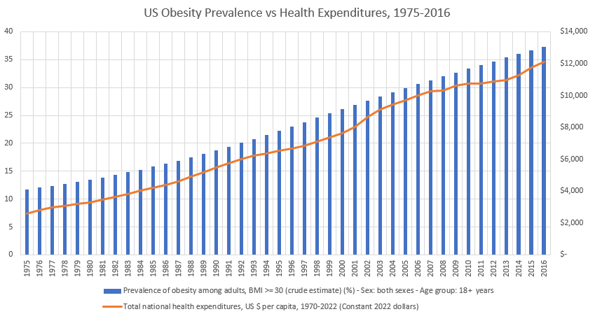
The US far and away spends more on healthcare care and it’s not even close.
The US has one of the highest obesity rates in the world. The only higher are small island countries and petro-states.
Something something, correlation is not causation, something something.
Was the per capita spending inflation adjusted?
The question is how much of this correlates with each other. It’s definitely a non-zero amount of correlation, but this graph makes it look like it’s 100% on rising obesity and not other factors like rapidly expanding administrative costs.
Seems to me that we can eliminate obesity by spending nothing on healthcare!
And ice cream sales increase gun violence. 🙄
This chart needs work. $/capita should be on the y-axis. Gridlines, ew.
Some say we need universal healthcare, some say we should pass on the pie.
I see the normal seagulls flying around, shitting on this chart saying, “correlation is not causation”, but obesity is a strong predictor/forerunner of heart disease, diabetes, and many chronic illnesses. So, although the obesity itself may not be driving the increase it is causing increases in other diseases that are definitely increasing spend/person. So at worst you could make the argument that obesity is just the switch on a Rube Goldberg machine that ends with medical spending.
Total health expenditure per Capita v prevalence of obesity 1995-2022, US compared to all nations
I’m always suspicious of percentages on a y-axis that doesn’t go from 0 to 100, this is warping the perception of correlation.
Having two variables that go up and plotting them together makes any demonstration of correlation impossible to see. Maybe percentage change or log would show something meaningful.
Another reason it seems short-sighted for the average health insurance not to cover obesity treatment
15 comments
Sources:
Healthcare expenditures
[https://www.healthsystemtracker.org/chart-collection/u-s-spending-healthcare-changed-time/](https://www.healthsystemtracker.org/chart-collection/u-s-spending-healthcare-changed-time/)
Obesity rate
[https://ourworldindata.org/grapher/share-of-adults-defined-as-obese](https://ourworldindata.org/grapher/share-of-adults-defined-as-obese)
Chart created by me in Microsoft Excel
Interesting, I wonder how it compares to other countries.
Also, Whatever you do, don’t make cities walkable or tax sugary drinks, that would be communism.
The US far and away spends more on healthcare care and it’s not even close.
The US has one of the highest obesity rates in the world. The only higher are small island countries and petro-states.
Something something, correlation is not causation, something something.
Was the per capita spending inflation adjusted?
The question is how much of this correlates with each other. It’s definitely a non-zero amount of correlation, but this graph makes it look like it’s 100% on rising obesity and not other factors like rapidly expanding administrative costs.
Seems to me that we can eliminate obesity by spending nothing on healthcare!
And ice cream sales increase gun violence. 🙄
This chart needs work. $/capita should be on the y-axis. Gridlines, ew.
Some say we need universal healthcare, some say we should pass on the pie.
I see the normal seagulls flying around, shitting on this chart saying, “correlation is not causation”, but obesity is a strong predictor/forerunner of heart disease, diabetes, and many chronic illnesses. So, although the obesity itself may not be driving the increase it is causing increases in other diseases that are definitely increasing spend/person. So at worst you could make the argument that obesity is just the switch on a Rube Goldberg machine that ends with medical spending.
Total health expenditure per Capita v prevalence of obesity 1995-2022, US compared to all nations
https://imgur.com/a/CXNyWtl
I’m always suspicious of percentages on a y-axis that doesn’t go from 0 to 100, this is warping the perception of correlation.
Having two variables that go up and plotting them together makes any demonstration of correlation impossible to see. Maybe percentage change or log would show something meaningful.
Another reason it seems short-sighted for the average health insurance not to cover obesity treatment
Comments are closed.