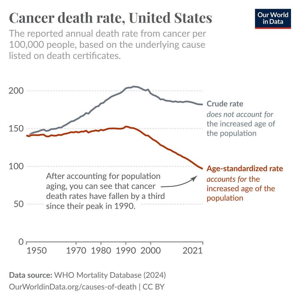
[OC] Americans are now one-third less likely to die from cancer at the same ages as Americans in 1990
Posted by salonium_
[OC] Americans are now one-third less likely to die from cancer at the same ages as Americans in 1990
Posted by salonium_
14 comments
[OC] I created this chart with the [OWID Grapher chart tool](https://ourworldindata.org/grapher/cancer-death-rate-crude-vs-age-standardized-who-mdb?country=~USA) (you can explore other countries in the interactive chart in the link).
Caption:
How has the risk of dying from cancer changed in the United States?
To understand this, we can look at national cancer death rates in the United States.
The gray line shows the crude rate, which is the rate of deaths from cancer per 100,000 people. It has risen between 1950 and 1990 and has fallen slightly since then.
However, cancer death rates rise sharply with age, and the age of the US population has [increased](https://ourworldindata.org/grapher/population-by-age-group?stackMode=relative&country=~USA) since 1950, so we would expect cancer death rates to rise for that reason alone.
What if we adjust for the increased age of the US population?
The red line, the age-standardized rate, shows this. It shows the cancer death rate *if* the age structure of the US population was held constant throughout.
This shows a slight rise until 1990 and then a significant decline; rates have fallen by one-third.
This means Americans are now one-third less likely to die from cancer at the same ages as Americans in 1990.
This comes from several factors: better screening and earlier diagnosis, medical advances in cancer treatments, and public health efforts to reduce risk factors like smoking and exposure to carcinogens.
You can read more on our page on global data and research on cancer: [https://ourworldindata.org/cancer](https://ourworldindata.org/cancer)
Explore the trends for other countries here: [https://ourworldindata.org/grapher/cancer-death-rate-crude-vs-age-standardized-who-mdb?country=~USA](https://ourworldindata.org/grapher/cancer-death-rate-crude-vs-age-standardized-who-mdb?country=~USA)
The American Oligarchs can’t be happy about this.
This is probably because since then, many smokers have quit earlier and less people have taken it up. Smoking kills, and cancer is a dogs death!
This, alongside other decreases in disease mortality, is a major driver of global healthcare cost increases. (Note the US is as always a special case – they’re affected by this, but also by their backwards payor system). It’s the dirty secret of healthcare – it’s a lot cheaper to die from cancer then it is to survive it. It’s a lot cheaper to die of a massive heart attack than live with chronic heart disease. Renal failure becomes dialysis, trauma becomes physical rehab, lethal strokes become managed hypertension.
Extending lifespans and conquering previously-deadly diseases is an unalloyed good, but it’s important to recognize that it comes with a (literal) cost. As a society we need to pay that cost, but it’s also why prevention is so important – every citizen that avoids a chronic metabolic disease saves society literal millions of dollars.
Out of curiosity does the data allow to do the reverse, say show the evolution of cancer mortality for people aged 40-50-60, etc?
Curious if it’s uniform.
Edit: Found something but the breakdown is not that fine. Still it’s depressing to see the cancer rate for <5y is not 0…
[https://ourworldindata.org/grapher/cancer-death-rates-by-age?country=~USA](https://ourworldindata.org/grapher/cancer-death-rates-by-age?country=~USA)
imagine what this number would be if american insurance providers weren’t fucking pieces of shit.
Would be nice to see it together with smoking rates, to see if there is a correlation also (and in this case, it certainly would imply causation)
When I was a child, my dad would occasionally send me to the corner bar to get a pack of cigarettes from a VENDING machine.
When I was old enough to have a job and I asked what he wanted for his birthday, all he wanted was a carton of cigarettes (10 packs of 20 cigarettes, so 200 cigs)
Very good analysis! It totally changes perspective and improves understanding without apocallyptic messages. Thanks a lot.
Unfortunately the data is significantly skewed, as someone who is dying of cancer can have their ultimate cause of death reclassified at the last minute, like passing from an pneumonia, which is very common due to the weakened immune systems. In reality, deaths from cancer are way up.
Is there any really good data correlating this decrease to any specific factor?
I’d like to see this data juxtaposed with obesity related mortality. Let’s find out if trading chain smoking for stress eating is a good thing or not.
Now compare this to other countries. This chart is just the healthcare industry trying to pat itself on the back
Kind of meaningless data. Are cancer rates dropping because people are living longer, or are they dropping because people are dying earlier of other morbidities like diabetes, coronary disease, suicide, etc.?
Comments are closed.