I like how the balkan ones are all over the place… you just know something is wrong when serbia that high up 😭
It’s always Finland at the top.
The Swiss flag is wrong (correct would be square not rectangular) but otherwise nice graphics.
Place 6, we are doing good.
INB4 An American comes to complain to the rest of the world how hard they have it.
ireland has a higher gdp per capita than singapore ?
I know Finns and Swedes. I would not describe them as “happy”.
I wonder if the breakdown in correlation between higher GDP/capita and more happiness is just a virtue of the small number of data points or if the [research suggesting a decoupling at a personal level](https://www.pnas.org/doi/epdf/10.1073/pnas.2208661120) effects countries in a similar way
Costa Rica seems quite good at a lower gdp per capita than Finland. Is it truly good there?
Looks nice, but the happiness index is horribly flawed. It turns out cultures have different ideas about what happiness means and if it’s ok to express it. Quelle surprise…
The Latin paradox is apparent, romance speaking countries, particularly those in Latin America are happier than their income indicates
Turkey is so bad it doesn’t even on the map.
In conclusion, money buys happiness. /j
Interesting that there is almost no difference in happiness between US and Mexico. Clearly there are some substantial false impressions of how great it is to live in the US.
feels like I should move to Costa Rica.
Brits are happier than us germans? Man, that drags me down even more
It took me forever to figure which middleastern country was the red, green, black and white flag next to the US. It’s the UAE
The Netherlands’ GDP per capita is completely off here. It is lile 10% lower than Denmark’s as per 2024.
So happiness comes from having a -|– in your flag?
I’m unhappy that I don’t recognize more flags.
FYI, the “happiness score” is a sham. Read on, because almost no one gets this straight, and the shit is important.
The number on the vertical axis comes from the “World Happiness Report” which uses only a single question to gauge your “happiness”, a tool called the Cantril ladder. You are asked to imagine a ladder that has rungs going from 0 to 10, 10 being the highest, “the best possible life”. The question is simple: where are you now? On which rung? The nation’s “happiness score” is simply the average of people’s answers.
There are numerous problems with this approach and it is generally seen as low-effort, methodologically flawed and culturally tainted by anyone seriously studying happiness (which is more often quantified as ‘wellbeing’, btw).
But the biggest problem is that imagining the ladder elicits thoughts about power and wealth, not my everyday emotional state and well-being. This was suggested ca. 10 years ago by Nobel-prize winning economist Daniel Kahneman and later proved in numerous studies. Basically, people answering that they are at the top of the ladder are the people who are wealthy and content with their place in society’s vertical structure.
If you ask instead directly about what actually constitutes happiness for people – if you simply ask around how happiness is understood – so stuff such as being healthy, well-rested, content, treated with respect, having a fulfilled life, learning interesting stuff, not having much pain, stress or worry in your life, the results are completely different. The Gallup Global Emotions (GGE) does exactly that, and consistently top ranking are countries such as Paraguay, Mexico, Philippines, Indonesia, Panama etc. Last time they did it, Finland was 44th if I remember correctly.
Simply put, whenever you see “happiness scores” for different countries, and Scandinavian countries are at the top, just remember that this comes from WHR which is a bullshit study pushed aggresively by the UN (who officially co-sponsors the report) with a clear political agenda. In brief, they consistently attempt to “explain” the fact that the Scandinavian countries are the “happiest” – which they aren’t, using more reasonable and standard measures used by psychologists, such as the affective component of the well-being, as measured e.g. by GGE – by their social and political choices. Which, statistically, doesn’t work, and is simply a political agenda thinly veiled by bad science.
On an unrelated note, the graph is hideous.
Proof that having a sideways t on your flag causes happiness.
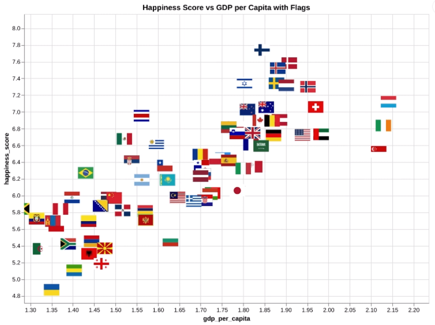
![[OC] Country happiness vs GDP](https://www.europesays.com/wp-content/uploads/2024/12/d763qsn9j16e1-1442x1024.png)
26 comments
– data source World Happiness Report from years 2015-2024, aggregated as CSV, available on my github [https://github.com/pplonski/datasets-for-start/tree/master/world_happiness_report](https://github.com/pplonski/datasets-for-start/tree/master/world_happiness_report)
– ChatGPT + Python notebook to create visualization, packages: pandas, pycountry, requests, altair
– video with all my prompts used to create plot [https://youtu.be/srUkr7vjVUc](https://youtu.be/srUkr7vjVUc)
Hey, do that against GINI.
I like how the balkan ones are all over the place… you just know something is wrong when serbia that high up 😭
It’s always Finland at the top.
The Swiss flag is wrong (correct would be square not rectangular) but otherwise nice graphics.
Place 6, we are doing good.
INB4 An American comes to complain to the rest of the world how hard they have it.
ireland has a higher gdp per capita than singapore ?
I know Finns and Swedes. I would not describe them as “happy”.
I wonder if the breakdown in correlation between higher GDP/capita and more happiness is just a virtue of the small number of data points or if the [research suggesting a decoupling at a personal level](https://www.pnas.org/doi/epdf/10.1073/pnas.2208661120) effects countries in a similar way
Costa Rica seems quite good at a lower gdp per capita than Finland. Is it truly good there?
Looks nice, but the happiness index is horribly flawed. It turns out cultures have different ideas about what happiness means and if it’s ok to express it. Quelle surprise…
The Latin paradox is apparent, romance speaking countries, particularly those in Latin America are happier than their income indicates
Turkey is so bad it doesn’t even on the map.
In conclusion, money buys happiness. /j
Interesting that there is almost no difference in happiness between US and Mexico. Clearly there are some substantial false impressions of how great it is to live in the US.
feels like I should move to Costa Rica.
Brits are happier than us germans? Man, that drags me down even more
It took me forever to figure which middleastern country was the red, green, black and white flag next to the US. It’s the UAE
The Netherlands’ GDP per capita is completely off here. It is lile 10% lower than Denmark’s as per 2024.
So happiness comes from having a -|– in your flag?
I’m unhappy that I don’t recognize more flags.
FYI, the “happiness score” is a sham. Read on, because almost no one gets this straight, and the shit is important.
The number on the vertical axis comes from the “World Happiness Report” which uses only a single question to gauge your “happiness”, a tool called the Cantril ladder. You are asked to imagine a ladder that has rungs going from 0 to 10, 10 being the highest, “the best possible life”. The question is simple: where are you now? On which rung? The nation’s “happiness score” is simply the average of people’s answers.
There are numerous problems with this approach and it is generally seen as low-effort, methodologically flawed and culturally tainted by anyone seriously studying happiness (which is more often quantified as ‘wellbeing’, btw).
But the biggest problem is that imagining the ladder elicits thoughts about power and wealth, not my everyday emotional state and well-being. This was suggested ca. 10 years ago by Nobel-prize winning economist Daniel Kahneman and later proved in numerous studies. Basically, people answering that they are at the top of the ladder are the people who are wealthy and content with their place in society’s vertical structure.
If you ask instead directly about what actually constitutes happiness for people – if you simply ask around how happiness is understood – so stuff such as being healthy, well-rested, content, treated with respect, having a fulfilled life, learning interesting stuff, not having much pain, stress or worry in your life, the results are completely different. The Gallup Global Emotions (GGE) does exactly that, and consistently top ranking are countries such as Paraguay, Mexico, Philippines, Indonesia, Panama etc. Last time they did it, Finland was 44th if I remember correctly.
Simply put, whenever you see “happiness scores” for different countries, and Scandinavian countries are at the top, just remember that this comes from WHR which is a bullshit study pushed aggresively by the UN (who officially co-sponsors the report) with a clear political agenda. In brief, they consistently attempt to “explain” the fact that the Scandinavian countries are the “happiest” – which they aren’t, using more reasonable and standard measures used by psychologists, such as the affective component of the well-being, as measured e.g. by GGE – by their social and political choices. Which, statistically, doesn’t work, and is simply a political agenda thinly veiled by bad science.
On an unrelated note, the graph is hideous.
Proof that having a sideways t on your flag causes happiness.
“Happiness_score” has that IQ-score energy.
what in the heck is your x-axis?
Comments are closed.