Check out the cumulative percentage change in CPI for major spending categories in the US over the last decade. Data comes from **FRED** via the `fredr` R package, with visualization done using `ggplot2` and `viridis`. Housing and transportation have seen the highest inflation, while apparel has remained relatively stable.
What do you think about these trends?
Having a color scale that is exactly the same as the x axis is unnecessary
[deleted]
basic thing : defining ***”CPI”*** in a title on the chart
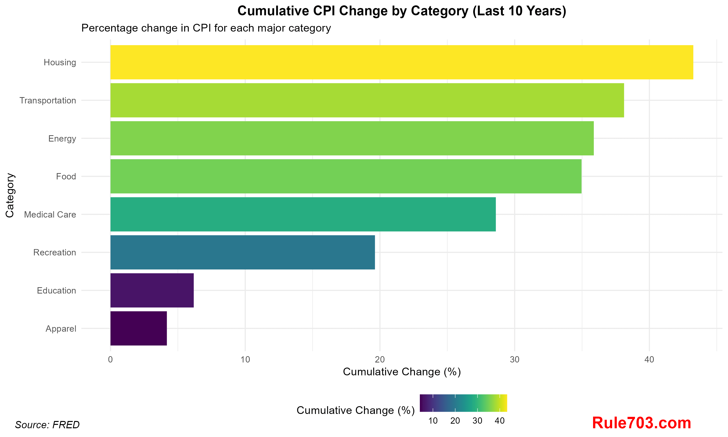
![Inflation in the US: Cumulative CPI Changes by Category (Last 10 Years) [OC]](https://www.europesays.com/wp-content/uploads/2024/12/vhxxs9p5o26e1-1920x1024.png)
4 comments
Check out the cumulative percentage change in CPI for major spending categories in the US over the last decade. Data comes from **FRED** via the `fredr` R package, with visualization done using `ggplot2` and `viridis`. Housing and transportation have seen the highest inflation, while apparel has remained relatively stable.
What do you think about these trends?
Having a color scale that is exactly the same as the x axis is unnecessary
[deleted]
basic thing : defining ***”CPI”*** in a title on the chart
Comments are closed.