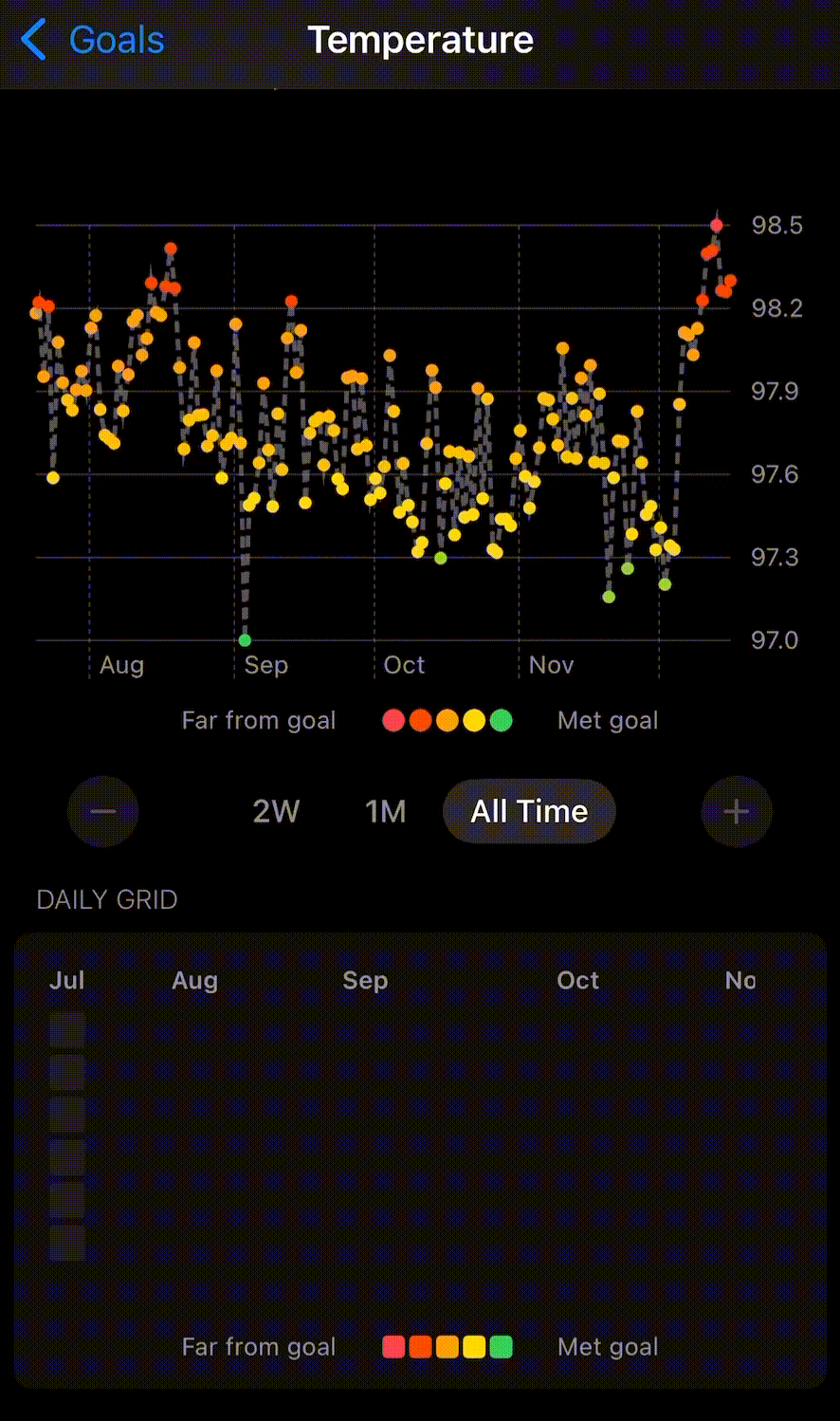
I have been tracking my temperature multiple times daily since July of this year, and noticed an interesting trend show up recently after a confirmed COVID exposure. My average daily temperature has been elevated for the past week, despite having no other symptoms of illness and repeatedly testing negative.
If you look closely, there’s a similar spike in temperature that happened in August, when one of my roommates had COVID (and once again, I never tested positive or had significant symptoms beyond a mild headache for a few days)
**Edit:** The legend on the plot is labeled “Far from goal”/”Met goal” because the plot was created in the Goals feature in the app, which I used with a “Minimize Temperature” goal to get the red/green color coding. As some commenters correctly pointed out, having a “goal” temperature isn’t necessarily appropriate to show this information, and it’s making me want to add additional custom color-coding features to visualizations in the app independent of goals.
That’s fun. So you’re probably fighting the infection, but it hasn’t gotten to the point of showing other symptoms. But you’re also probably one bad nights sleep away from waking up with full-blown COVID.
Interesting data (I’ve got a Garmin smart watch and can similarly identify flu/COVID bouts in all the fitness tracking), but not an ideal presentation.
The animation in the second panel is unnecessary and distracting. The legend for the colours in the first panel isn’t appropriate to the data set–“goal” body temperatures aren’t really a thing.
It’s kind of weird that it sets the “goal” temperature at the bottom of the normal range. In general, 97 is no better than 98 or 99.
There are asymptomatic and presymtomatic stages. Huge difference.
This happened to me. In the past 35 or so years I’ve had a fever about 10-11 times.
One was an infection caused by a wound. One was pneumonia. Another 2-3 were just normal illnesses.
Six happened in the year after I had Covid.
But what if you eat ice cream?
Seeing any daily grid like that will only ever remind me of Github contributions
![[OC] Elevated Temperature After COVID Exposure](https://www.europesays.com/wp-content/uploads/2024/12/il5ba3ohj97e1-886x1024.gif)
8 comments
I have been tracking my temperature multiple times daily since July of this year, and noticed an interesting trend show up recently after a confirmed COVID exposure. My average daily temperature has been elevated for the past week, despite having no other symptoms of illness and repeatedly testing negative.
If you look closely, there’s a similar spike in temperature that happened in August, when one of my roommates had COVID (and once again, I never tested positive or had significant symptoms beyond a mild headache for a few days)
Source: The visualization was created with [Reflect](https://apps.apple.com/us/app/reflect-track-anything/id6463800032), a personal tracking iOS app I’m a co-creator of.
**Edit:** The legend on the plot is labeled “Far from goal”/”Met goal” because the plot was created in the Goals feature in the app, which I used with a “Minimize Temperature” goal to get the red/green color coding. As some commenters correctly pointed out, having a “goal” temperature isn’t necessarily appropriate to show this information, and it’s making me want to add additional custom color-coding features to visualizations in the app independent of goals.
That’s fun. So you’re probably fighting the infection, but it hasn’t gotten to the point of showing other symptoms. But you’re also probably one bad nights sleep away from waking up with full-blown COVID.
Interesting data (I’ve got a Garmin smart watch and can similarly identify flu/COVID bouts in all the fitness tracking), but not an ideal presentation.
The animation in the second panel is unnecessary and distracting. The legend for the colours in the first panel isn’t appropriate to the data set–“goal” body temperatures aren’t really a thing.
It’s kind of weird that it sets the “goal” temperature at the bottom of the normal range. In general, 97 is no better than 98 or 99.
There are asymptomatic and presymtomatic stages. Huge difference.
This happened to me. In the past 35 or so years I’ve had a fever about 10-11 times.
One was an infection caused by a wound. One was pneumonia. Another 2-3 were just normal illnesses.
Six happened in the year after I had Covid.
But what if you eat ice cream?
Seeing any daily grid like that will only ever remind me of Github contributions
Comments are closed.