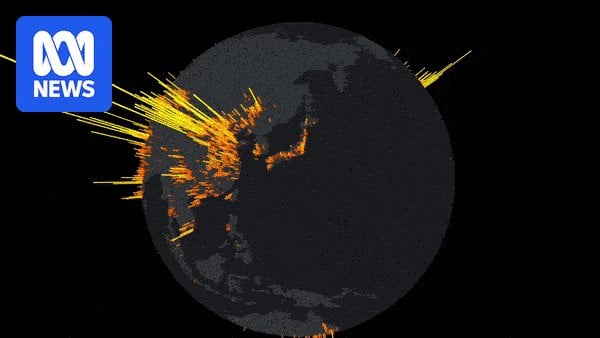
The world’s solar farms visualised as a beautiful 3D spike chart Posted by eacc-jezos Tags:DataData Is BeautifulDataIsBeautiful 2 comments Well that’s pretty damn positive It’s a lovely visualisation, shame it’s wrapped in that abomination of a dynamic website. Comments are closed.
2 comments
Well that’s pretty damn positive
It’s a lovely visualisation, shame it’s wrapped in that abomination of a dynamic website.
Comments are closed.