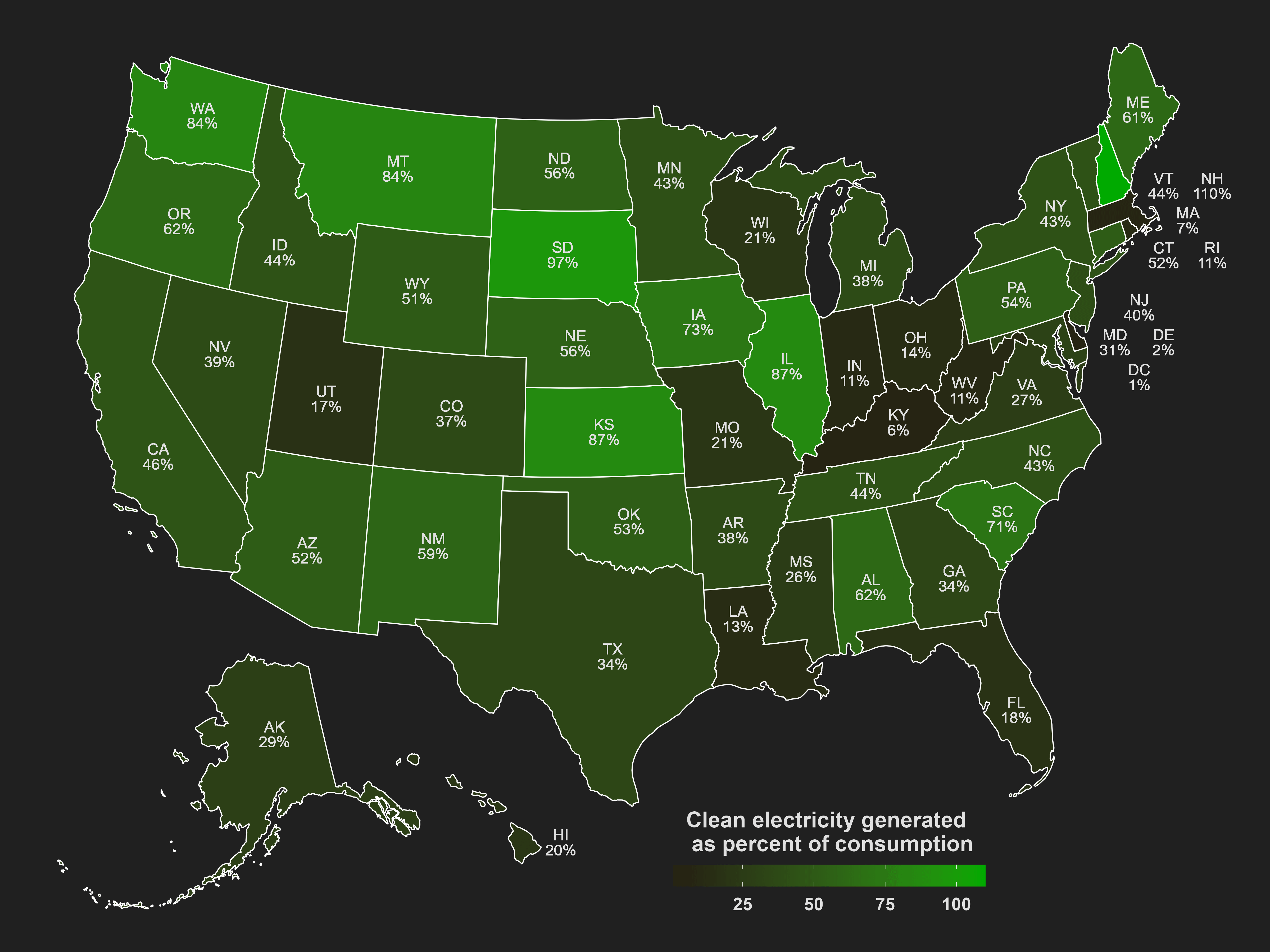
Data are from the EIA and are for the year 2023. The map was made with R and the usmap and ggplot2 packages, along with rio to grab the data. The ‘usmapdata’ package provided some centroids, many of which had to be adjusted or moved off to the side manually.
The data for consumption includes sales, direct use, transmission losses and unaccounted.[[1]](https://www.eia.gov/electricity/state/) To see these figures, click on a state and scroll down and click on “Full data tables 1–17”. The excel file will have a tab that says “10. Source-Disposition”. Cells B23, B24, B26, B27 have the usage figures. Generation is in cell B14. I used an R script to grab all of this data automatically, with help from ChatGPT.
Data on clean generation includes renewables (wind, hydro, solar, biomass and geothermal) and nuclear.[[2]](https://www.eia.gov/electricity/data/state/). These figures are in the third table, “Net Generation by State by Type of Producer by Energy Source”. This probably doesn’t include most small-scale solar power, which is estimated to be perhaps a third of total solar generation.[[3]](https://www.eia.gov/totalenergy/data/monthly/pdf/sec10_12.pdf) Unfortunately I couldn’t find estimates of small-scale solar broken down by state.
The results are often surprising; plenty of red and blue states can be seen having high or low percentages. New Hampshire generates an abundance of clean energy and exports the leftovers. In second place is deep red South Dakota, and from there it is Kansas, Illinois, Montana, Washington, Iowa, South Carolina – almost perfectly alternating, as if politics had no effect. The most anemic states in generating their own clean energy are (besides DC): Delaware, Kentucky, Massachusetts, West Virginia, Indiana, Rhode Island. The national average is 40%.
California and Texas are both close to the national average, but for different reasons. California is pretty clean, but they import 20% of consumption. Texas actually generates 50% more clean electricity than California, but they also use double the total amount California uses, and burn far more fossil fuels than any other state.
How is it that Indiana has wind turbines as far as the eye can see but only generating 11% consumption of clean energy?
![[OC] US states and clean electricity: Who's pulling their weight?](https://www.europesays.com/wp-content/uploads/2024/12/vlz9jwrifs7e1-1920x1024.png)
2 comments
Data are from the EIA and are for the year 2023. The map was made with R and the usmap and ggplot2 packages, along with rio to grab the data. The ‘usmapdata’ package provided some centroids, many of which had to be adjusted or moved off to the side manually.
The data for consumption includes sales, direct use, transmission losses and unaccounted.[[1]](https://www.eia.gov/electricity/state/) To see these figures, click on a state and scroll down and click on “Full data tables 1–17”. The excel file will have a tab that says “10. Source-Disposition”. Cells B23, B24, B26, B27 have the usage figures. Generation is in cell B14. I used an R script to grab all of this data automatically, with help from ChatGPT.
Data on clean generation includes renewables (wind, hydro, solar, biomass and geothermal) and nuclear.[[2]](https://www.eia.gov/electricity/data/state/). These figures are in the third table, “Net Generation by State by Type of Producer by Energy Source”. This probably doesn’t include most small-scale solar power, which is estimated to be perhaps a third of total solar generation.[[3]](https://www.eia.gov/totalenergy/data/monthly/pdf/sec10_12.pdf) Unfortunately I couldn’t find estimates of small-scale solar broken down by state.
The results are often surprising; plenty of red and blue states can be seen having high or low percentages. New Hampshire generates an abundance of clean energy and exports the leftovers. In second place is deep red South Dakota, and from there it is Kansas, Illinois, Montana, Washington, Iowa, South Carolina – almost perfectly alternating, as if politics had no effect. The most anemic states in generating their own clean energy are (besides DC): Delaware, Kentucky, Massachusetts, West Virginia, Indiana, Rhode Island. The national average is 40%.
California and Texas are both close to the national average, but for different reasons. California is pretty clean, but they import 20% of consumption. Texas actually generates 50% more clean electricity than California, but they also use double the total amount California uses, and burn far more fossil fuels than any other state.
How is it that Indiana has wind turbines as far as the eye can see but only generating 11% consumption of clean energy?
Comments are closed.