
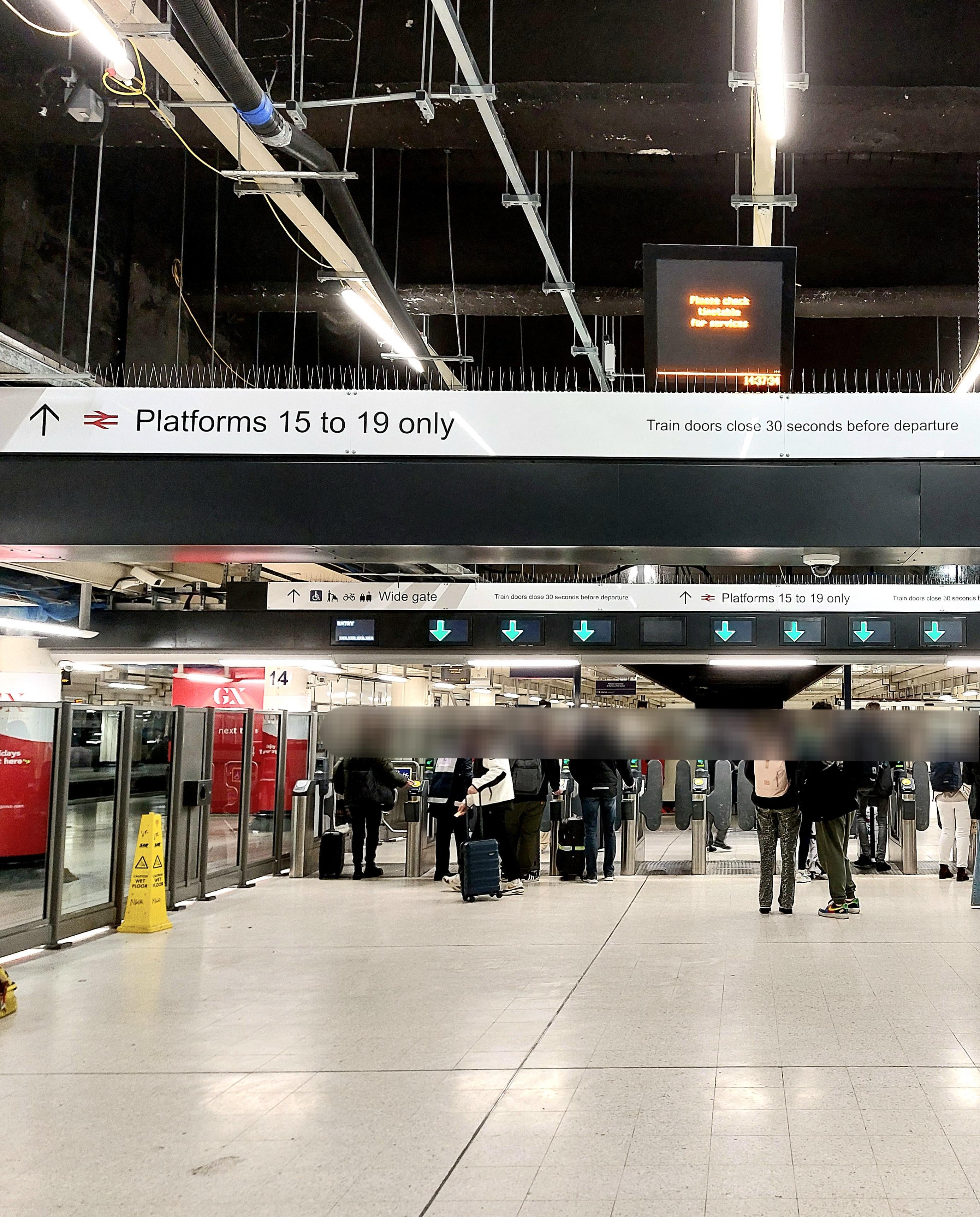
Arial is a pretty recognisable typeface, but the numbers and weight really give it away. What happened to Rail Alphabet 2, which has been widely rolled out at other stations?
At the end of the day, good to see they at least have the correct information on the signs, but curious whether this was an error or inentional?
by uninspiredarchitect
17 comments
This sub is turning into the Dull Mens Club
I’m livid
Khan’s London (joke)
I noticed the same at Waterloo the other day. It was … disconcerting at the time but I was in too much of a hurry to take it in.
I’m furious. Should have been Wingdings!
Queen be rolling over about this injustice

It’s an interesting question but requiring uncommonly specific expertise here. Surely nobody with such a strong special interest in exact styles of typography is also going to have in-depth knowledge about the organisation and administration of the railway network?
… now leave me alone, I’ve got chaos space marines that need painting.
Not Aptos?
If you hate someone, teach them to spot bad kerning.
Well at least it’s not [Papyrus](https://www.youtube.com/watch?v=jVhlJNJopOQ&pp=ygULcGFweXJ1cyBzbmw%3D) oh and don’t forget it’s not [Papyrus](https://www.youtube.com/watch?v=Q8PdffUfoF0&pp=ygULcGFweXJ1cyBzbmw%3D)
They probably balked at the cost to license New Rail Alphabet for way-finding… .
You can actually tell they’re not ariels. For a start, the font isn’t even digital. They’re just spikes to keep the pigeons away
Screw the signs, why are those green arrows not centered. I am triggered.
It might seem trivial but it all contributes to the degradation of our civil infrastructure and speaks to how little pride most people have in it.
I recon it’s an oversight. Companies with well known and well developed style guides usually make an announcement when they update the font stack.
> curious whether this was an error or inentional?
I’m curious whether “inentional” was an error or…inentional?
Such a good post
Comments are closed.