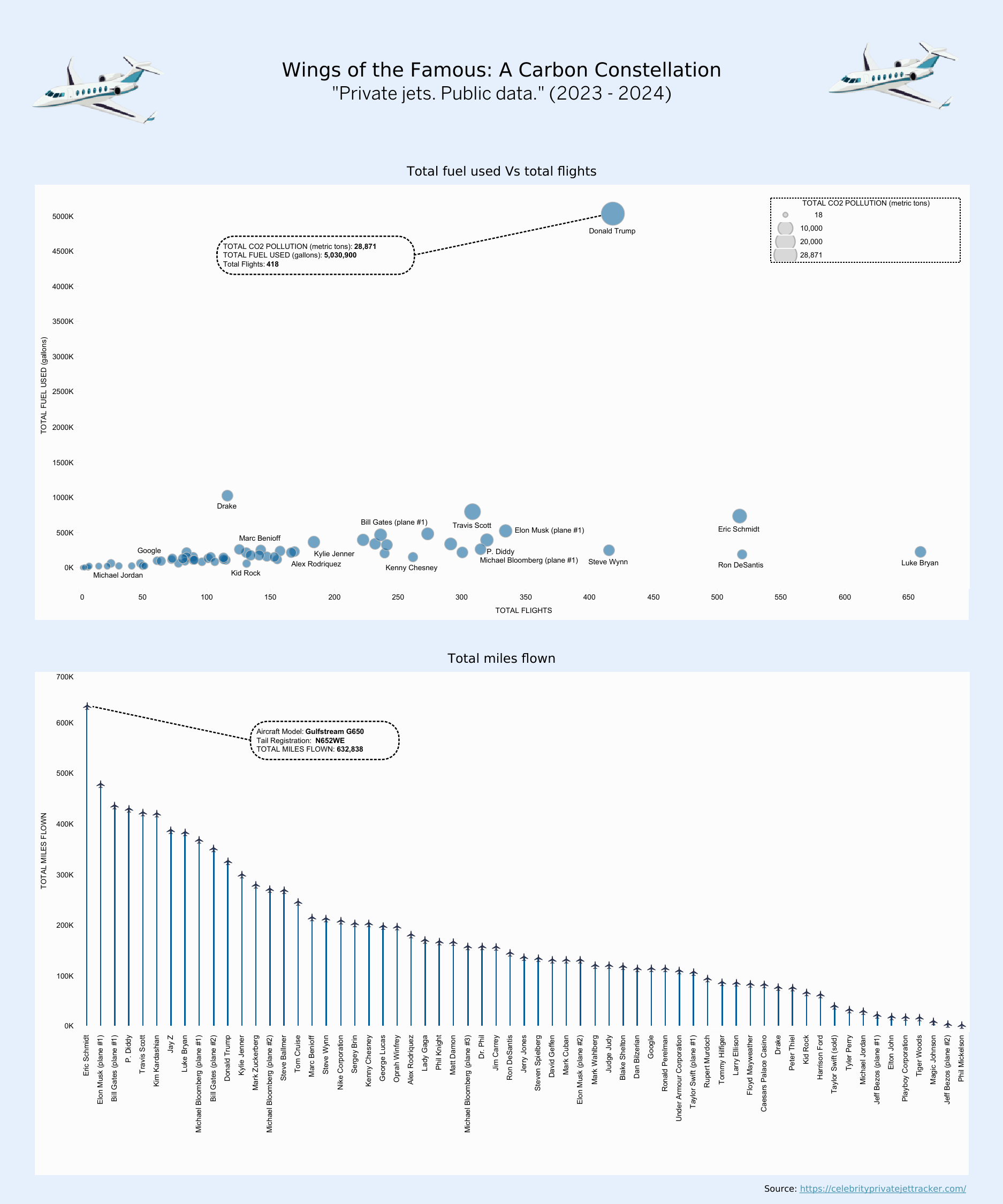
[OC] Celebrity Private Jet Tracker Data (2023 – 2024) – Data depicts the famous celebrity private jet details like total distance flown, CO2 footprint.
Posted by nharshav
![[OC] Celebrity Private Jet Tracker Data (2023 - 2024) - Data depicts the famous celebrity private jet details like total distance flown, CO2 footprint.](https://www.europesays.com/wp-content/uploads/2024/12/ohu6o6gb5e9e1-1874x1024.png)
[OC] Celebrity Private Jet Tracker Data (2023 – 2024) – Data depicts the famous celebrity private jet details like total distance flown, CO2 footprint.
Posted by nharshav
25 comments
Source: [https://celebrityprivatejettracker.com/](https://celebrityprivatejettracker.com/)
Tool used: Tableau
Link to Visualization: [https://public.tableau.com/views/Jet_tracker/Dashboard1?:language=en-US&:sid=&:redirect=auth&:display_count=n&:origin=viz_share_link](https://public.tableau.com/views/Jet_tracker/Dashboard1?:language=en-US&:sid=&:redirect=auth&:display_count=n&:origin=viz_share_link)
Judge Judy ha ? Interesting
How does Ron Desantis have a private jet as a governor? Who’s paying for that?
Where’s Taylor swift? Heard she’s the worst
That 2nd Jeff Bezos plane seems rusty.
Why is Trump such an outlier? Is he changing continents every other day?
luke bryan must hate car rides given all them short trips
This site or tool has always spooked me…y’all know how creepy this is right? Imagine millions of strangers knowing when, where and how far your car traveled at any given time. Yeah yeah I get it rich people bad but…yikes.
600 flights in 2 years – be in the airplane every day.
What’s the carbon footprint of making these planes in the first place?
I’m just wondering if the planes sitting there at ~zero miles are actually worse from an MPG perspective than many of the others.
It’s funny to me that judge Judy has a pj.
Taylor Swift often criticised for her jet use is behind Elon Musk second plane and Bloomberg third plane
[deleted]
Placing trump in this chart as an outlier is basically propaganda. Nothing beautiful about this data.
Why are us plabs being shamed out of flying while these rich snobs keep flying like there is no tomorrow?
More interestingly is whom you chose to
Track
I had to google who Luke Bryan was.
So keeping Diddy behind bars is actually good for the whole planet.
Where’s Joe Biden? Where’s Kamala Harris? This is an election year, duh.
WTF is Jim Carrey doing flying around so much in a private jet? He hasn’t done like any movies except sonic in the last 10 years.
“If poor people knew how rich rich people are, there would be riots in the streets.”
This is worthless without knowing how many passengers those planes had. If Swift is flying with 15 other musicians or team members, or Trump is traveling with a whole campaign team, it would be more reasonable to divide those CO2 figures between all the people who needed to get from point A to point B. One person flying their private jet alone constantly and another taking a whole executive team somewhere constantly might look the same on this graph but would have wildly different per person numbers.
Also, though this isn’t criticism of this data, it should be noted when interpreting this info that some of the people on this graph simply couldn’t fly commercial without it being a massive disruption.
What’s the co2 footprint of the avg American in a year
Five MILLION gallons of fuel…. in a single year. JFC…. the rich are so god damn wasteful. But tell me again how I’m supposed to not idle my car or buy an electric to save the planet.
Everybody is busy shaming celebrities that no one seems to notice that the first graph would have been better with a logarithmic y-axis. Trump would still stand out, but we would be able to compare the others with “smaller” numbers
Comments are closed.