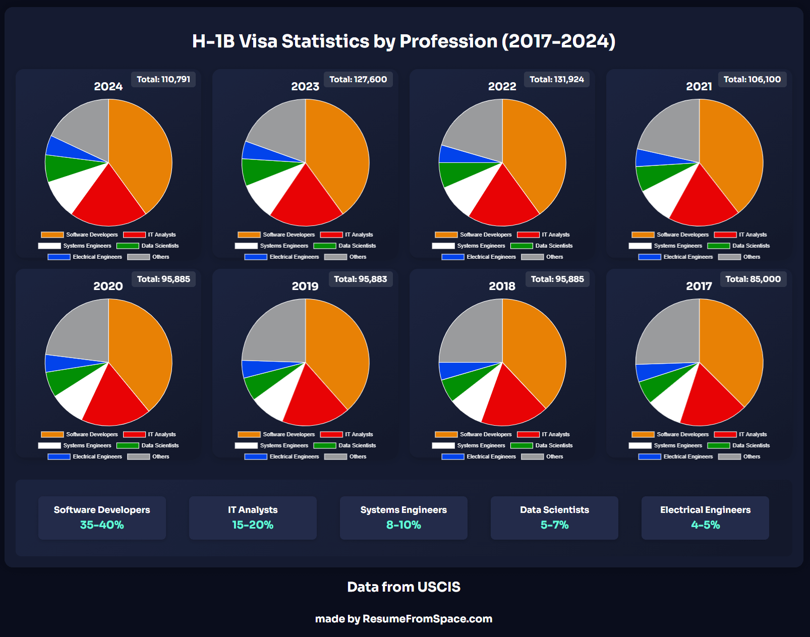
This is a better chart in my opinion, that shows number of selected visas
Also info about visa cap
The H-1B visa has two caps:
1. Regular cap: 65,000 visas
2. Advanced degree exemption (Master’s cap): Additional 20,000 visas
Total statutory cap = 85,000 visas
However, USCIS selects MORE people than the cap because:
1. Not all selected candidates will actually file petitions
2. Some filed petitions will be denied
3. Some selected candidates may find other opportunities
4. Some may not meet requirements when filing
5. Some companies may withdraw their applications
For example, in FY 2024:
– 110,791 were selected
– But only 85,000 will actually get visas
– USCIS estimates roughly 30-35% of selected registrations don’t result in filed petitions
This “over-selection” helps ensure all 85,000 visa slots are filled. If USCIS notices they might fall short, they sometimes conduct additional selection rounds.
Some H-1B workers are exempt from the cap:
– Higher education institutions
– Non-profit research organizations
– Government research organizations
This is why the selection numbers can be higher than the statutory cap of 85,000.
Deleting original comment which turned out to be very wrong. Really don’t want to share misinformation.
It’s what I understood, and I should have presented it like that instead of matter of factly.
It’s a bit funny how many people move to work in tech when the job could be done remotely.
Like 20 million people illegally crossed the border in the last few years alone. A few hundred thousand people coming in legally on this program is a complete non-issue relative to that.
Could you squeeze in a few more pie charts?
Could use some cleaning up imo.
If showing multiple graphs with the same color coding on the same page you can include a single legend.
I’m assuming the numbers at the bottom is the grand total for all visas, but this is not clear.
If you’re trying to convey in part change over time pie charts are not the way to go. Some sort of stacked column or stacked line would work better.
Being that the limit is capped at 85,000 this data may be misleading. It would be better to use only accepted requests depending on what you’re trying to show, but this might be a limitation of the data idk.
I bet you could find a much better way to display the information. There’s such small changes from year to year… Maybe a line chart? Does it really mean anything to show proportions (pie chart)? I don’t mean to be too critical, but you’re posting this on r/dataisbeautiful but this really isn’t very good.
![[OC] H-1B Visas (Selected) Stats by Profession (Last 2 administrations)](https://www.europesays.com/wp-content/uploads/2024/12/9i2wj8uykw9e1-1606x1024.png)
7 comments
Source: USCIS
Tool: Me & some mad graphics skills
This is a better chart in my opinion, that shows number of selected visas
Also info about visa cap
The H-1B visa has two caps:
1. Regular cap: 65,000 visas
2. Advanced degree exemption (Master’s cap): Additional 20,000 visas
Total statutory cap = 85,000 visas
However, USCIS selects MORE people than the cap because:
1. Not all selected candidates will actually file petitions
2. Some filed petitions will be denied
3. Some selected candidates may find other opportunities
4. Some may not meet requirements when filing
5. Some companies may withdraw their applications
For example, in FY 2024:
– 110,791 were selected
– But only 85,000 will actually get visas
– USCIS estimates roughly 30-35% of selected registrations don’t result in filed petitions
This “over-selection” helps ensure all 85,000 visa slots are filled. If USCIS notices they might fall short, they sometimes conduct additional selection rounds.
Some H-1B workers are exempt from the cap:
– Higher education institutions
– Non-profit research organizations
– Government research organizations
This is why the selection numbers can be higher than the statutory cap of 85,000.
Deleting original comment which turned out to be very wrong. Really don’t want to share misinformation.
It’s what I understood, and I should have presented it like that instead of matter of factly.
It’s a bit funny how many people move to work in tech when the job could be done remotely.
Like 20 million people illegally crossed the border in the last few years alone. A few hundred thousand people coming in legally on this program is a complete non-issue relative to that.
Could you squeeze in a few more pie charts?
Could use some cleaning up imo.
If showing multiple graphs with the same color coding on the same page you can include a single legend.
I’m assuming the numbers at the bottom is the grand total for all visas, but this is not clear.
If you’re trying to convey in part change over time pie charts are not the way to go. Some sort of stacked column or stacked line would work better.
Being that the limit is capped at 85,000 this data may be misleading. It would be better to use only accepted requests depending on what you’re trying to show, but this might be a limitation of the data idk.
I bet you could find a much better way to display the information. There’s such small changes from year to year… Maybe a line chart? Does it really mean anything to show proportions (pie chart)? I don’t mean to be too critical, but you’re posting this on r/dataisbeautiful but this really isn’t very good.
Comments are closed.