US States by Personal Income Metrics [OC] Posted by alexski55 Tags:DataData Is BeautifulDataIsBeautiful 6 comments [Source 1](https://apps.bea.gov/itable/index.html?appid=70&stepnum=40&Major_Area=3&State=0&Area=XX&TableId=100&Statistic=2&Year=2023&YearBegin=-1&Year_End=-1&Unit_Of_Measure=Levels&Rank=1&Drill=1&nRange=5) [Source 2](https://apps.bea.gov/itable/?ReqID=70#eyJhcHBpZCI6NzAsInN0ZXBzIjpbMSwyOSwyNSwzMSwyNiwyNywzMF0sImRhdGEiOltbIlRhYmxlSWQiLCI2MDAiXSxbIk1ham9yX0FyZWEiLCIwIl0sWyJTdGF0ZSIsWyIwIl1dLFsiQXJlYSIsWyIwMTAwMCIsIjAyMDAwIiwiMDQwMDAiLCIwNTAwMCIsIjA2MDAwIiwiMDgwMDAiLCIwOTAwMCIsIjEwMDAwIiwiMTIwMDAiLCIxMzAwMCIsIjE1MDAwIiwiMTYwMDAiLCIxNzAwMCIsIjE4MDAwIiwiMTkwMDAiLCIyMDAwMCIsIjIxMDAwIiwiMjIwMDAiLCIyMzAwMCIsIjI0MDAwIiwiMjUwMDAiLCIyNjAwMCIsIjI3MDAwIiwiMjgwMDAiLCIyOTAwMCIsIjMwMDAwIiwiMzEwMDAiLCIzMjAwMCIsIjMzMDAwIiwiMzQwMDAiLCIzNTAwMCIsIjM2MDAwIiwiMzcwMDAiLCIzODAwMCIsIjM5MDAwIiwiNDAwMDAiLCI0MTAwMCIsIjQyMDAwIiwiNDQwMDAiLCI0NTAwMCIsIjQ2MDAwIiwiNDcwMDAiLCI0ODAwMCIsIjQ5MDAwIiwiNTAwMDAiLCI1MTAwMCIsIjUzMDAwIiwiNTQwMDAiLCI1NTAwMCIsIjU2MDAwIl1dLFsiU3RhdGlzdGljIixbIjEwIiwiMTMiXV0sWyJVbml0X29mX21lYXN1cmUiLCJMZXZlbHMiXSxbIlllYXIiLFsiMjAyMiJdXSxbIlllYXJCZWdpbiIsIi0xIl0sWyJZZWFyX0VuZCIsIi0xIl1dfQ==) Chart made [here using Datawrapper](https://www.datawrapper.de/_/KbYoc/) This is just showing how two similarly-defined variables are similar. Of course they’re going to be correlated when one is defined using the other. Which state has the largest negative residual relative to its Real Personal Income? Some of the names on the first chart overlap, the second chart is too blurry to read. Interesting, but not that beautiful. It seems like you’re looking for disposable income, not real income. Real income ~~doesn’t~~ accounts for inflation. Also I very much doubt this is truly per capita. Per the census, per capita income is around $43,000. what year is this for? 2021? does it include the jobs where the income is from? police jobs? is there a correlation between the states’ percentage of armed people? Comments are closed.
[Source 1](https://apps.bea.gov/itable/index.html?appid=70&stepnum=40&Major_Area=3&State=0&Area=XX&TableId=100&Statistic=2&Year=2023&YearBegin=-1&Year_End=-1&Unit_Of_Measure=Levels&Rank=1&Drill=1&nRange=5) [Source 2](https://apps.bea.gov/itable/?ReqID=70#eyJhcHBpZCI6NzAsInN0ZXBzIjpbMSwyOSwyNSwzMSwyNiwyNywzMF0sImRhdGEiOltbIlRhYmxlSWQiLCI2MDAiXSxbIk1ham9yX0FyZWEiLCIwIl0sWyJTdGF0ZSIsWyIwIl1dLFsiQXJlYSIsWyIwMTAwMCIsIjAyMDAwIiwiMDQwMDAiLCIwNTAwMCIsIjA2MDAwIiwiMDgwMDAiLCIwOTAwMCIsIjEwMDAwIiwiMTIwMDAiLCIxMzAwMCIsIjE1MDAwIiwiMTYwMDAiLCIxNzAwMCIsIjE4MDAwIiwiMTkwMDAiLCIyMDAwMCIsIjIxMDAwIiwiMjIwMDAiLCIyMzAwMCIsIjI0MDAwIiwiMjUwMDAiLCIyNjAwMCIsIjI3MDAwIiwiMjgwMDAiLCIyOTAwMCIsIjMwMDAwIiwiMzEwMDAiLCIzMjAwMCIsIjMzMDAwIiwiMzQwMDAiLCIzNTAwMCIsIjM2MDAwIiwiMzcwMDAiLCIzODAwMCIsIjM5MDAwIiwiNDAwMDAiLCI0MTAwMCIsIjQyMDAwIiwiNDQwMDAiLCI0NTAwMCIsIjQ2MDAwIiwiNDcwMDAiLCI0ODAwMCIsIjQ5MDAwIiwiNTAwMDAiLCI1MTAwMCIsIjUzMDAwIiwiNTQwMDAiLCI1NTAwMCIsIjU2MDAwIl1dLFsiU3RhdGlzdGljIixbIjEwIiwiMTMiXV0sWyJVbml0X29mX21lYXN1cmUiLCJMZXZlbHMiXSxbIlllYXIiLFsiMjAyMiJdXSxbIlllYXJCZWdpbiIsIi0xIl0sWyJZZWFyX0VuZCIsIi0xIl1dfQ==) Chart made [here using Datawrapper](https://www.datawrapper.de/_/KbYoc/)
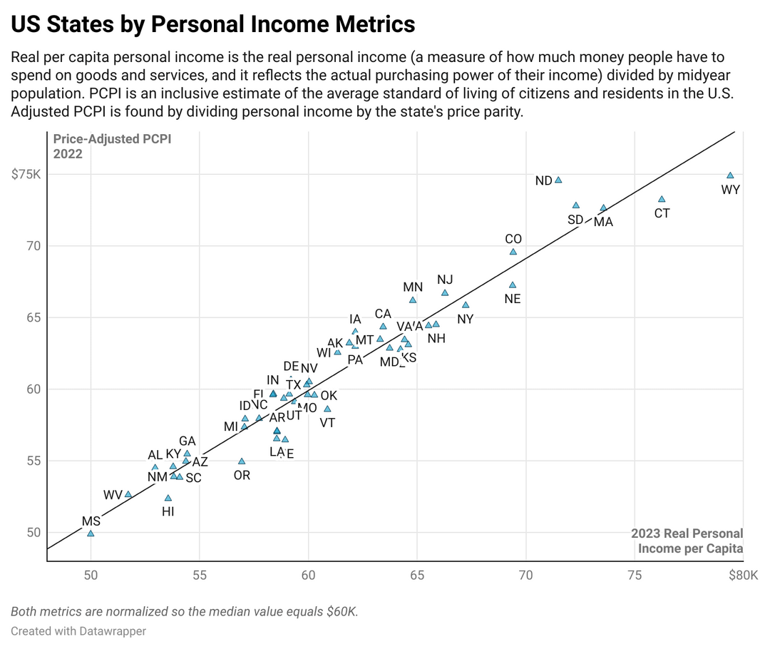
This is just showing how two similarly-defined variables are similar. Of course they’re going to be correlated when one is defined using the other.
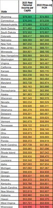
Some of the names on the first chart overlap, the second chart is too blurry to read. Interesting, but not that beautiful.
It seems like you’re looking for disposable income, not real income. Real income ~~doesn’t~~ accounts for inflation. Also I very much doubt this is truly per capita. Per the census, per capita income is around $43,000.
what year is this for? 2021? does it include the jobs where the income is from? police jobs? is there a correlation between the states’ percentage of armed people?
6 comments
[Source 1](https://apps.bea.gov/itable/index.html?appid=70&stepnum=40&Major_Area=3&State=0&Area=XX&TableId=100&Statistic=2&Year=2023&YearBegin=-1&Year_End=-1&Unit_Of_Measure=Levels&Rank=1&Drill=1&nRange=5)
[Source 2](https://apps.bea.gov/itable/?ReqID=70#eyJhcHBpZCI6NzAsInN0ZXBzIjpbMSwyOSwyNSwzMSwyNiwyNywzMF0sImRhdGEiOltbIlRhYmxlSWQiLCI2MDAiXSxbIk1ham9yX0FyZWEiLCIwIl0sWyJTdGF0ZSIsWyIwIl1dLFsiQXJlYSIsWyIwMTAwMCIsIjAyMDAwIiwiMDQwMDAiLCIwNTAwMCIsIjA2MDAwIiwiMDgwMDAiLCIwOTAwMCIsIjEwMDAwIiwiMTIwMDAiLCIxMzAwMCIsIjE1MDAwIiwiMTYwMDAiLCIxNzAwMCIsIjE4MDAwIiwiMTkwMDAiLCIyMDAwMCIsIjIxMDAwIiwiMjIwMDAiLCIyMzAwMCIsIjI0MDAwIiwiMjUwMDAiLCIyNjAwMCIsIjI3MDAwIiwiMjgwMDAiLCIyOTAwMCIsIjMwMDAwIiwiMzEwMDAiLCIzMjAwMCIsIjMzMDAwIiwiMzQwMDAiLCIzNTAwMCIsIjM2MDAwIiwiMzcwMDAiLCIzODAwMCIsIjM5MDAwIiwiNDAwMDAiLCI0MTAwMCIsIjQyMDAwIiwiNDQwMDAiLCI0NTAwMCIsIjQ2MDAwIiwiNDcwMDAiLCI0ODAwMCIsIjQ5MDAwIiwiNTAwMDAiLCI1MTAwMCIsIjUzMDAwIiwiNTQwMDAiLCI1NTAwMCIsIjU2MDAwIl1dLFsiU3RhdGlzdGljIixbIjEwIiwiMTMiXV0sWyJVbml0X29mX21lYXN1cmUiLCJMZXZlbHMiXSxbIlllYXIiLFsiMjAyMiJdXSxbIlllYXJCZWdpbiIsIi0xIl0sWyJZZWFyX0VuZCIsIi0xIl1dfQ==)
Chart made [here using Datawrapper](https://www.datawrapper.de/_/KbYoc/)
This is just showing how two similarly-defined variables are similar. Of course they’re going to be correlated when one is defined using the other.
Which state has the largest negative residual relative to its Real Personal Income?
Some of the names on the first chart overlap, the second chart is too blurry to read. Interesting, but not that beautiful.
It seems like you’re looking for disposable income, not real income. Real income ~~doesn’t~~ accounts for inflation.
Also I very much doubt this is truly per capita. Per the census, per capita income is around $43,000.
what year is this for? 2021?
does it include the jobs where the income is from? police jobs?
is there a correlation between the states’ percentage of armed people?
Comments are closed.