This is, perhaps, the worst way this data could have been presented. A series of heat maps would be infinitely more informative.
Many posts here are very focused on the data part and don’t actually follow through on the beautiful part. This however is the most beautiful post I’ve seen in a long time.
How did you make it, looks amazing.
Seeing the one full court shot he had in the 06-07 season is crazy because I got to see that in person against the C’s. Never realized it was the longest shot of his career!
I like how there’s a couple 3/4 court shots mixed in requiring a zoom out.
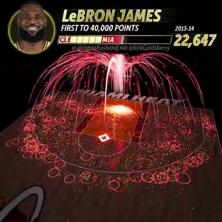
lol the solid beam of light coming from the free-throw line and from right-under the basket where he does his best work.
I like how you can see the death of the mid range jumper in the mid-late 2010s, really cool stuff
This is amazing 🤩 I’m going to show it to my students before our data science unit. Thank you!
I follow this to show them standouts because whenever I introduce the unit they go booooo and it sounds boring to them.
This is perfect.
Genuinely looks like an Elden Ring spell.
So crazy. Dude really has no dead areas. Love to see the graphic for other players too. That very first and second shot were funny too.
Data is Beautiful MVP right here.
This is a work of art. Beautiful display of a huge amount of information.
I don’t like LBJ as much as other nba greats but I love this format. I like how it changes colors for the teams he played. I really like how it brightens up more where more shots are taken.
very cool! missed a chance to change his profile picture for each season though!
How on earth is there a database of every angle from and distance to the basket? Let’s just start with the fact that there are 40,000 data points on that alone. Now, let’s talk about the animation of these data. Truly superb
Was expecting a map of the US (lower48) at the end.
For once… the data is in fact beautiful. This was amazing
If the place of the shots are really accurate I am more than astonished
Legitimately beautiful. Well done!:
This is the best moving graphic I have seen on this sub.
What you are trying to show is immediately clear, it makes a whole lot of sense to show it via animation like this because of the time component, and there is a slider and pause button.
Your post should really include credit to Kirk goldsberry
Dude really does not like the corner 3 for some reason.
I would love to see Shaq’s data 😂
I don’t know his actual 3pt shooting stats (attempts, %) off hand but when watching this I’m like holy shit he makes a lot of 3s.
23 comments
This is, perhaps, the worst way this data could have been presented. A series of heat maps would be infinitely more informative.
Many posts here are very focused on the data part and don’t actually follow through on the beautiful part. This however is the most beautiful post I’ve seen in a long time.
How did you make it, looks amazing.
Seeing the one full court shot he had in the 06-07 season is crazy because I got to see that in person against the C’s. Never realized it was the longest shot of his career!
I like how there’s a couple 3/4 court shots mixed in requiring a zoom out.
lol the solid beam of light coming from the free-throw line and from right-under the basket where he does his best work.
I like how you can see the death of the mid range jumper in the mid-late 2010s, really cool stuff
This is amazing 🤩 I’m going to show it to my students before our data science unit. Thank you!
I follow this to show them standouts because whenever I introduce the unit they go booooo and it sounds boring to them.
This is perfect.
Genuinely looks like an Elden Ring spell.
So crazy. Dude really has no dead areas. Love to see the graphic for other players too. That very first and second shot were funny too.
Data is Beautiful MVP right here.
This is a work of art. Beautiful display of a huge amount of information.
I don’t like LBJ as much as other nba greats but I love this format. I like how it changes colors for the teams he played. I really like how it brightens up more where more shots are taken.
very cool! missed a chance to change his profile picture for each season though!
How on earth is there a database of every angle from and distance to the basket? Let’s just start with the fact that there are 40,000 data points on that alone. Now, let’s talk about the animation of these data. Truly superb
Was expecting a map of the US (lower48) at the end.
For once… the data is in fact beautiful. This was amazing
If the place of the shots are really accurate I am more than astonished
Legitimately beautiful. Well done!:
This is the best moving graphic I have seen on this sub.
What you are trying to show is immediately clear, it makes a whole lot of sense to show it via animation like this because of the time component, and there is a slider and pause button.
Your post should really include credit to Kirk goldsberry
Dude really does not like the corner 3 for some reason.
I would love to see Shaq’s data 😂
I don’t know his actual 3pt shooting stats (attempts, %) off hand but when watching this I’m like holy shit he makes a lot of 3s.
Comments are closed.