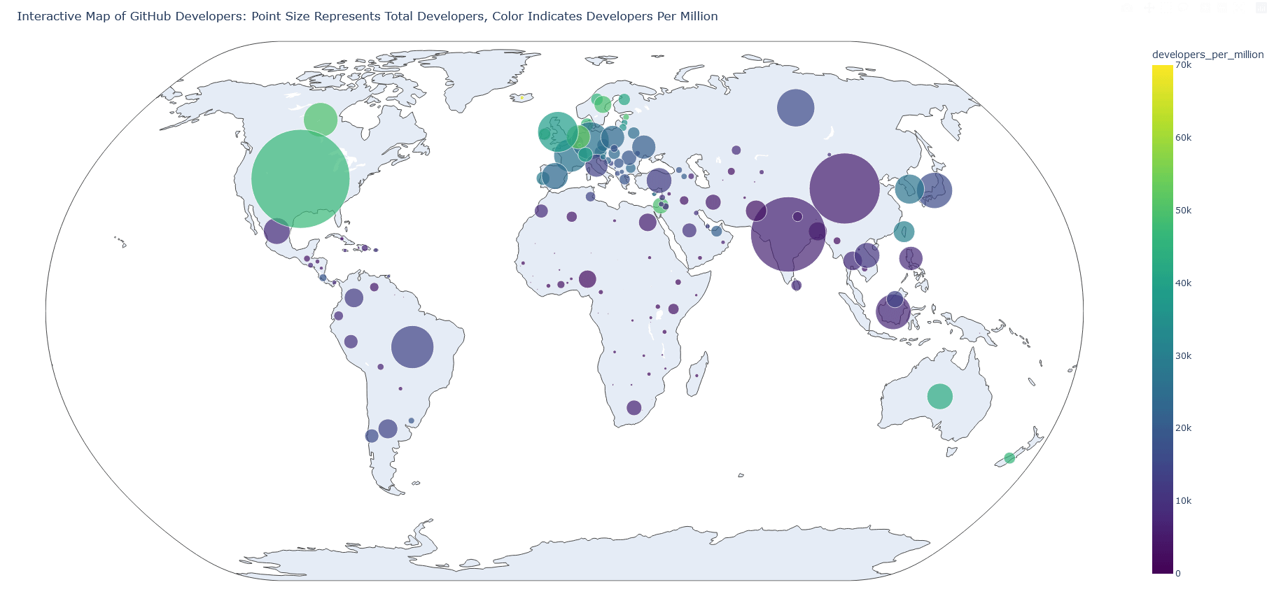
The dashboard for the worldwide programmers’ map (from GitHub), second version. I adjusted it a bit to display more information, including raw values. [OC]
Posted by alucinario
The dashboard for the worldwide programmers’ map (from GitHub), second version. I adjusted it a bit to display more information, including raw values. [OC]
Posted by alucinario
1 comment
You should color the countries instead of creating circles for each because it’s impossible to see what’s going on in Europe.
Comments are closed.