It’s unfortunate that this sub does not allow videos, which forced me to make some adjustments. For example, I had to create a 25-second GIF instead of a full minute and lower the framerate.
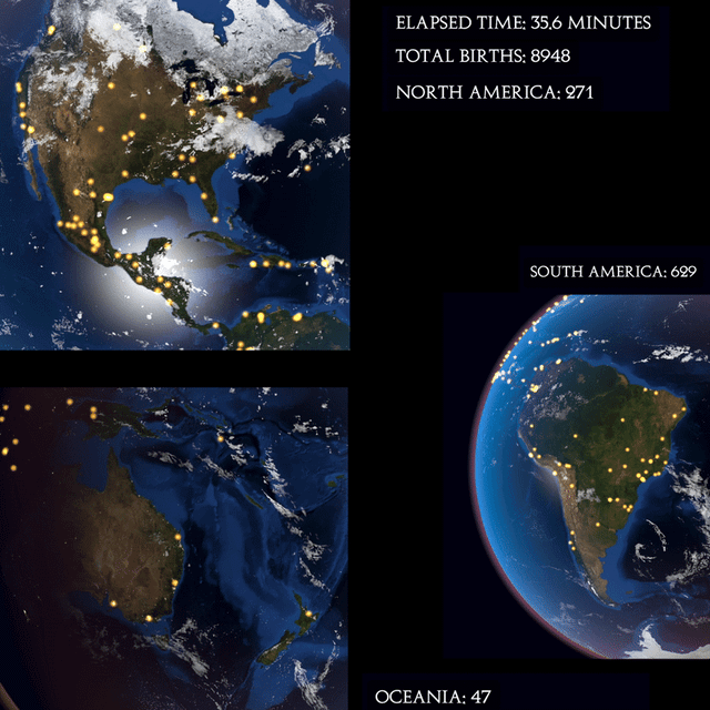
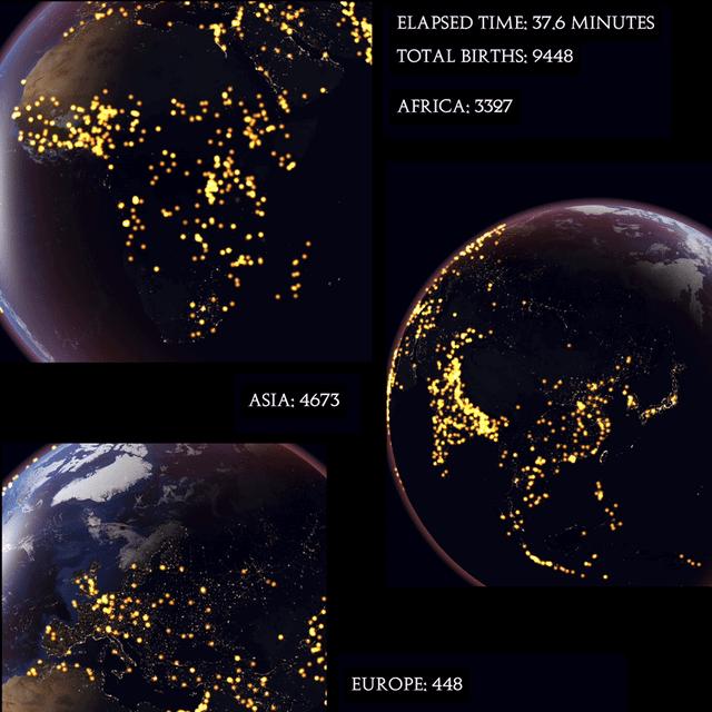
The data used in the project is a combination of the World Population Prospects (providing death estimates by country, for 2024) and Kontour’s global population distribution. I assumed that births are geographically distributed in the same way as the overall population. While this assumption is obviously not entirely accurate, it serves as an educated guess since such detailed data is virtually impossible to obtain.
This web application was built using Three.js, starting with a template from Bruno Simon’s “ThreeJS Journey” course. I just recorded some sections of the globe to make a video out of it.
4 comments
It’s unfortunate that this sub does not allow videos, which forced me to make some adjustments. For example, I had to create a 25-second GIF instead of a full minute and lower the framerate.
The data used in the project is a combination of the World Population Prospects (providing death estimates by country, for 2024) and Kontour’s global population distribution. I assumed that births are geographically distributed in the same way as the overall population. While this assumption is obviously not entirely accurate, it serves as an educated guess since such detailed data is virtually impossible to obtain.
This web application was built using Three.js, starting with a template from Bruno Simon’s “ThreeJS Journey” course. I just recorded some sections of the globe to make a video out of it.
The project can be found on my [Github ](https://github.com/PietroViolo/globalBirths/tree/main).
Finally some actually beautiful data and not just a bar chart or sankey diagram!
r/overpopulation is worried about this
been a big fan of map visualizations recently, this is right
up there! love that you can see the globe rotating as well
Comments are closed.