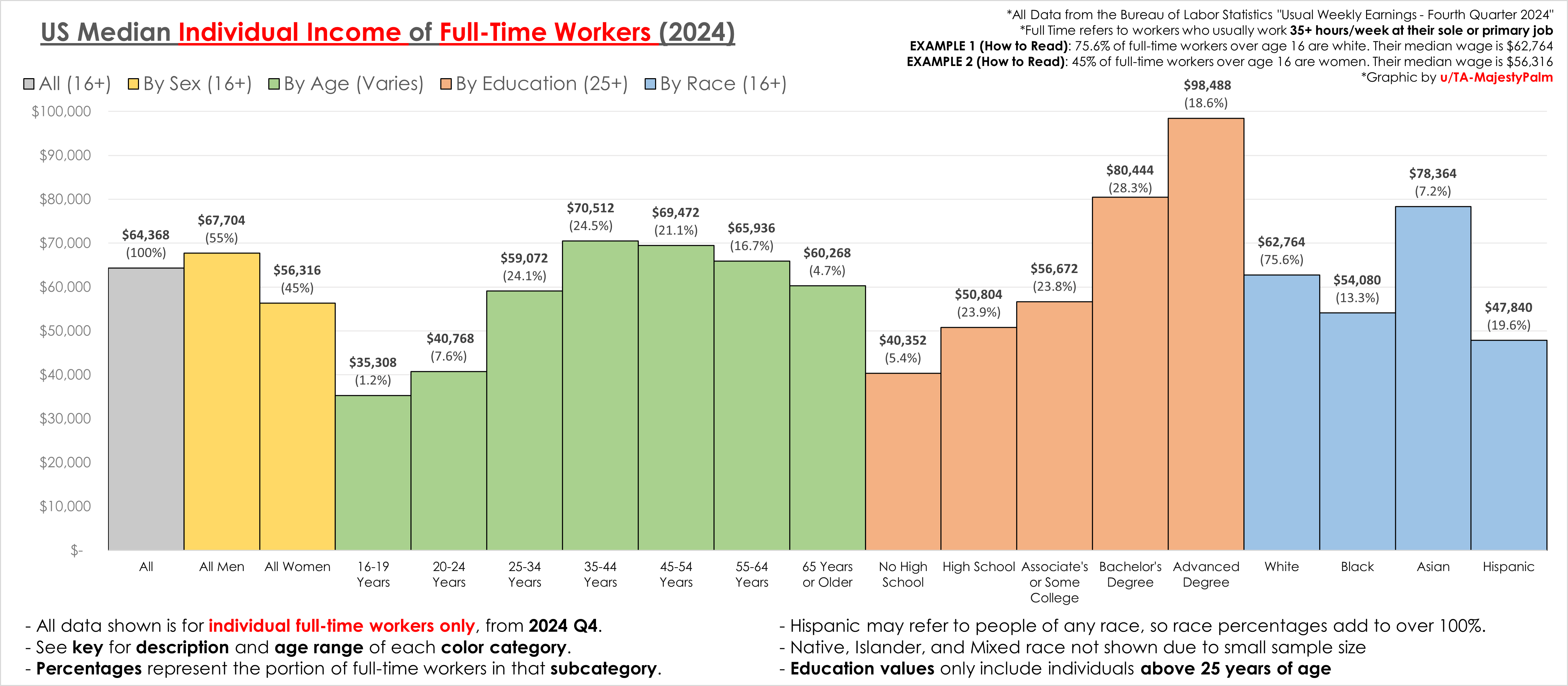
Graphic by me, created in excel, all data from the US bureau of labor statistics "Usual Weekly Earnings of Wage and Salary Workers Fourth Quarter 2024".
This is for full time workers only, and is individual, not household.
Posted by TA-MajestyPalm
![[OC] US Median Individual Wage by Characteristic (2024)](https://www.europesays.com/wp-content/uploads/2025/01/oxa2usot6yee1-1920x1024.png)
Graphic by me, created in excel, all data from the US bureau of labor statistics "Usual Weekly Earnings of Wage and Salary Workers Fourth Quarter 2024".
This is for full time workers only, and is individual, not household.
Posted by TA-MajestyPalm
11 comments
Graphic by me, created in excel, all data from the US bureau of labor statistics “Usual Weekly Earnings of Wage and Salary Workers Fourth Quarter 2024”.
This is for full time workers only, and is individual, not household.
[Source PDF](https://www.google.com/url?sa=t&source=web&rct=j&opi=89978449&url=https://www.bls.gov/news.release/pdf/wkyeng.pdf&ved=2ahUKEwiH1_OLwI6LAxWWCjQIHQyRHLYQFnoECEsQAQ&usg=AOvVaw1JwUL3jU3Cb9xJYkSjBAUx)
So Asians are the true oppressors?
This data is nice, but the really interesting data is in the crosstabs. Most of the variability in income between race for instance is really just the result of education.
Always curious when seeing salary charts like this, does taking the median salary generally offset variances due to cost of living? As in, are these values at or close to a cost of living index of 100 and I need to adjust them to my local region accordingly?
Thanks, good to know I’m below the median for my sex, age, education, and race.
Would be interesting to see additional breakdowns of what the outliers are for each column, but it seems clear that people still earn more with more education.
Perfect data for a pivot table analysis
So if you’re a 35-44 year old male asian with an advanced degree you’d be killin it
The gap between Asians and Whites is larger than between Whites and Blacks. Wow
wow 1/5 of the population has advanced degrees
I’m not sure if you’re looking for critiques, but having categorical data on the x-axis without having clear gaps in the categories themselves tricks my mind into assuming the x-axis was continuous in nature. Perhaps adding breaks in the axis would help delineate it better.
Comments are closed.