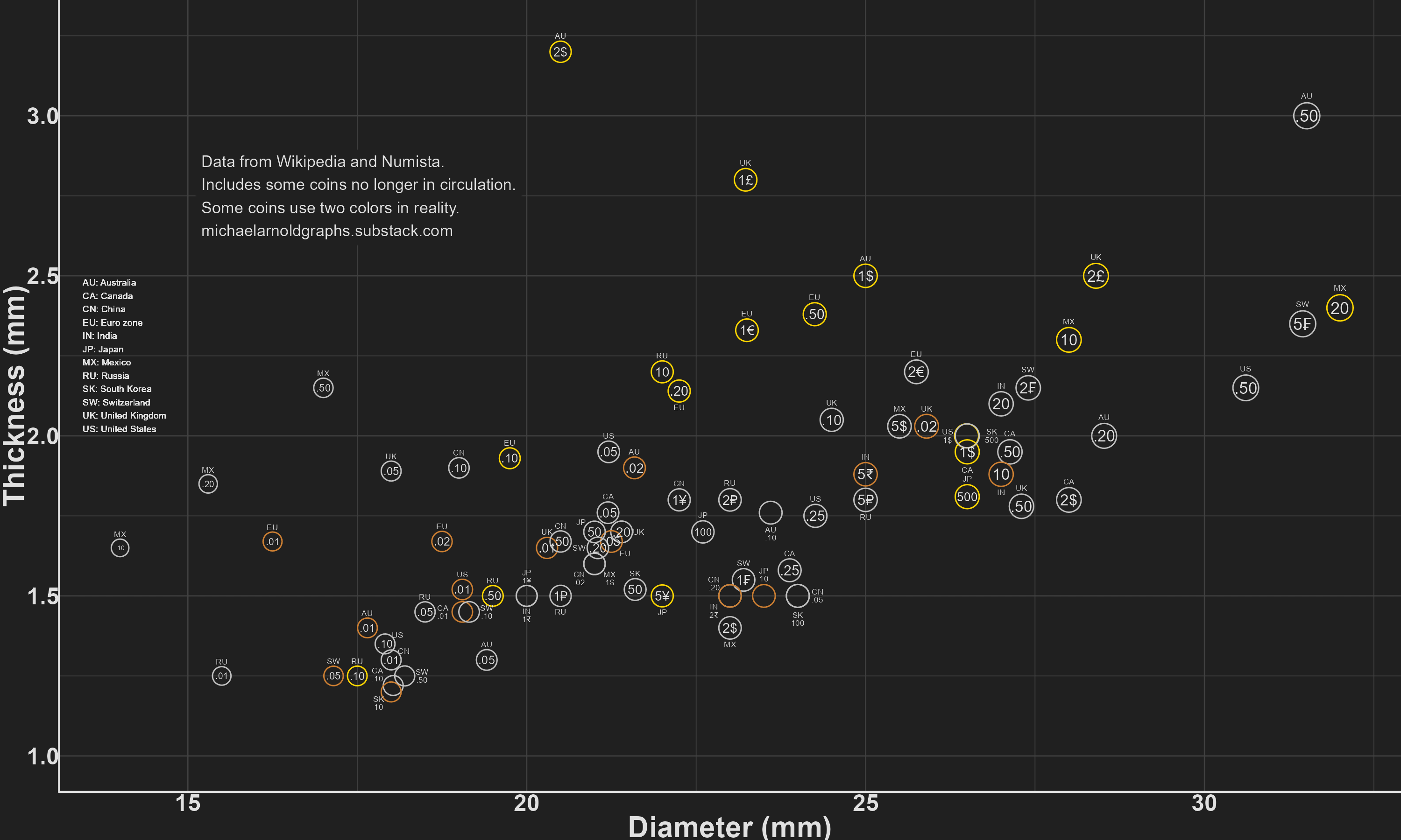
This was made in R with ggplot2. The data was pulled from Wikipedia and Numista. I chose these twelve currencies because it was easy to find data for them – at some point I may revise and include Brazil or Indonesia.
The fattest is definitely the $2 coin from Australia. The skinniest is up for debate. It could be the South Korean 10 won, because it is only 1.2mm thick. Or it could be Mexican 2 peso, because it is only 1.4mm thick while being 23mm wide – more than 16 times wider than thick. For comparison the Australian $2 has a diameter less than 7 times as wide as it is thick.
—
I mentioned in an earlier post on this sub that I may start a blog, as a repository for the graphs I make. Here is the post that contains the above graph, and also a bonus graph about how high the coins from each currency would stack up:
This is the kind of data I never knew I needed to see
I have to say, the Aussie $2 is a very satisfying coin. I think they must have looked at the Pound and said, “Like that, but more.”
Apparently Australians are fast becoming a cashless society. I wonder if there’s any correlation between having some of the thickest, biggest coins and not wanting to carry cash around. The $2 and 50¢ are outliers in the dataset.
Australia’s $2 is a great coin, the 50c not so much.
Before even clicking on this I knew the $2 was gonna be on top.
Love our $2 chonky coin. It’s always confusing going to the UK though and having to remember the one that looks a bit like the $2 is the 1 pound coin, and the one that looks like a slightly bigger $1 is the 2 pound.
![[OC] Who has the fattest coins?](https://www.europesays.com/wp-content/uploads/2025/01/64jtrz3224fe1-1920x1024.png)
9 comments
This was made in R with ggplot2. The data was pulled from Wikipedia and Numista. I chose these twelve currencies because it was easy to find data for them – at some point I may revise and include Brazil or Indonesia.
The fattest is definitely the $2 coin from Australia. The skinniest is up for debate. It could be the South Korean 10 won, because it is only 1.2mm thick. Or it could be Mexican 2 peso, because it is only 1.4mm thick while being 23mm wide – more than 16 times wider than thick. For comparison the Australian $2 has a diameter less than 7 times as wide as it is thick.
—
I mentioned in an earlier post on this sub that I may start a blog, as a repository for the graphs I make. Here is the post that contains the above graph, and also a bonus graph about how high the coins from each currency would stack up:
https://michaelarnoldgraphs.substack.com/p/who-has-the-fattest-coins
This is the kind of data I never knew I needed to see
I have to say, the Aussie $2 is a very satisfying coin. I think they must have looked at the Pound and said, “Like that, but more.”
Apparently Australians are fast becoming a cashless society. I wonder if there’s any correlation between having some of the thickest, biggest coins and not wanting to carry cash around. The $2 and 50¢ are outliers in the dataset.
Australia’s $2 is a great coin, the 50c not so much.
30mm? lol
Swedish [10 daler silvermynt](https://mb.cision.com/Public/3346/3210706/8e81cd4dd56f750b_800x800ar.jpg)
[Am I a joke to you?](https://en.wikipedia.org/wiki/Rai_stones)
Before even clicking on this I knew the $2 was gonna be on top.
Love our $2 chonky coin. It’s always confusing going to the UK though and having to remember the one that looks a bit like the $2 is the 1 pound coin, and the one that looks like a slightly bigger $1 is the 2 pound.
Comments are closed.