Is the data somehow corrected for household-size? I can imagine that with decreasing household-sizes the average income per household also decreases..
I emigrated to London in 2007. My bad.
Sorry.
This is great, presumably using by CPI inflation? I’d love to see an inflation measure which includes housing, e.g CPIH.
14 years of Tory austerity really fixed the economy
It says house hold does this mean two working adults?
As two adults on full time minimum wage would be on £48k annual combined before tax come April.
I would love to see other countries in Europe like Poland, Grecce, Italy
Something like this for Germany would be really interesting to see as well.
How does this look measured against population increase?
70K feels about right taking into account my middle management position and skills involved. I am even applying for such income brackets but requirements are slightly higher…
The chart says **average income**, but the axis says **disposable income**. Which is it?
That trend line is pure wishful thinking. We grew like this for so long, so we expect to grow forever. Based on what? Neoliberal economics relying on endless growth is not proof that endless growth is possible. The conditions that allowed for it in the late 20th century no longer exist. 🤷🏼♀️
The population boom is over. The oil boom is over. Human beings can’t keep being better off than their parents forever. Eventually kids will just have to make do with the same as their parents had, like every other period in human history. Disposable income was very stagnant in medieval times too. At least we’re going back to a four day week.
The data in this graph is beautiful. It shows how our societies need to change in the face of economic reality. The arbitrary line imposed on top is meaningless. Why should it keep going up like that? How would everyone getting more and more and more on top of what they actually need, forever, work in the long term? Is a mean disposable income of £70k even desirable? Shouldn’t we raise the tax burden and fix some potholes before everyone gets a Merc?
Disposable income?? (Left hand scale) seems very unlikely, and this descriptor contradicts the headline ‘average income’
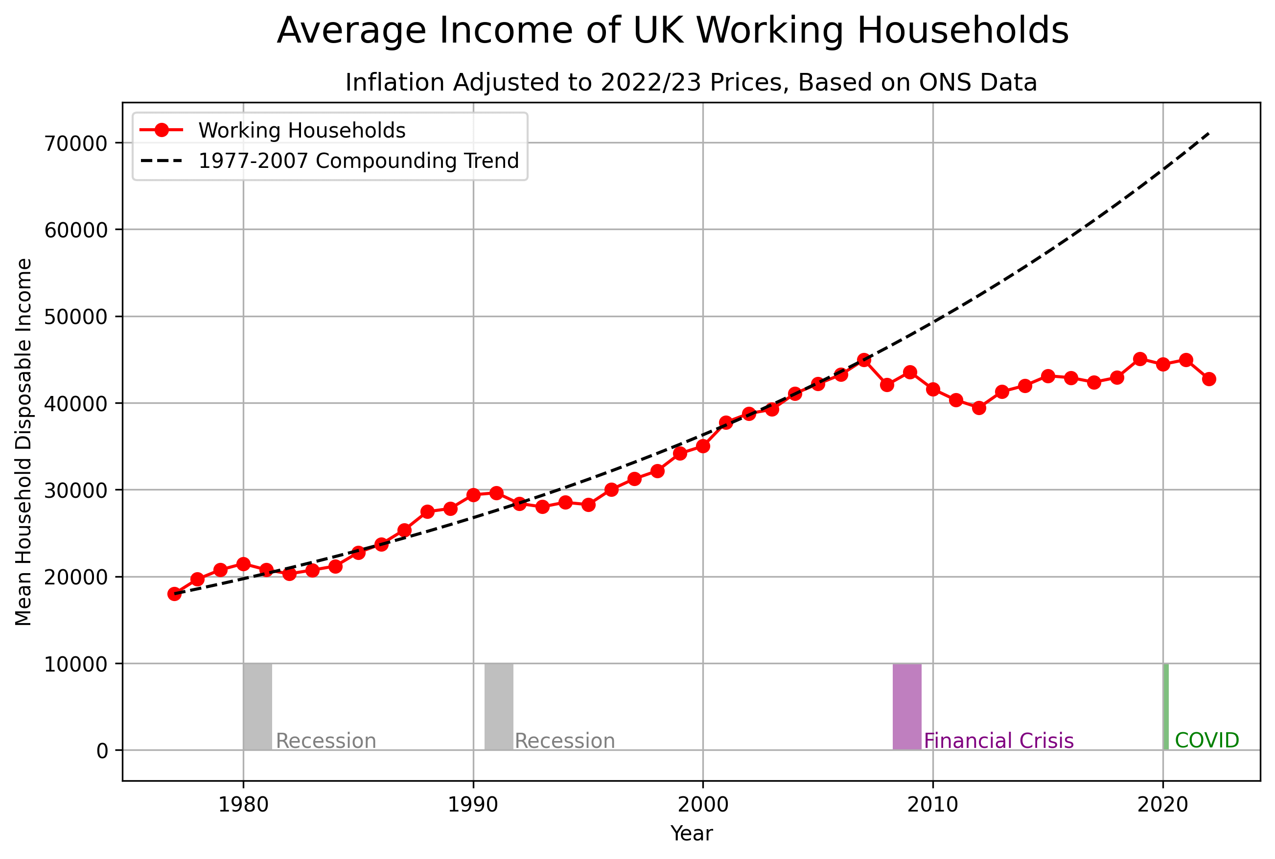
![[OC] Average Income of UK Working Households](https://www.europesays.com/wp-content/uploads/2025/01/7v9i6f8vrofe1-1920x1024.png)
20 comments
People in the UK are now very poor now compared to the trend it was on before the Financial Crises.
This is disposable income which is income after tax and after social welfare payments.
‘disposable income measure, which is the amount of money households have available for spending and saving after direct taxes have been accounted for. It includes earnings from employment, private pensions and investments as well as cash benefits provided by the state.’ https://www.ons.gov.uk/peoplepopulationandcommunity/personalandhouseholdfinances/incomeandwealth/bulletins/householddisposableincomeandinequality/financialyearending2022
Data from ons
https://www.ons.gov.uk/peoplepopulationandcommunity/personalandhouseholdfinances/incomeandwealth/datasets/householddisposableincomeandinequality it is released in September for the year before so only up to 2023 now. But 2024 is not expected to help much.
Python matplotlib code up at
https://gist.github.com/cavedave/1083d866f78760b036263a98cb68c1dc
Its amazing how small the dips were in the other recessions
The wealth is still there, just in fewer pockets. If this keeps up, there will be guilliotines.
So basically income in the UK has stagnated for 20 years?
I miss the Brexit effect.
I wonder what impact immigration, if any, had on this
Brexit and COVID occurred at the same time, it would be interesting to see which has had more impact on incomes.
The US has been heading the same way since Reaganomics started.
It should be median income not average income, only polticians and media with an agenda use average.
https://youtu.be/BVR2PnpQXP4?si=aaaOTP27xNRd6O-Z
Is the data somehow corrected for household-size? I can imagine that with decreasing household-sizes the average income per household also decreases..
I emigrated to London in 2007. My bad.
Sorry.
This is great, presumably using by CPI inflation? I’d love to see an inflation measure which includes housing, e.g CPIH.
14 years of Tory austerity really fixed the economy
It says house hold does this mean two working adults?
As two adults on full time minimum wage would be on £48k annual combined before tax come April.
I would love to see other countries in Europe like Poland, Grecce, Italy
Something like this for Germany would be really interesting to see as well.
How does this look measured against population increase?
70K feels about right taking into account my middle management position and skills involved. I am even applying for such income brackets but requirements are slightly higher…
The chart says **average income**, but the axis says **disposable income**. Which is it?
That trend line is pure wishful thinking. We grew like this for so long, so we expect to grow forever. Based on what? Neoliberal economics relying on endless growth is not proof that endless growth is possible. The conditions that allowed for it in the late 20th century no longer exist. 🤷🏼♀️
The population boom is over. The oil boom is over. Human beings can’t keep being better off than their parents forever. Eventually kids will just have to make do with the same as their parents had, like every other period in human history. Disposable income was very stagnant in medieval times too. At least we’re going back to a four day week.
The data in this graph is beautiful. It shows how our societies need to change in the face of economic reality. The arbitrary line imposed on top is meaningless. Why should it keep going up like that? How would everyone getting more and more and more on top of what they actually need, forever, work in the long term? Is a mean disposable income of £70k even desirable? Shouldn’t we raise the tax burden and fix some potholes before everyone gets a Merc?
Disposable income?? (Left hand scale) seems very unlikely, and this descriptor contradicts the headline ‘average income’
Comments are closed.