Data Source: FRED (Federal Reserve Economic Data), U.S. Bureau of Economic Analysis
**Disposable Personal Income (DSPI)**: [https://fred.stlouisfed.org/series/DSPI]()
**Personal Consumption Expenditures (PCE)**: [https://fred.stlouisfed.org/series/PCE]()
R Packages Used: fredr, tidyverse, ggplot2
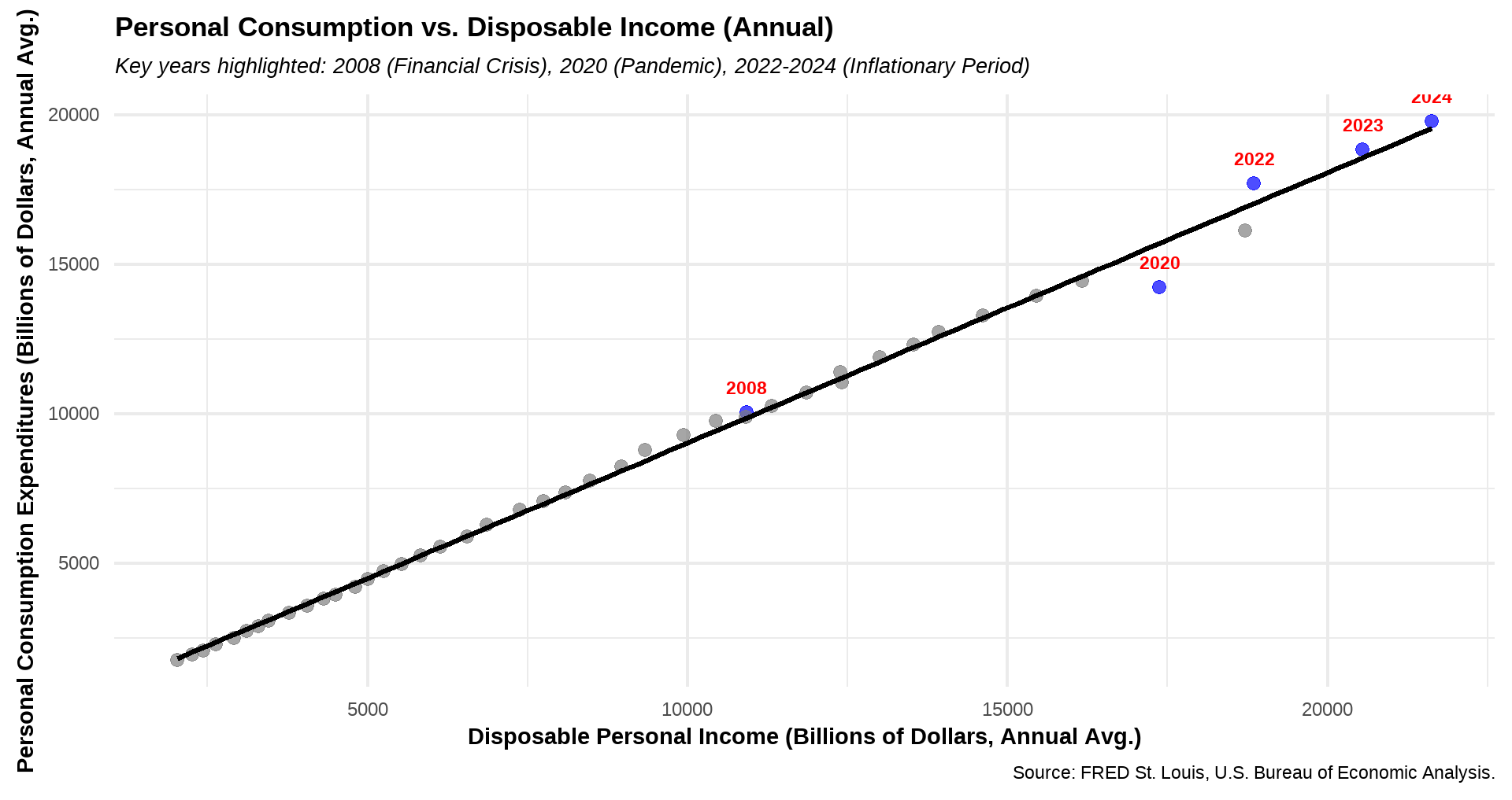
Check out the relationship between Personal Consumption Expenditures (PCE) and Disposable Personal Income (DPI) in the U.S. from 1980 to 2024. Key economic events, including the 2008 Financial Crisis, 2020 COVID-19 Pandemic, and 2022-2024 Inflationary Period, are highlighted to show their impact on spending patterns.
Spending always rises to match income.
X axis should be time (year) and Y axis should be Personal Disposable/Personal Expenditure or some ratio of that sort.
Is this just showing that personal spending correlates to how much money you have available to spend? In that case, it’s more or less a 2D plot with inflation on both axes? 2020/2021 is pretty interesting though, you can see that people weren’t able to spend on activities that were banned, so these years are below the trendline. Then in 2022 there is a rebound to above the trendline as people spend their excess savings. During the inflationary period of 2022-2024, inflation affects both axes, so it has caused the gaps between these years to be larger than between preceding years.
This would be even more interesting if it were a series of graphs showing the same output, but tiered in blocks of income levels – say 50% poverty level, 100%, 150%, etc. (That way even though incomes are moving the relative groups would stay the same.)
I’m betting the result would show at lower levels a 1-1 ratio, and as you progressed up the wealth scale it would become much less.
Lovely chart, I made the Canadian version. I was curious about how it compared across income quintiles, the results are pretty striking. I added the slopes on the chart for information.
Interesting that between 2008 and 2020, theres one year that backslid before an earlier year (likely that dot near 2008. being 2009? so loss of disposable income vs 08). That or there’s coinciding dots. And another around 2012 ish where personal income was stagnant, so 2 stacked dots.
This is great. I’ve had a o many debates with people about how expensive life is now, with most people refusing to admit that people make much more money now—and they spend much more money. House size alone is a big explainer of this.
Are you implying these are chronologically ordered ? What about the other years?
If debt is added to this, I.E the y axis was wealth and not spending, it would look very different. I am capable of spending ~twice what I make in a year right now on credit, Lifestyle inflation is very real, but any debt I take on is not accounted for in this graph.
10 comments
Data Source: FRED (Federal Reserve Economic Data), U.S. Bureau of Economic Analysis
**Disposable Personal Income (DSPI)**: [https://fred.stlouisfed.org/series/DSPI]()
**Personal Consumption Expenditures (PCE)**: [https://fred.stlouisfed.org/series/PCE]()
R Packages Used: fredr, tidyverse, ggplot2
Check out the relationship between Personal Consumption Expenditures (PCE) and Disposable Personal Income (DPI) in the U.S. from 1980 to 2024. Key economic events, including the 2008 Financial Crisis, 2020 COVID-19 Pandemic, and 2022-2024 Inflationary Period, are highlighted to show their impact on spending patterns.
Spending always rises to match income.
X axis should be time (year) and Y axis should be Personal Disposable/Personal Expenditure or some ratio of that sort.
Is this just showing that personal spending correlates to how much money you have available to spend? In that case, it’s more or less a 2D plot with inflation on both axes? 2020/2021 is pretty interesting though, you can see that people weren’t able to spend on activities that were banned, so these years are below the trendline. Then in 2022 there is a rebound to above the trendline as people spend their excess savings. During the inflationary period of 2022-2024, inflation affects both axes, so it has caused the gaps between these years to be larger than between preceding years.
This would be even more interesting if it were a series of graphs showing the same output, but tiered in blocks of income levels – say 50% poverty level, 100%, 150%, etc. (That way even though incomes are moving the relative groups would stay the same.)
I’m betting the result would show at lower levels a 1-1 ratio, and as you progressed up the wealth scale it would become much less.
https://preview.redd.it/dqdfr0o8eufe1.jpeg?width=1440&format=pjpg&auto=webp&s=c4f23e39ccc4b71ec5b752978cf47dee1f21b96f
Lovely chart, I made the Canadian version. I was curious about how it compared across income quintiles, the results are pretty striking. I added the slopes on the chart for information.
Interesting that between 2008 and 2020, theres one year that backslid before an earlier year (likely that dot near 2008. being 2009? so loss of disposable income vs 08). That or there’s coinciding dots. And another around 2012 ish where personal income was stagnant, so 2 stacked dots.
This is great. I’ve had a o many debates with people about how expensive life is now, with most people refusing to admit that people make much more money now—and they spend much more money. House size alone is a big explainer of this.
Are you implying these are chronologically ordered ? What about the other years?
If debt is added to this, I.E the y axis was wealth and not spending, it would look very different. I am capable of spending ~twice what I make in a year right now on credit, Lifestyle inflation is very real, but any debt I take on is not accounted for in this graph.
Comments are closed.