Slides from 167 patients used as the development cohort were collected from three institutions (Supplementary Table 1, Supplementary Fig. 1a): New York University (NYU), University of California San Francisco (UCSF) and Brigham and Women’s Hospital (BWH), along with clinical information regarding whether the patient developed a good or poor outcome (see Method section, and Supplementary Fig. 2). As an external cohort, slides from 153 patients were received from the Complejo Asistencial Universitario de Salamanca (CAUSA) and 410 patients from the Mayo Clinic in Arizona (Mayo).
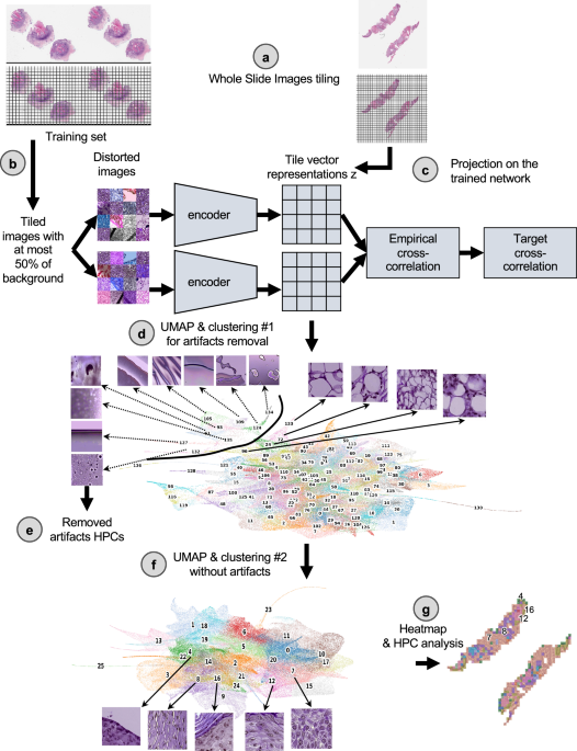
Clinical outcome data was notated as a binary label of good vs. poor outcome, with good outcome indicating no evidence of disease at most recent follow-up and PO representing local recurrence, nodal metastases, distant metastases or disease-specific death. Furthermore, disease-free survival (DFS) data were available for the NYU and UCSF development datasets (median follow-up, 38.0 and 32.7 months respectively), and for the CAUSA and Mayo test datasets (median follow-up, 51.5 and 41.9 months respectively), allowing us to perform Cox regression models with these cohorts. Further patient information regarding age, tumor stage, size, was not available for the UCSF and BWH cohorts. To objectively identify phenotypes which could potentially be predictive of PO, we used a pipeline based on the Barlow-Twins self-supervised approach37 as described in Fig. 1 (see Method for details). This pipeline has been shown to successfully identify clusters of meaningful phenotypes on lung adenocarcinoma (such as different histological subtypes and types of tissues), and link them to overall and recurrence-free survival29. The Barlow-Twins model runs into two identical encoders, batches of samples originating from similar tiles but distorted in different ways. In trying to minimize the empirical cross-correlation between the embeddings on those two networks and the target cross-correlation, images projected into that network will eventually lead to tile vector representations that are more similar to each other if the corresponding images carry similar features. To simplify the analysis of the vector representations, tiles sharing similar phenotypes are clustered into groups called HPC (Histomorphological Phenotype Clusters) using the Leiden algorithm, which has the advantage of being a community detection algorithm with hierarchical clustering and can identify groups of nodes as well as connections between the entities.
Following the strategy explained in the method section to reduce overfitting, we froze a Leiden cluster configuration corresponding to a resolution r = 0.75, leading to splitting the dataset into 26 HPCs (Fig. 2a). A PAGA (PArtition-based Graph Abstraction) representation (Fig. 2b) illustrates how the clusters at the top of the graph and of the corresponding UMAP (Fig. 2c) appear more enriched in tiles associated with risk of poor outcome. As expected, at the selected resolution, phenotypes are present in different proportions and the relative size of HPCs vary considerably (Supplementary Figs. 3a, 4a, 5a). However, we can see that patients are well represented, and many of those phenotypes are present to various degrees in most of the patients (Supplementary Figs. 3b, 4b, 5b), with the exception of HPC 25. Similar observation is made regarding the representativity of the different institutions (Supplementary Figs. 3c, 4b, 5b, 6b).
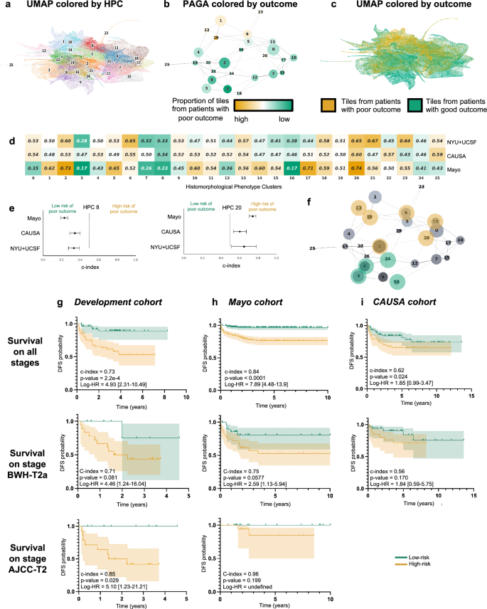
a UMAP with the 26 Leiden clusters found at resolution 0.75. b PAGA representation of the Leiden clusters with node connections. The size of the nodes is proportional to the number of tiles and their color is proportional to the proportion of tiles associated with good/poor outcome patients. c UMAP with colors showing tiles associated with good/poor outcome patients (green/orange). Each dot is a tile. d Univariate analysis comparing the c-index (average of a 3-fold cross validation) for the prediction of the RFS for the development cohort (NYU + UCSF) and on the external cohorts (CAUSA, Mayo). c-index below 0.5 (green) indicates lower risk of poor outcome, while c-index above 0.5 (orange) indicates higher risk of poor outcome. e Details of panel c for two clusters where the development cohort and the external cohort show the same trend (See Supplementary Fig. 6 for all clusters). Error bars show the confidence interval. f Projection on the PAGA of the HPCs showing coherent trends for both the cross-validation on the development cohort, and on the external cohorts. g Kaplan–Meier curve of predicted high and low risk patients of having a poor outcome from the unsupervised HPL approach using a Cox regression, 3-fold cross-validation on the development cohort (NYU + UCSF). First row is computed using the whole dataset, while second and third show a subset of patient with stage T2a (BWH staging) and T2 (AJCC staging) only. Error bars show 95% confidence interval (CI). 95% CI of hazard ratio (logrank) is shown between brackets. The median value computed on the whole dataset is used to split low from high risk patients. h Same as g but using the Mayo as a test cohort. i Same as g but using the CAUSA as a test cohort.
Using the HPL pipeline, each patient can be described by the percentage of tiles contained in each HPC, which in turn can be used as an input into regression models to estimate the HPC outcome prediction power. To assess the variability and impact of Leiden clustering on prediction of outcome, we also ran three-fold cross-validation log regression for binary classification of poor versus good outcome (Supplementary Fig. 6d) and a Cox regressions for survival prediction analysis (Supplementary Fig. 6e) at various resolutions. We observe that the resolution of r = 0.75 selected above also allows for successful predictions in both approaches while preventing overfitting.
Self-supervised learning identifies histomorphological phenotype clusters associated with survival
As mentioned, each patient can be described by the proportion of tiles assigned to each HPC, and this simplified phenotype description can in turn be used to study outcome predictability. Computing a univariate c-index analysis on each HPC independently, we observe some HPCs are either correlated with poor or good outcome (Fig. 2d), and for 10 of these HPCs, the trends are confirmed in the two external cohorts (Fig. 2e, Supplementary Fig. 7). Projected on the PAGA representation (Fig. 2f), we notice those related to poor outcomes are located on the upper part of the graph and those related to better outcomes are located on the lower part of the graph.
Using a multivariate log regression approach on the whole HPC vector describing the HPC distribution, we investigated the potential to predict the binary outcome from those HPCs. The good versus poor outcome binary classification run on the 3 development datasets available resulted in an average 3-fold cross-validation AUC of 0.724 (validation set) and 0.689 (test set; Supplementary Fig. 8a). While the performances were lower for the CAUSA cohort (AUC-0.554), they were very good on the Mayo external cohort which contains a mix of Mohs excisions, shave and punch biopsies (AUC ~ 0.844; Supplementary Fig. 8a). This result, as based on a self-supervised approach, allows for an unbiased selection of clusters of tiles which are identified as the most relevant to achieve the classification. It also provides an easy way to identify phenotypes important for such prediction, such as a forest plot analysis which shows the contribution of the main clusters to this prediction (Supplementary Fig. 8b).
As a comparison, we trained the supervised network inception v3, which relies on selected labeled regions. Manual free-text annotations based on consensus agreement were performed by three board certified Mohs micrographic surgeons (M.C., S.R.J, R.W.) and a senior dermatology resident (M.J.) using Aperio’s Imagescope interface. Consensus was achieved if all reviewers agreed with the annotation features. We followed the pipeline similarly used by Johannet et al.22 in their study of melanoma. Here, we first trained the algorithm (Supplementary Fig. 8c, e, Supplementary Tables 2, 3) to identify the regions manually annotated (normal skin, squamous cell carcinoma in situ, invasive squamous cell carcinoma, other, and artifact). Annotations in the ‘other’ group included dermis, fat, glandular tissue, smooth muscle, cartilage, inflammatory infiltrates, and the presence of ortho and hyperkeratosis. The artifact annotation included negative white space, bubbles or pen markings. Second, we checked whether a selected region (invasive cSCC) or a set of regions of interest (normal, in situ, invasive) could be used to predict a binary outcome (Supplementary Fig. 8d, f). Such a supervised approach achieved performances of AUC = 0.675 on invasive cSCC and 0.671 on the set of regions of interest (normal, in situ and invasive combined) for the development cohort. On the CAUSA and Mayo test cohorts, it achieved performances of AUC = 0.576 and 0.711, respectively, on invasive cSCC, and AUC = 0.598 and 0.726, respectively, on the set of regions of interest. In addition to performing slightly worse than the self-supervised approach (Supplementary Fig. 9 and more metrics in Supplementary Tables 4, 5), this two-step method relies on manual annotations, choices of regions from which the prediction should be made, and little possibility to directly interpret how the model made its decision or what subsets of phenotypes were used. These three bottlenecks are all addressed by the self-supervised approach as described in the next section.
More interestingly, with the two datasets where the DFS data are available, we performed a Cox Regression and obtain a DFS prediction with a Harrell’s c-index of 0.73 (0.72 Uno’s c-index), and p-value of 2.2e−4 on the cross-validation cohort (Fig. 2g), a Harrell’s c-index of 0.84 (0.83 Uno’s c-index), and p-value 2h), a Harrell’s c-index of 0.62 (0.62 Uno’s c-index), and p-value of 2.4e−2 on the CAUSA cohort (Fig. 2i). A forest plot (Supplementary Fig. 10a) and SHAP plot (Supplementary Fig. 10b) were computed to interpret the contributions of the different HPCs to this prediction and understand which phenotypes influence the model’s prediction. Expectedly, most of the HPCs identified by the univariate approach appear also relevant in this multivariate approach. This approach is particularly effective at differentiating poor from good outcome in a subset of BWH T2a and AJCC-8 T2 tumors respectively (Fig. 2g–i), which currently face significant outcome heterogeneity thus rendering prognostication challenging. Note that the Kaplan–Meier plots extrapolated from the poor outcome probabilities generated by supervised classifiers show overall much lower performances (Supplementary Figs. 11, 12). This self-supervised approach could potentially address the gap in the current staging systems caused by the relative lack of outcome homogeneity within AJCC T2 and BWH T2a groups.
Cluster interpretation highlights histomorphological phenotypes linked with increased risk of local recurrence, metastasis and increased likelihood of good outcome
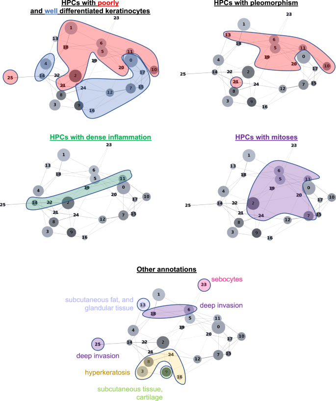
The HPL self-supervised approach provides interpretability power that allows us to identify how HPCs are weighted in terms of lower or higher risk of overall PO in our Cox regression model (DFS), or in terms of good/poor outcome in the log regression model. First, 100 random tiles were selected from each HPC and visually analyzed by three board certified Mohs micrographic surgeons (M.C., S.R.J, R.W.) and a senior dermatology resident (M.J.). The details of these observations are shown in Supplementary Table 6 (see Supplementary Fig. 13 for a subset of randomly selected tiles). When we project those observations on the Partition-based Graph Abstraction (PAGA Fig. 3), we observe that HPCs sharing similar phenotypes are linked and located in specific and coherent regions, confirming the coherence of the HPL representation. Further validation was done proceeding similarly on the external cohorts (Supplementary Figs. 14, 15).
In Fig. 4 and in Fig. 5, we show examples of HPCs and tiles associated with higher and lower risk of PO by our Cox model from Fig. 2g.

a Example of tiles randomly selected from certain HPCs leading to risk prediction of poor outcome. b, c Examples of data from patients with poor outcome shortly after surgery (10.5 months, local recurrence) and with poor outcome a few years after surgery (46 months, nodal metastasis). For each case, a small portion of the original slide is shown as well as the corresponding heatmap and the associated SHAP decision plot. The color of the heatmap shows the HPC associated with each tile, with the proportion of tile belonging to each HPC shown in the legend (percentages computed over the whole slide(s) available for each patient). The top of the SHAP decision plot shows the predicted value which determines the color of the curve. Reading from bottom to top, the SHAP values for each HPC are cumulatively summed, and the HPCs are ordered according to the absolute SHAP weight. On the right, the proportion of tiles associated with each cluster is shown on a Log10 scale. All tiles are shown after Reinhard’s color normalization47.
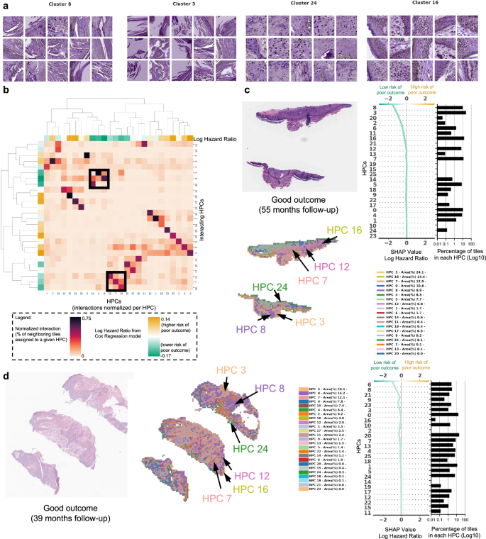
a Example of tiles randomly selected from certain HPCs leading to prediction of good outcome. b The interaction analysis between HPCs shows two groups of HPCs which tend to be adjacent on slides; each column shows the normalized proportion of interactions each tile associated with a given HPC has with HPCs associated with its adjacent tiles. The dendrograms correspond to bi-hierarchical clustering of HPCs. c, d Examples of data from patients who have not recurred and have been followed for more than three years. For each case, a small portion of the original slide is shown as well as the corresponding heatmap and the associated SHAP decision plot. The color of the heatmap shows the HPC associated with each tile, with the proportion of tile belonging to each HPC shown in the legend (percentages computed over the whole slide(s) available for each patient). The top of the SHAP decision plot shows the predicted value which determines the color of the curve. Reading from bottom to top, the SHAP values for each HPC are cumulatively summed, and the HPCs are ordered according to the absolute SHAP weight. On the right, the proportion of tiles associated with each cluster is shown on a Log10 scale. All tiles are shown after Reinhard’s color normalization47.
In Fig. 4a we show randomly selected tiles from the HPCs having the highest influence on the c-index for prediction of higher risk of PO, and in Fig. 4b, c, three heatmaps of patients with PO show the HPCs composition projected on sections of the WSI. For the patient in Fig. 4b, for example, the tumor recurred after 10.5 months and its associated WSI demonstrated high enrichments in HPCs 1, 6 and 20, the latter two with a high SHAP log hazard ratio value synonymous with higher risk of PO. The HPC 6 shows deep invasion of poorly differentiated keratinocytes with mitoses. HPC 20 shows poorly differentiated and pleomorphic keratinocytes with mitoses, and HPC 1 similarly demonstrates poorly differentiated keratinocytes, which have been shown in prior studies to correlate with POs, such as local recurrence38.
The WSI in Fig. 4c shows a high presence of HPCs 0, 1, 5, 6 and 13, the latter 2 showing a high SHAP log hazard ratio value. HPC 13 shows some pleomorphic features as well as deeply infiltrative tumor cells, of which is a feature associated with POs. Similarly HPC 6 demonstrates deep invasion, poor differentiation, and significant atypia, factors that are recognized to contribute to POs38. The SHAP decision plots resulting from our study show how the enrichment or depletion of tiles from certain HPCs weigh into the final decision for a patient whose tumor recurred shortly after surgery (LR, Fig. 4b) and for a patient recurring 46 months after surgery (NM, Fig. 4c).
In Fig. 5a we show randomly selected tiles for the HPCs having the highest influence on the c-index for prediction of a lower-risk of PO. In Fig. 5b, an analysis shows clusters of HPCs which tend to be adjacent on a slide, by checking, for each tile belonging to a given HPCs, what HPCs were associated with its adjacent tiles. Two groups of HPCs identified as lower risk of PO were seen as having relatively high interactions: HPCs 7, 12 and 16 as one group and HPCs 3, 8 and 24 as the other. A commonality of all these HPCS was the presence of well-differentiated keratinocytes and the lack of atypia or pleomorphism, which would be expected for a tumor with good outcome. In Fig. 5c, d, we show the slides associated with two patients who were followed up for more than three years with no evidence of disease. Those slides show the presence of HPCs 3, 8 and 24 seen in Fig. 5b, as well as HPCs 7, 12 and 16. Similarly, it is likely that the good differentiation, lack of pleomorphism and relatively non-specific features of hyperkeratosis can be attributed to these findings.
Because the HPCs that are associated with good outcome are those that have normal appearing keratinocytes, intuitively, the slide selection could impact the resulting percentage of tiles and therefore final classification. To explore this, we first generated a dendrogram with the heatmap color showing the HPC composition per slide for all patients with multiple slides, and performed hierarchical clustering (Supplementary Fig. 16a), demonstratingthat for most cases, slides belonging to the same patient are clustered nearby showing similar overall composition. Then for each patient, we computed the variance, among their own slides, on the percentage of tiles associated with each cluster (intra-patient variance), and normalized it by the variance across patients (inter-patient variance of tile percentages associated with each cluster). Supplementary Fig. 16b, c shows that the ratio intra-patient variance versus inter-patient variance is above 1 for most patients and most HPCs, meaning more homogeneity among slides belonging to the same patient. Finally, we computed per slide instead of per patient SHAP decision plots (Supplementary Fig. 16d), showing that the conclusions differ only slightly among slides from a given patient.
Other differences and potential confounding factors between the development and the test set are the type of biopsy and the source of the anatomic site. While the NYU cohort had nearly as many slides from excision as from shave biopsies, the CAUSA test cohort is exclusively composed of wide local excision, and the Mayo cohort, on the other hand, is mostly dominated by shave biopsy (Supplementary Table 1). We notice that most HPCs contain tiles from all types of preparations (Supplementary Figs. 3e, 4d). In some rare HPCs, the relative proportion of tiles between excision and biopsies varies more (Supplementary Figs. 3d, 4c): for example, HPCs 1 and 13, located at the top left of the PAGA graph and contain subcutaneous fat/tissues, are relatively more rare in shave biopsies than excisions, which is consistent considering that the depth of the shave samples is thinner than excisions which are often full-thickness. While the survival prediction pipeline seems to perform well on both the shave and excision biopsies specimens from the Mayo cohort (Supplementary Fig. 17a–c), we cannot rule out that with larger training set, a biopsy-type specific Cox Regression approach would lead to even better performances, specially for wide local excisions specimens like those used in the CAUSA cohort. Finally, because the anatomic sites are so diverse compared to the number of patients available, conclusions regarding potential biases are more difficult to draw but we notice as well that most HPCs contain at least a few tiles from most sites (Supplementary Figs. 3f, g, 4e, f, 5c, d). At this stage, we did not identify either impact from the tissue source on the survival prediction, though larger per source cohorts would be needed (Supplementary Fig. 17d, e).