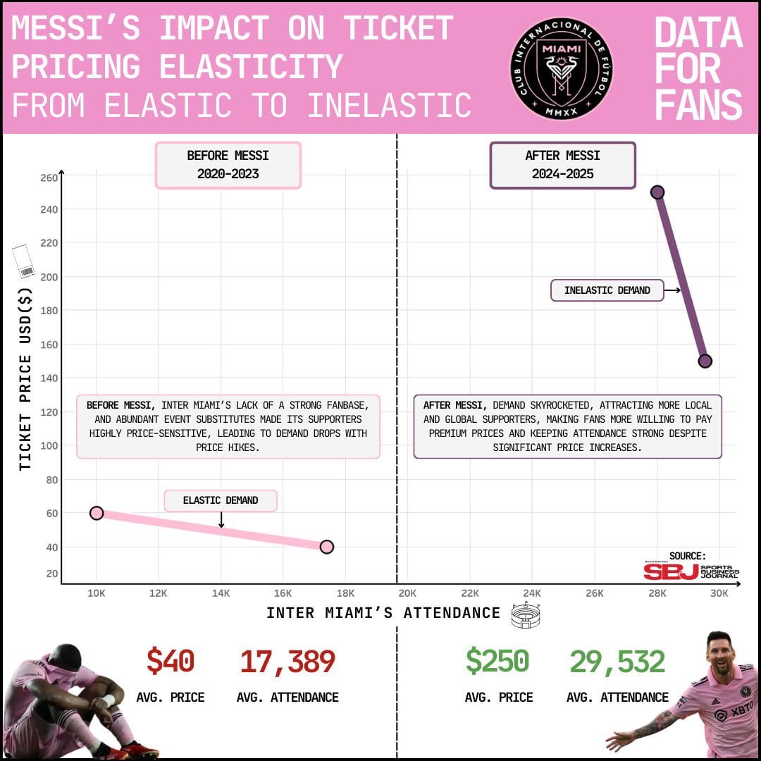
Wouldn’t inelastic demand mean a straight line up on the right graph? So it’s ‘near inelastic’, but not quite?
[deleted]
Dude, switch those damn axes. Can’t even put the independent variable on the x axis and posts on data is beautiful….. sigh…
25k+ is a sellout crowd in most MLS stadiums, makes sense that elasticity breaks down there – if every seat sold, you could have increased the price and still filled them all.
I’m really smug right now having watched Messi at Barça three times and each trip was worth around $200 each time for travel, accom and match ticket.
Neat data analysis! A couple of things that jumped out though about how it’s being presented.
The mixed up X/Y is making my brain short-circuit. Typically you want your X variable to be the “cause” and the Y to be the “effect” for it to be a more intuitive connection for people to make about a data set.
Also, considering that the change (slope) is the variable you are trying to highlight, it might be helpful to identify this component of the data instead of simply having a line between the data points. As it is here, on first glance one might think the length of the lines (distance between the points within each scenario) is significantly related to your analysis. While it might be interesting to see this information as well, it’s obfuscating what you’re trying to display about the elasticity of demand in two different pricing scenarios/”The Messi Effect”.
To more clearly show the effect of Messi on change in ticket prices vs attendance it would be nice to see something that compares the two differently. Instead of using the raw numbers, you might show the percent change in attendance vs absolute increase in cost. For example, No-Messi a price change of +$20 correlated with 7.4k of 17.4k (43% drop) change in attendance vs With-Messi +$100 correlated with 2k out of 29.5k (7% drop). The slopes aren’t super obvious on the graph that there is a 500% difference in attendance change and if you go further to compare it PER dollar change, it’s even more apparent how much people are motivated to spend on seeing Messi. The Attendance per Dollar component of The Messi Effect can be seen in the following:
Without Messi: -7.4k/$20 = -370 fans per $1 increase in ticket price.
With Messi: -2k/$100 = -20 fans per $1 increase in ticket price.
The Messi Effect (Elasticity of attendance correlation with ticket price change) = -370 fans/-20 fans per $1 increase in ticket price.
The Messi Effect (ET) = 18.5 times less attendance loss per $1 increase in ticket price.
That’s a HUGE difference in elasticity! A power of 18.5 when providing resilience to change is a big number! I think it is challenging to see this from your graph as-is. Even if you just sort of eye-ball the slope, it would only look like a 5x effect or so. Of course your visualization does also show the absolute numbers of fans, so I think it’s worth coming up with a few different components of The Messi Effect.
Next is the total attendance. This one is simple. 29.5k vs 17.4k. A 70% increase in attendance.
The Messi Effect (A) = 1.7
Alright, not too bad.
How about absolute ticket price? 250 vs 40. Simple again, 250/40. That’s a 650% increase (oof).
The Messi Effect (T) = 6.5
Digging the visual of players emoting, that does drive your point home.
Well….I’m out of time. Thanks for giving me something to do as I really don’t want to be working on my actual work right now. Also I have never even watched Messi play but I really like doing stupid math like this.
This data doesn’t make sense given the capacity of Inter Miami’s stadium isn’t close to 28 or 29k, it’s 19.1k . Even the new and bigger one that holds 25.5k doesn’t open til next year.
250$ for an Inter Miami match? My god….
You could go to a great champions league match for that money
![[OC] Messi’s impact on Ticket Pricing Elasticity](https://www.europesays.com/wp-content/uploads/2025/02/isem9m14mqle1-1080x1024.jpeg)
9 comments
Wouldn’t inelastic demand mean a straight line up on the right graph? So it’s ‘near inelastic’, but not quite?
[deleted]
Dude, switch those damn axes. Can’t even put the independent variable on the x axis and posts on data is beautiful….. sigh…
25k+ is a sellout crowd in most MLS stadiums, makes sense that elasticity breaks down there – if every seat sold, you could have increased the price and still filled them all.
I’m really smug right now having watched Messi at Barça three times and each trip was worth around $200 each time for travel, accom and match ticket.
Neat data analysis! A couple of things that jumped out though about how it’s being presented.
The mixed up X/Y is making my brain short-circuit. Typically you want your X variable to be the “cause” and the Y to be the “effect” for it to be a more intuitive connection for people to make about a data set.
Also, considering that the change (slope) is the variable you are trying to highlight, it might be helpful to identify this component of the data instead of simply having a line between the data points. As it is here, on first glance one might think the length of the lines (distance between the points within each scenario) is significantly related to your analysis. While it might be interesting to see this information as well, it’s obfuscating what you’re trying to display about the elasticity of demand in two different pricing scenarios/”The Messi Effect”.
To more clearly show the effect of Messi on change in ticket prices vs attendance it would be nice to see something that compares the two differently. Instead of using the raw numbers, you might show the percent change in attendance vs absolute increase in cost. For example, No-Messi a price change of +$20 correlated with 7.4k of 17.4k (43% drop) change in attendance vs With-Messi +$100 correlated with 2k out of 29.5k (7% drop). The slopes aren’t super obvious on the graph that there is a 500% difference in attendance change and if you go further to compare it PER dollar change, it’s even more apparent how much people are motivated to spend on seeing Messi. The Attendance per Dollar component of The Messi Effect can be seen in the following:
Without Messi: -7.4k/$20 = -370 fans per $1 increase in ticket price.
With Messi: -2k/$100 = -20 fans per $1 increase in ticket price.
The Messi Effect (Elasticity of attendance correlation with ticket price change) = -370 fans/-20 fans per $1 increase in ticket price.
The Messi Effect (ET) = 18.5 times less attendance loss per $1 increase in ticket price.
That’s a HUGE difference in elasticity! A power of 18.5 when providing resilience to change is a big number! I think it is challenging to see this from your graph as-is. Even if you just sort of eye-ball the slope, it would only look like a 5x effect or so. Of course your visualization does also show the absolute numbers of fans, so I think it’s worth coming up with a few different components of The Messi Effect.
Next is the total attendance. This one is simple. 29.5k vs 17.4k. A 70% increase in attendance.
The Messi Effect (A) = 1.7
Alright, not too bad.
How about absolute ticket price? 250 vs 40. Simple again, 250/40. That’s a 650% increase (oof).
The Messi Effect (T) = 6.5
Digging the visual of players emoting, that does drive your point home.
Well….I’m out of time. Thanks for giving me something to do as I really don’t want to be working on my actual work right now. Also I have never even watched Messi play but I really like doing stupid math like this.
This data doesn’t make sense given the capacity of Inter Miami’s stadium isn’t close to 28 or 29k, it’s 19.1k . Even the new and bigger one that holds 25.5k doesn’t open til next year.
250$ for an Inter Miami match? My god….
You could go to a great champions league match for that money
You forgot suarez, alba, busquets…
Comments are closed.