I don’t need a beautiful chart to be convinced to scrabble with anyone!
My extended family has always played lots of games with each other. Card games, dice and board games all alike. However there are two games banned for life as far as I can tell. Scrabble and monopoly.
Scrabble because apparently in the late 80s my uncle learned all the two letter words that are legal and to put it bluntly most of my family isn’t highly educated. Instead of adjusting their play style or you know just learning all those words they just stopped playing
We had to stop monopoly when two of my cousins threw down and broke my grandmas coffee table. About two years later they got in a fight again when someone asked why we don’t play monopoly. That moment was much funnier.
A paradox exists in that under no circumstance should you agree to play Scrabble with someone who was able to convince you through data that you should.
Tell me you’re a research scientist without telling me you’re a research scientist.
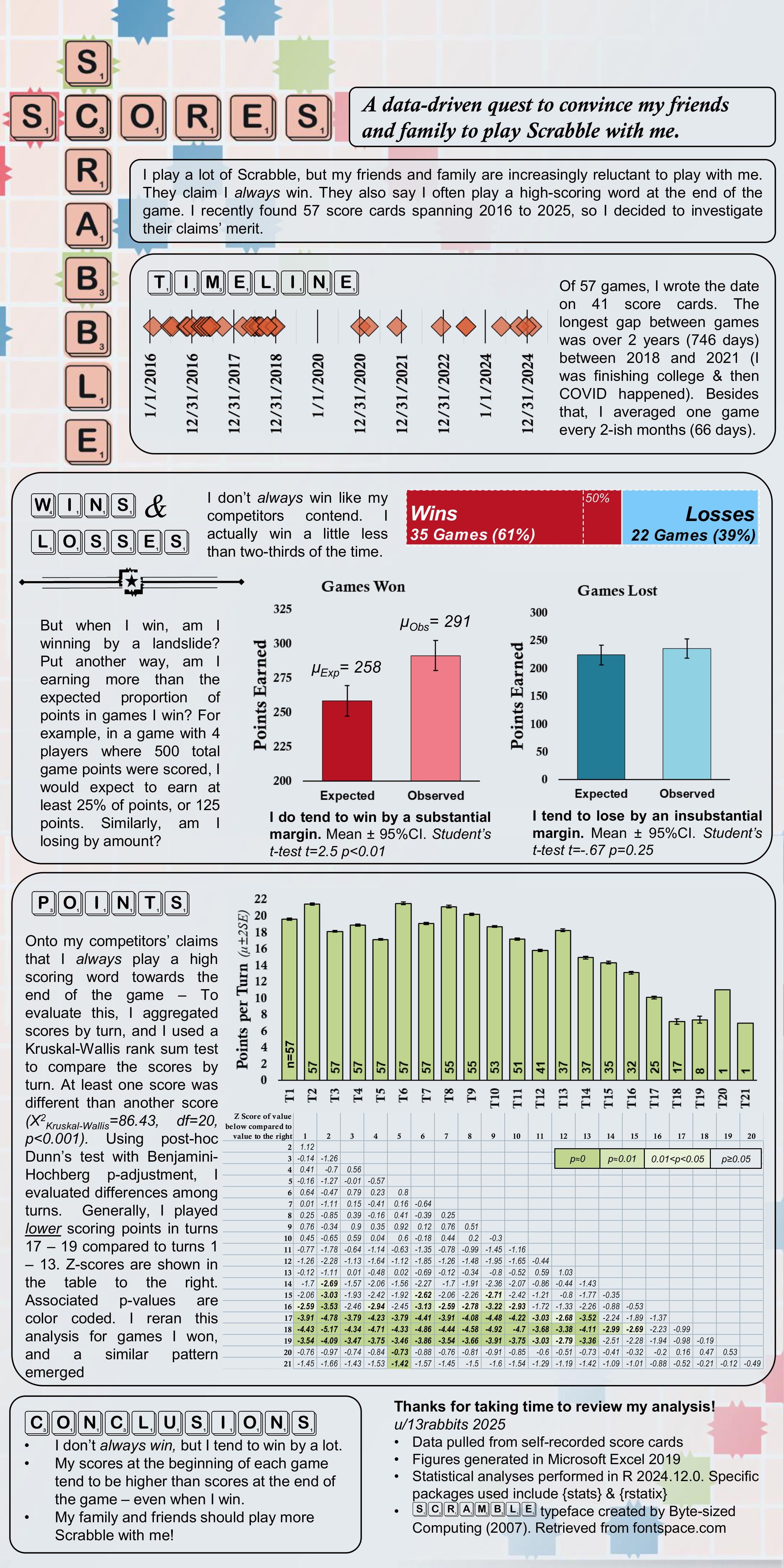
*Everybody’s* scores are lower at the end of the game when options become fewer and there is less room on the board for bingo plays.
That said if you are averaging over 50 points per play in early game, and only winning 65% of the time, your competition is also really good and shouldn’t need convincing to play.
Do you have any visualizations or data insights that show the benefits or fun aspects of playing Scrabble?
Under no circumstances am I playing scrabble with someone who has this amount of data on their scrabble playing
Data pulled from self-recorded score cards.
Figures generated in Microsoft Excel 2019.
Statistical analyses performed in R 2024.12.0. Packages used include {stats} & {rstatix}.
This is sexy af. Nice R work.
I like that your conclusion is that your friends should play more scrabble with you after you disproven their claim that you always win, because It’s just 2/3 of times by a significantly substantial margin. I hope it convinces them!
Nice visualisation overall. Except your “games won” bar chart should start at zero. It exaggerates the difference and isn’t comparable to your “games lost” plot.
What does the “expected” score mean in the first analysis? I see the text on the left, but I notice that the value differs in games won and lost. (Changing the y-axes in such a direct comparison is a cardinal sin by the way)
I play tournament Scrabble, and the pattern of points per move is typical at any level, except that at higher levels of play there’s a noticable peak in moves 1-4 because that’s when bingos are most likely to be played. Maybe a more interesting analysis would have been to look at the distribution of 50+ scores by turn.
![[OC] A data-driven quest to convince people to play Scrabble with me](https://www.europesays.com/wp-content/uploads/2025/03/z4gpcocxmzle1-1920x1024.jpeg)
12 comments
I don’t need a beautiful chart to be convinced to scrabble with anyone!
My extended family has always played lots of games with each other. Card games, dice and board games all alike. However there are two games banned for life as far as I can tell. Scrabble and monopoly.
Scrabble because apparently in the late 80s my uncle learned all the two letter words that are legal and to put it bluntly most of my family isn’t highly educated. Instead of adjusting their play style or you know just learning all those words they just stopped playing
We had to stop monopoly when two of my cousins threw down and broke my grandmas coffee table. About two years later they got in a fight again when someone asked why we don’t play monopoly. That moment was much funnier.
A paradox exists in that under no circumstance should you agree to play Scrabble with someone who was able to convince you through data that you should.
Tell me you’re a research scientist without telling me you’re a research scientist.
*Everybody’s* scores are lower at the end of the game when options become fewer and there is less room on the board for bingo plays.
That said if you are averaging over 50 points per play in early game, and only winning 65% of the time, your competition is also really good and shouldn’t need convincing to play.
Do you have any visualizations or data insights that show the benefits or fun aspects of playing Scrabble?
Under no circumstances am I playing scrabble with someone who has this amount of data on their scrabble playing
Data pulled from self-recorded score cards.
Figures generated in Microsoft Excel 2019.
Statistical analyses performed in R 2024.12.0. Packages used include {stats} & {rstatix}.
This is sexy af. Nice R work.
I like that your conclusion is that your friends should play more scrabble with you after you disproven their claim that you always win, because It’s just 2/3 of times by a significantly substantial margin. I hope it convinces them!
Nice visualisation overall. Except your “games won” bar chart should start at zero. It exaggerates the difference and isn’t comparable to your “games lost” plot.
What does the “expected” score mean in the first analysis? I see the text on the left, but I notice that the value differs in games won and lost. (Changing the y-axes in such a direct comparison is a cardinal sin by the way)
I play tournament Scrabble, and the pattern of points per move is typical at any level, except that at higher levels of play there’s a noticable peak in moves 1-4 because that’s when bingos are most likely to be played. Maybe a more interesting analysis would have been to look at the distribution of 50+ scores by turn.
Comments are closed.