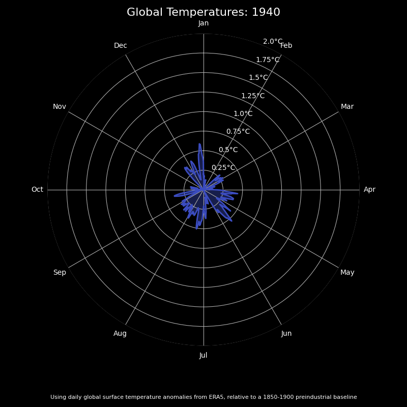
[OC] Daily global temperatures by year between 1940 and the end of 2024 | Yes, it’s getting warmer, with the last few years showing dramatic warmth | from https://www.theclimatebrink.com/p/visualizing-daily-global-temperatures
Posted by adessler
10 comments
Data are from Berkeley Earth (https://berkeleyearth.org/data/), coded in Python with some help from chatGPT. Posted on my substack, https://www.theclimatebrink.com/, by my co-author, Zeke Hausfather.
I miss windows music visualizer…
Great visualization. Thanks.
The problem with those temperature graphs is that they always use the full colour range from blue to red no matter how small the differences are. If you see blue, you would rather think of freezing cold, while red is unbearable hot. That is a mean psychological trick that is even used in official temperature graphs. In reality many countries still need heating for most of the year. I am writing this while my heater is running one metre from me.
Your data is, indeed, beautiful.
Another example that would be a great addition to
r/dataisbeautifulbutwhatitmeansisscary
Am I reading this right if I say that this shows how much warmer each year (and month) is compared to the average temp of the 50 years between 1850-1900?
Look babe it’s a NCS video
The thing I don’t like about this is that many people may subconsciously equate area with magnitude, when its really magnitude x duration.
Come on now, orange guy says it isn’t true, why the hell should we care about it. What we really want is making life a nightmare for a random transgender girl in a random high school!!!
Comments are closed.