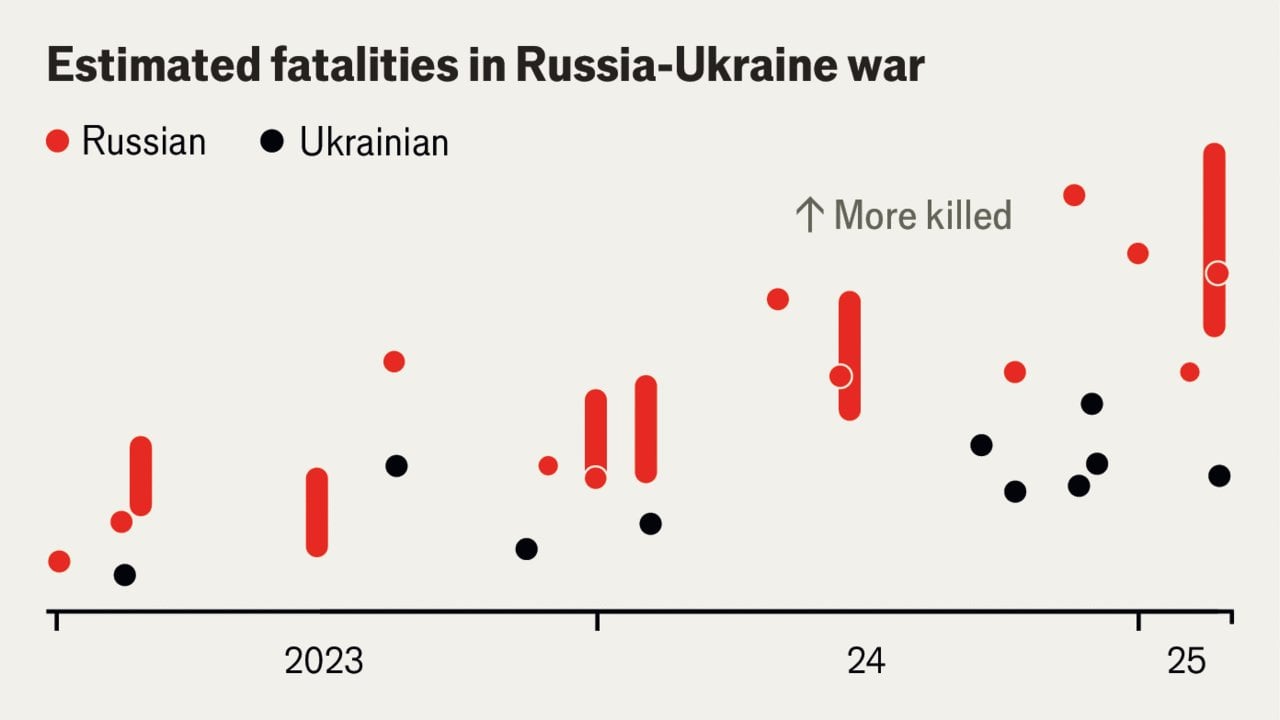
How do Ukrainian soldier fatalities compare with Russia’s? Posted by statisticalanalysis_ Tags:DataData Is BeautifulDataIsBeautiful 2 comments This might be some of the worst data presentation I have seen? Is that 1 worm or 25 chickens per bar? I assume the y axis is plotted in the whole graph, but it requieres a free trial to even check so… Not very beautiful Comments are closed.
This might be some of the worst data presentation I have seen? Is that 1 worm or 25 chickens per bar?
I assume the y axis is plotted in the whole graph, but it requieres a free trial to even check so… Not very beautiful
2 comments
This might be some of the worst data presentation I have seen? Is that 1 worm or 25 chickens per bar?
I assume the y axis is plotted in the whole graph, but it requieres a free trial to even check so… Not very beautiful
Comments are closed.