Interesting. Now eat them all at once and make another graphic of the consequences!
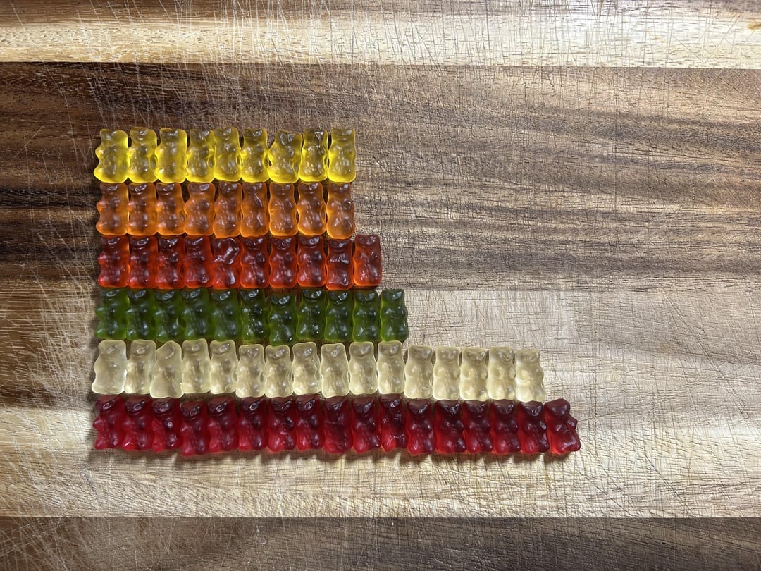
missed opportunity to use gummy bears instead of plain colored rectangles
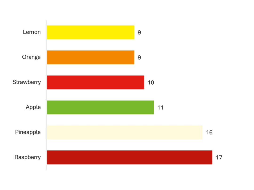
After all this time, I never realized the white ones were pineapple.
Next time try bigger sample size, buy more packs.
I wonder if the top 2 have anything to do with their Valentine’s Day individuals – they had only raspberry and pineapple
I’m ok with these numbers
Sample size too small. More gummies needed!
Do anyone actual enjoy the yellow ones?
Been a long time since I’ve seen someone so passionate about segregation. Also the green is not Apple flavored 🍓
When i was a kid, a pack was 250g
God bless you, you beautiful Deutschbags…you like ‘red’ best too
Somehow, I feel like I always just end up with mostly lemons and oranges. You were blessed with a great distribution.
I love the absolute unnecessity of the chart. Really makes this.
the red ones are raspberry? i thought they were strawberyy, imma have a midlife crisis rq
Now do 9 more bags to compare
I taught maths lessons using that and technique. It’s a great way to teach bar graphs..
Very neat post OP. My favorite is the orange gummy.
Holy crap! That is supposed to taste like pineapple!?
Wondering if these percentages change over time? Like if they’re running a little low on pineapple juice but have plenty of strawberry juice, they reduce the percentage of bears made with pineapple an increase the strawberry ones. Maybe this changes over the week, or maye it’s seasonal, because different fruits are in season at different times?
Lemons are named after the color they are.
Finally a data representation that is enjoyable to look at!
Why is the order upside down?
I’ve been eating haribos for years but still had no idea there were two different reds
23 comments
Interesting. Now eat them all at once and make another graphic of the consequences!
missed opportunity to use gummy bears instead of plain colored rectangles
After all this time, I never realized the white ones were pineapple.
Next time try bigger sample size, buy more packs.
I wonder if the top 2 have anything to do with their Valentine’s Day individuals – they had only raspberry and pineapple
I’m ok with these numbers
Sample size too small. More gummies needed!
Do anyone actual enjoy the yellow ones?
Been a long time since I’ve seen someone so passionate about segregation. Also the green is not Apple flavored 🍓
When i was a kid, a pack was 250g
God bless you, you beautiful Deutschbags…you like ‘red’ best too
Somehow, I feel like I always just end up with mostly lemons and oranges. You were blessed with a great distribution.
I love the absolute unnecessity of the chart. Really makes this.
the red ones are raspberry? i thought they were strawberyy, imma have a midlife crisis rq
Now do 9 more bags to compare
I taught maths lessons using that and technique. It’s a great way to teach bar graphs..
Very neat post OP. My favorite is the orange gummy.
Holy crap! That is supposed to taste like pineapple!?
Wondering if these percentages change over time? Like if they’re running a little low on pineapple juice but have plenty of strawberry juice, they reduce the percentage of bears made with pineapple an increase the strawberry ones. Maybe this changes over the week, or maye it’s seasonal, because different fruits are in season at different times?
Lemons are named after the color they are.
Finally a data representation that is enjoyable to look at!
Why is the order upside down?
I’ve been eating haribos for years but still had no idea there were two different reds
Comments are closed.