![[OC] Visualizing Distance Metrics. Data Source: Math Equations. Tools: Python. Distance metrics reveal hidden patterns: Euclidean forms circles, Manhattan makes diamonds, Chebyshev builds squares, and Minkowski blends them. Each impacts clustering, optimization, and nearest neighbor searches.](https://www.europesays.com/wp-content/uploads/2025/03/8wiph6yt53oe1-1920x1024.png)
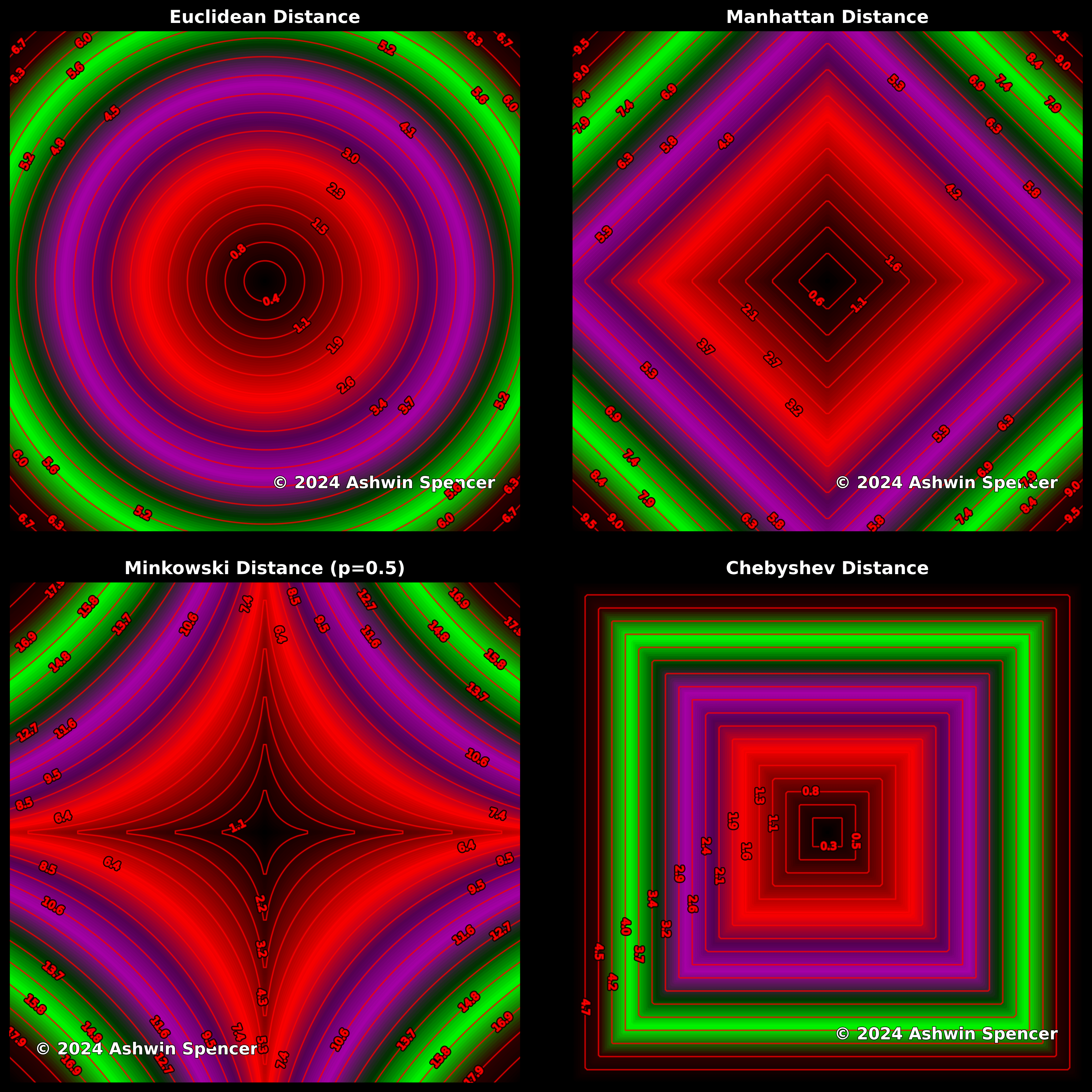
[OC] Visualizing Distance Metrics. Data Source: Math Equations. Tools: Python. Distance metrics reveal hidden patterns: Euclidean forms circles, Manhattan makes diamonds, Chebyshev builds squares, and Minkowski blends them. Each impacts clustering, optimization, and nearest neighbor searches.
Posted by AIwithAshwin
6 comments
Why do these all use different scales?
What are the different clustering uses for the methods?
I just had an assignment in numerical analysis where i was given different contours of shapes that had lots of noise and i needed to return the original shape it was derived from.
i ended up using kmeans for clustering and combining that with some smoothing and traveling agent algorithms.
what kind of clustering would you use for that case? euclidian?
I know some of these words.
Pretty interesting.
But that color palette is a crime against data viz.
What do the different colors even mean? They dont seem to correspond to the same equivalence class of isocontours across the different metrics.
Comments are closed.