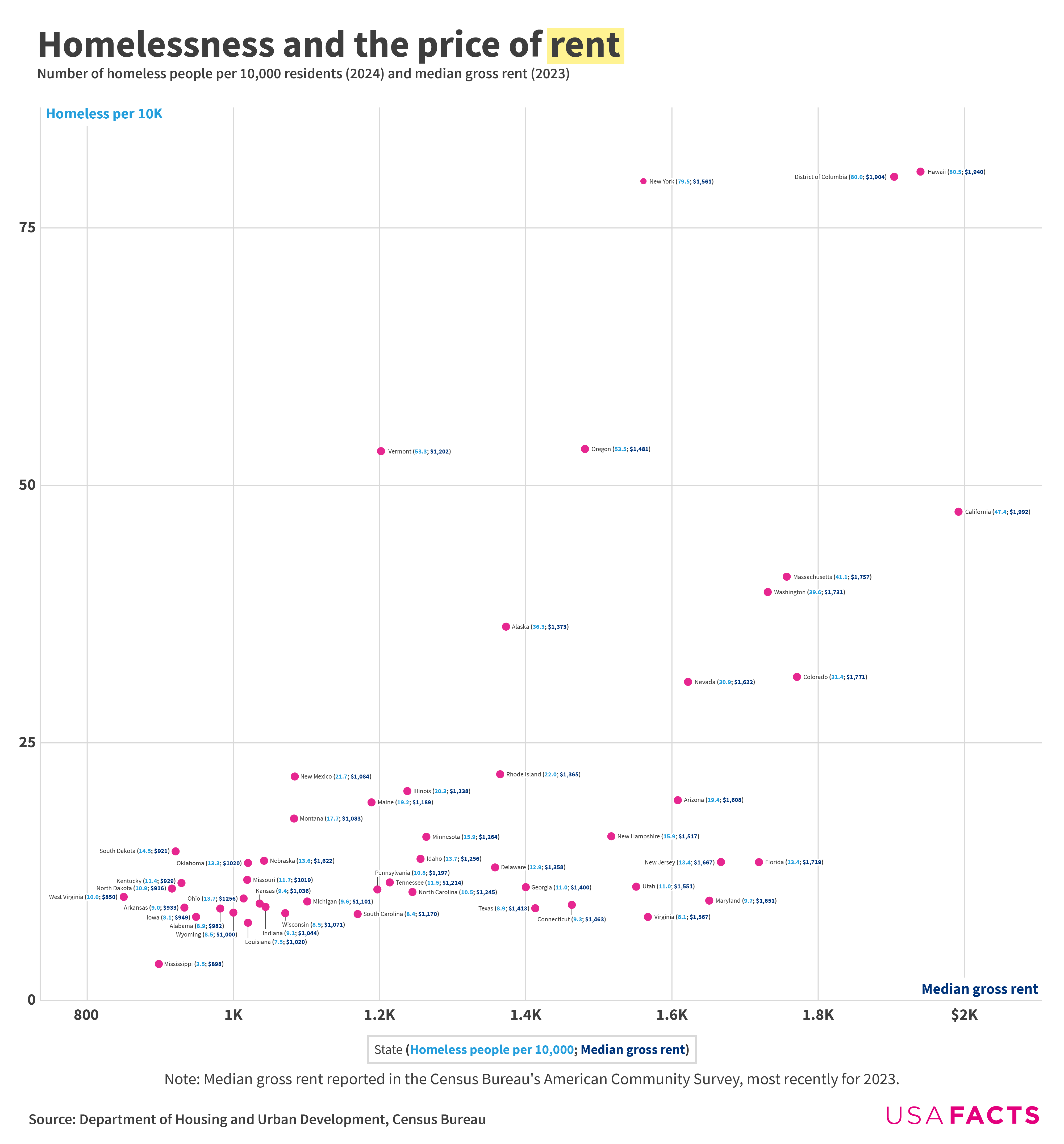
>According to a 2020 [Government Accountability Office report](https://www.gao.gov/assets/gao-20-433.pdf), rent prices can play a role in homelessness rates. California, Washington, DC, and Hawaii had the nation’s highest rents in 2023 and were all among the six states with the highest rates of homelessness in 2024. Mississippi had both the country’s second-lowest rents and the lowest homelessness rate.
>These figures are likely also affected by difficulties in counting the homeless population; rural states and states with lots of unsheltered homeless people face unique challenges in estimating their homeless populations.
>From 2019 to 2024, homelessness in Hawaii increased from 44.0 people per 10,000 to 80.5, the biggest increase in any state. Vermont’s and New York’s rates also increased by more than 30 people per 10,000.
>Four states had decreases — Wyoming, Maryland, Mississippi, and Texas — though those decreases were comparably modest.
>In Washington, DC, the homelessness rate dropped by 14.9 people per 10,000.
What’s going on in Vermont?
major cities instead of states would give more intel tbh
Red states doing better than blue states
Would be interesting to see a deep dive into some of the outliers here. What is Florida doing that means it has relatively low homelessness with high rents? On their other end, Vermont and surprisingly NY have lower rents and much higher homelessness.
Is the problem here in averaging out the states? I would suspect if we took NYC’s rental prices and homelessness it would sit in the far right corner past Hawaii.
Depicting large cities rather than states might be more useful, or at least a helpful comparison/supplement.
Unless something radically changes you aren’t building any rental housing in any of those markets without gross rents in the ~$1,850 range. That is for the cheapest 3 story walk up surface parked deal. And assumes a low-ish land price. Depending on local taxes that could skyrocket.
Also, the RE developer in me cringes at this that lumps state markets together. Rents outside of Rock Hill, SC and Charleston are $100’s of dollars cheaper. But there is no analysis here of suburban vs urban homeless. I’d rather see this on a map with county or census level data. Otherwise it isn’t useful to target specific areas with housing shortages.
Correlation is not causation: same (not exposed in the chart) reason may drive both factors – rent and homelessness, while both are independent on each other, but dependent on that third factor.
In this case, this is a combination of weather, and social services. Places with better weather and better social services are desirable for living – resulting in higher rents, and same also makes them more desirable (or bearable) for homeless.
Interesting position for Florida. If you asked locals, you’d think we were the homelessness capital of the country. I wonder if comparing cities vs. suburbs vs. rural towns would tell a different story.
(PS: Any homelessness should be unacceptable in this country.)
It doesn’t seem like a great correlation between homelessness/rent. Actually seems pretty random.
This seems more like a graph of which states do a good job of counting their homeless populations and which don’t.
Homelessness rate already >1% in most mid-large cities, higher in major cities, and rising every year. What is the tipping point when homelessness can no longer simply be ignored? When 1 in 20 residents of a city live on the street? 1 in 10? 1 in 5?
Makes you wonder what is considered a “home” in West Virginia
edit: apparently Charleston is the biggest city in WV with a population of only 46,838. I’m guessing if you’re homeless in WV, you’re not getting a bus ticket to Charleston, you’re going to Philly, Baltimore, NY, etc.
I would encourage you to do this by metro region or county rather than state. There is a big difference between rural and urban California, for example.
“And Kevin, what is it you do for a living?” “I count the homeless”
Just curious, why do you guys sort these according to political leaning only when it benefits democrats? lol
why are x/y switched?
why is it such low resolution?
need to color the dots by level of benefits available. and separately, by weather. and government regulations. but yes, it’s clear the relationship.
Missing another important factor: WEATHER.
It’s very easy to be homeless in LA with 70 degree weather year round. More difficult in Alaska or Nevada.
I would include average weather too
No correlations. Rent is that high everywhere, and jobs are paying 20 year old wages because people who own homes and migrants will work for that.. White people who inherited a home and will work for 18k-35k are as guilty as a migrant.. BS lie narratives etc..
I see white people doing warehouse jobs for 14/Hr every day and driving new cars, cause they own homes they can under-cut a renter and point their finger at immigration..
That chart isn’t actually beautiful at all, especially not when compared to this one which makes the same point but in a way that’s much more clear.
Rent is the most horrible thing to ever become a thing… it only drains money it doesnt allow a person to ever have any real value.
With mortgage rates at 7% the issue with affordability means buying a $250,000 house at 7% is like $2200/month with interest and $6k for insurance and property taxes. So renting seems like high but compare to a mortgage to compare. Not saying renting is best in every situation but with rates so high right now make sure you take a look at the totality of buying.
I think some of the outliers on the plot have to do with the fact that “median” is being tracked, while the distribution is very important — it’s the availability of low-end housing that drives homelessness or lack thereof.
If rent was only $500 and there were available places to live in, there would be significantly less homeless people. It will never be zero but it will be close to it.
Higher rent means higher income means more money people are willing to spend on beggars.
Additionally higher rent usually means more desirable areas with weather being a big factor.
If you’re homeless you’re going to try to go to a high income area with good weather.
maybe having 2022 data points(in different color) would tell a better story
California too large and varied to be lumped into one data point
Interesting. For all the attention and hate CA gets for their homelessness issue, they’re actually doing relatively better than many other states.
![[OC] Homelessness and the price of rent in the US](https://www.europesays.com/wp-content/uploads/2025/03/p3t0pq0caope1-1920x1024.png)
30 comments
Sources: [Department of Housing and Urban Development ](https://www.huduser.gov/portal/sites/default/files/pdf/2024-AHAR-Part-1.pdf)(PDF warning) and the [Census Bureau](https://data.census.gov/table?q=B25064:+Median+Gross+Rent+(Dollars)&g=010XX00US$0400000&y=2023)
Tools: Datawrapper, Illustrator
More data [here](https://usafacts.org/articles/which-states-have-the-highest-and-lowest-rates-of-homelessness/)
This one might take some zooming, but I was determined to label every state. The version [on our site](https://usafacts.org/articles/which-states-have-the-highest-and-lowest-rates-of-homelessness/) is more compact, but it has the benefit of hover-text for labels.
Here’s a bit more on this chart’s background:
>According to a 2020 [Government Accountability Office report](https://www.gao.gov/assets/gao-20-433.pdf), rent prices can play a role in homelessness rates. California, Washington, DC, and Hawaii had the nation’s highest rents in 2023 and were all among the six states with the highest rates of homelessness in 2024. Mississippi had both the country’s second-lowest rents and the lowest homelessness rate.
>These figures are likely also affected by difficulties in counting the homeless population; rural states and states with lots of unsheltered homeless people face unique challenges in estimating their homeless populations.
>From 2019 to 2024, homelessness in Hawaii increased from 44.0 people per 10,000 to 80.5, the biggest increase in any state. Vermont’s and New York’s rates also increased by more than 30 people per 10,000.
>Four states had decreases — Wyoming, Maryland, Mississippi, and Texas — though those decreases were comparably modest.
>In Washington, DC, the homelessness rate dropped by 14.9 people per 10,000.
What’s going on in Vermont?
major cities instead of states would give more intel tbh
Red states doing better than blue states
Would be interesting to see a deep dive into some of the outliers here. What is Florida doing that means it has relatively low homelessness with high rents? On their other end, Vermont and surprisingly NY have lower rents and much higher homelessness.
Is the problem here in averaging out the states? I would suspect if we took NYC’s rental prices and homelessness it would sit in the far right corner past Hawaii.
Depicting large cities rather than states might be more useful, or at least a helpful comparison/supplement.
Unless something radically changes you aren’t building any rental housing in any of those markets without gross rents in the ~$1,850 range. That is for the cheapest 3 story walk up surface parked deal. And assumes a low-ish land price. Depending on local taxes that could skyrocket.
Also, the RE developer in me cringes at this that lumps state markets together. Rents outside of Rock Hill, SC and Charleston are $100’s of dollars cheaper. But there is no analysis here of suburban vs urban homeless. I’d rather see this on a map with county or census level data. Otherwise it isn’t useful to target specific areas with housing shortages.
Correlation is not causation: same (not exposed in the chart) reason may drive both factors – rent and homelessness, while both are independent on each other, but dependent on that third factor.
In this case, this is a combination of weather, and social services. Places with better weather and better social services are desirable for living – resulting in higher rents, and same also makes them more desirable (or bearable) for homeless.
Interesting position for Florida. If you asked locals, you’d think we were the homelessness capital of the country. I wonder if comparing cities vs. suburbs vs. rural towns would tell a different story.
(PS: Any homelessness should be unacceptable in this country.)
It doesn’t seem like a great correlation between homelessness/rent. Actually seems pretty random.
This seems more like a graph of which states do a good job of counting their homeless populations and which don’t.
Homelessness rate already >1% in most mid-large cities, higher in major cities, and rising every year. What is the tipping point when homelessness can no longer simply be ignored? When 1 in 20 residents of a city live on the street? 1 in 10? 1 in 5?
Makes you wonder what is considered a “home” in West Virginia
edit: apparently Charleston is the biggest city in WV with a population of only 46,838. I’m guessing if you’re homeless in WV, you’re not getting a bus ticket to Charleston, you’re going to Philly, Baltimore, NY, etc.
I would encourage you to do this by metro region or county rather than state. There is a big difference between rural and urban California, for example.
“And Kevin, what is it you do for a living?” “I count the homeless”
Just curious, why do you guys sort these according to political leaning only when it benefits democrats? lol
why are x/y switched?
why is it such low resolution?
need to color the dots by level of benefits available. and separately, by weather. and government regulations. but yes, it’s clear the relationship.
Missing another important factor: WEATHER.
It’s very easy to be homeless in LA with 70 degree weather year round. More difficult in Alaska or Nevada.
I would include average weather too
No correlations. Rent is that high everywhere, and jobs are paying 20 year old wages because people who own homes and migrants will work for that.. White people who inherited a home and will work for 18k-35k are as guilty as a migrant.. BS lie narratives etc..
I see white people doing warehouse jobs for 14/Hr every day and driving new cars, cause they own homes they can under-cut a renter and point their finger at immigration..
That chart isn’t actually beautiful at all, especially not when compared to this one which makes the same point but in a way that’s much more clear.
https://preview.redd.it/gbri4hk7kope1.png?width=1600&format=png&auto=webp&s=be6c5993f5e5cb83df6d1106ec1b2269e43fb24d
Rent is the most horrible thing to ever become a thing… it only drains money it doesnt allow a person to ever have any real value.
With mortgage rates at 7% the issue with affordability means buying a $250,000 house at 7% is like $2200/month with interest and $6k for insurance and property taxes. So renting seems like high but compare to a mortgage to compare. Not saying renting is best in every situation but with rates so high right now make sure you take a look at the totality of buying.
I think some of the outliers on the plot have to do with the fact that “median” is being tracked, while the distribution is very important — it’s the availability of low-end housing that drives homelessness or lack thereof.
If rent was only $500 and there were available places to live in, there would be significantly less homeless people. It will never be zero but it will be close to it.
Higher rent means higher income means more money people are willing to spend on beggars.
Additionally higher rent usually means more desirable areas with weather being a big factor.
If you’re homeless you’re going to try to go to a high income area with good weather.
maybe having 2022 data points(in different color) would tell a better story
California too large and varied to be lumped into one data point
Interesting. For all the attention and hate CA gets for their homelessness issue, they’re actually doing relatively better than many other states.
Comments are closed.