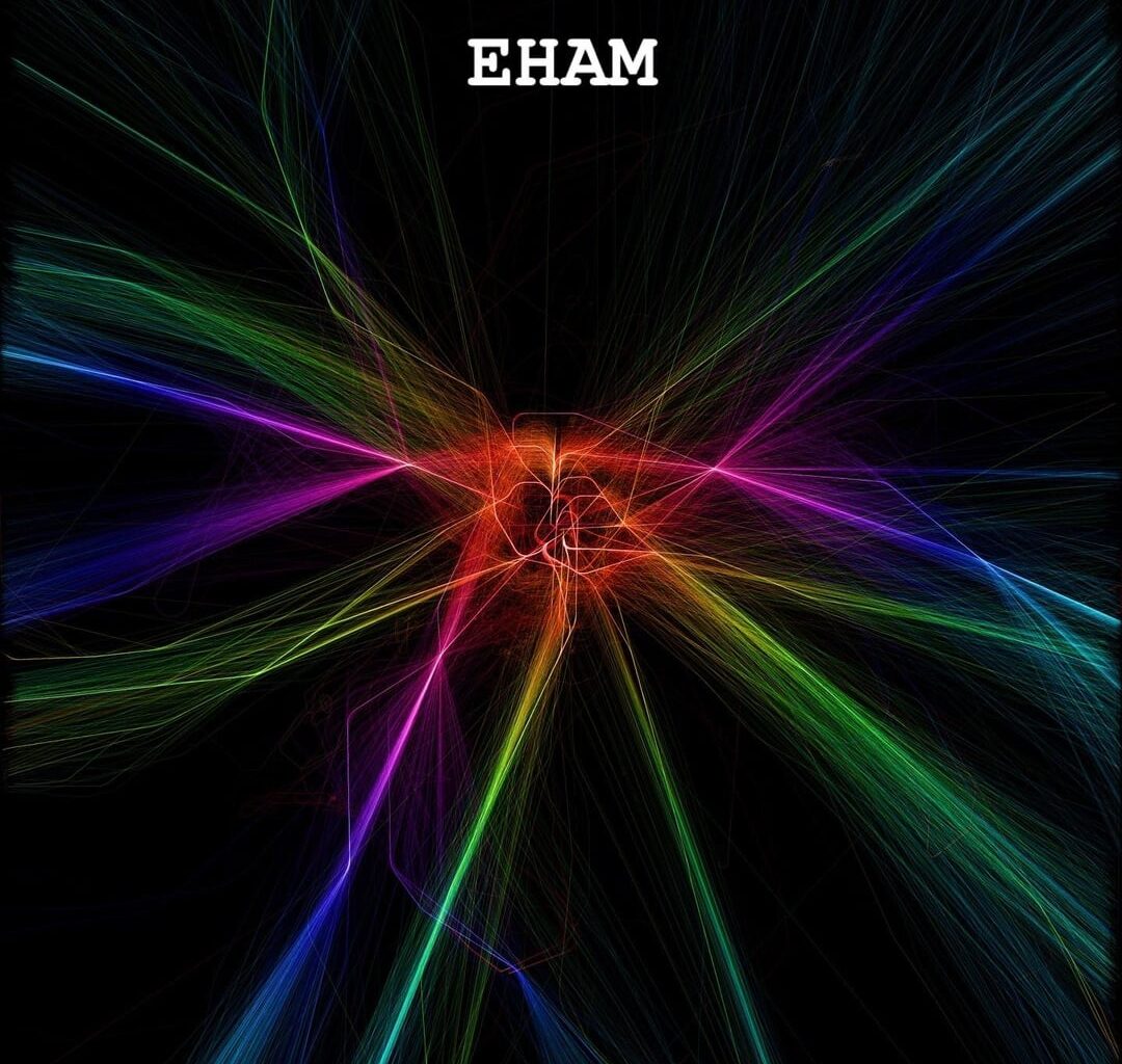
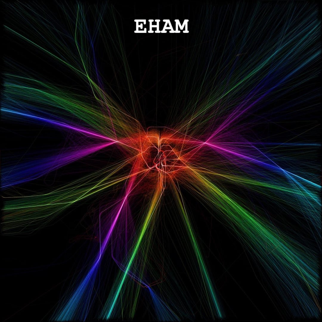
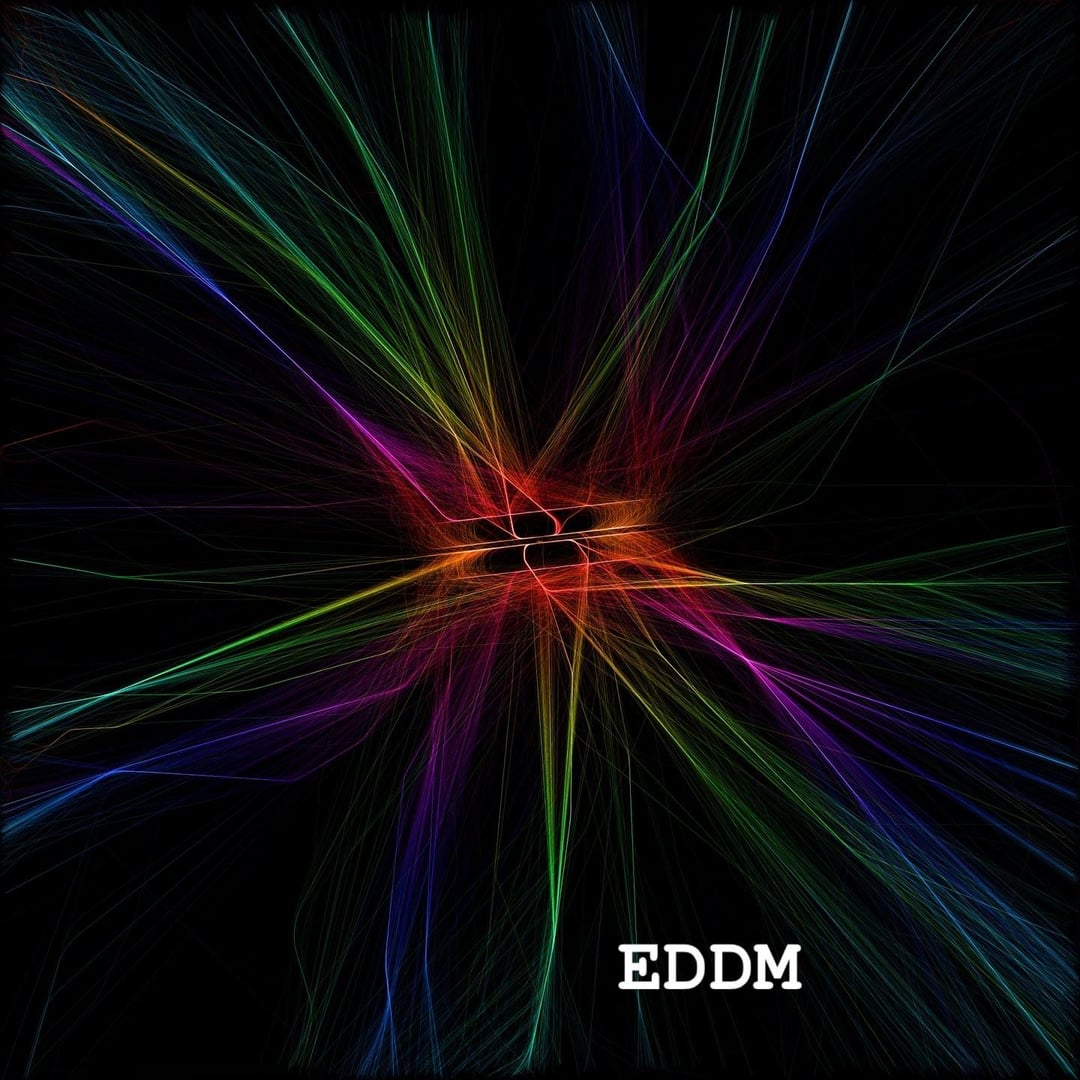
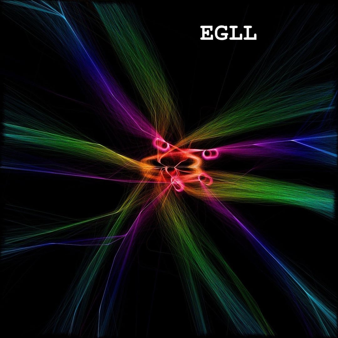
TLDR: I rendered approaches in hues from blue to red, and departures in hues from red to green. The images show Amsterdam Schiphol (AMS/EHAM), Munich (MUC/EDDM), and London Heathrow (LHR/EGLL). Please enjoy the pretty pictures! 😍✈️🎨🔥
About a month ago I made a post here about recording inbound and outbound traffic at Heathrow. As the post was so well received, I thought I’d post an update with the work I have done on the project in the meantime.
Originally these images were generated from about 15 hours worth of live data fetched over the course of two weeks. This was not scalable, and now additional/better data sources have allowed me to sample historical data to generate more heatmaps. Each image now represents a sample of flights spread out over 1 year of historical data.
The original heatmaps were also only rendered “naively” using one colour palette, and a single layer/resolution. After a few iterations, the new images are now generated with different palettes for arrivals and departures, and are formed from multiple layers stacked upon each other at different resolutions. These blended layers produce the observed brighter “highlights” at points which are particularly high traffic.
Finally, and unfortunately I can’t demonstrate the effect of this here, I have generated these images up to a resolution of 16384×16384 pixels. This is the equivalent of a 268MP image. 🥵 The result when zooming in on the images is quite stunning, especially when the details pop in after a brief load. I have rendered these because they are high enough resolution to print at 1 metre square at 300dpi; I’m looking forward to having some of these made, and will share pictures/videos of the comically large prints here in due course.
PS: The particularly sharp eyed amongst us might notice that the Heathrow image appears upside down compared to the original post. This was a rendering error with the coordinate system in the original post which has since been rectified… 🥴
Posted by jimbob3806
5 comments
See the original post [here](https://www.reddit.com/r/dataisbeautiful/s/XzKWsxkCfv) if you are interested, and feel free to suggest other airports I should share next which you think will have interesting approach patterns. I am particularly interested in any airports which have well defined holding patterns as can be seen in the Heathrow heatmap, but which are not obviously present in the others.
I love the way you can visually see how bad Heathrow is compared to functional airports.
Well done!
Very cool representation of data. I’m curious, what’s the range on these? How far out are we zoomed?
I love that the visualizations are completely intuitive when you look at them.
Correct me if I’m wrong: color palettes for arrivals and departures are both cyan to red (with cyan being the highest altitude and red being ground level), only arrivals cycle clockwise (through blue and purple) and departures counterclockwise (through green and yellow)?
To speed up rendering, Instead of using multiple layers, you could do it by setting a finite resolution (much higher than 268 megapixels), double precision floating point and normalize to {0;1}. When channel value reaches 1, the value for this channel spills over to surrounding pixels.
It would require much less CPU processing, at the expense of significantly more memory.
Or am I way off base?
I thought about how I’d improve this, and I think I’d want to see the runways better.
Which is hard at the ground size of these images. So here’s how I’d do it. For each image there’s an outer ring that doesn’t have much information. Once the intermediate inbound routes join up to the final outbound routes, and likewise when the outbound routes split, outside of this range, there isn’t much interesting to see, so that cuts each image down in about half to 60% of the size.
Then I would add runways as an overlay in a distinctive color. Since all the lines run together on the runways, the merged color seems to be white, so an overlay with a good color will easily stick out.
This might not have too much meaning for most airports, but for something like Schiphol, which has what seems to be a random scattering of runways over a large area, it might make some of the inner pathways easier to contextualize.
Comments are closed.