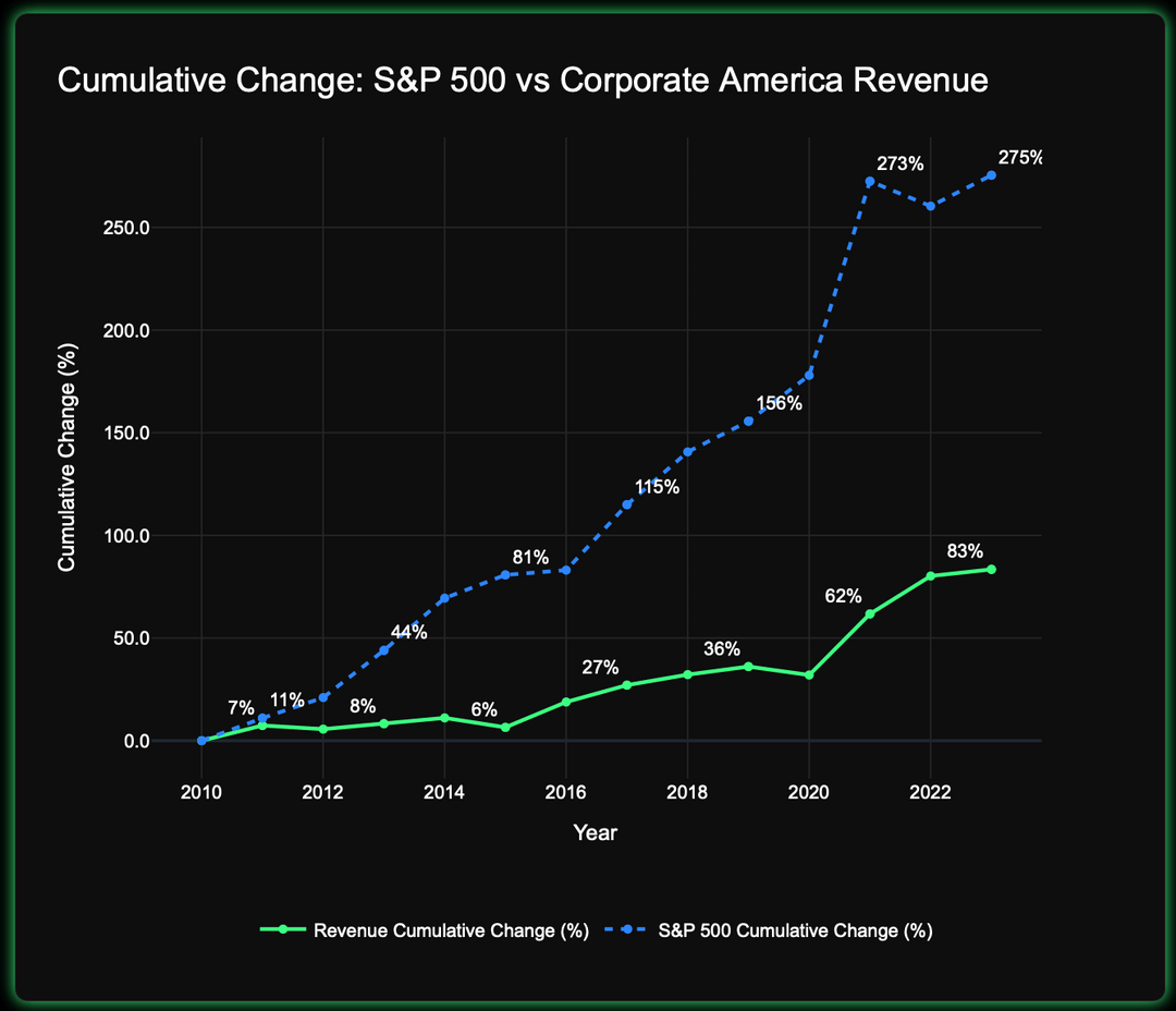
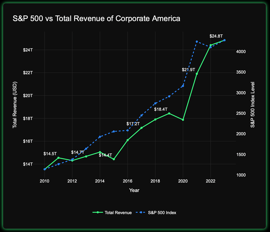
This visualization shows the cumulative growth of the S&P 500 index versus the total revenue of publicly reporting U.S. corporations (via EDGAR). While the S&P 500 rose ~275% since 2010, corporate revenue grew only ~83%.
This gap highlights how market valuations have increasingly diverged from business fundamentals, especially during periods of stimulus and low interest rates like the COVID-19 pandemic.
🔗 Full article and analysis:
https://yellowplannet.com/s-p-500-valuation-metrics-explained-s-p500-and-corporate-revenue-trends/
Data sources:
• SEC EDGAR (corporate revenue)
• Yahoo Finance (S&P 500 index and market cap)
Tools used: Click House, Python (Pandas, Plotly), Dash
Posted by kevinlim186
24 comments
Could add a line of net profit too – the market is definitely overstretched but this visual doesn’t show how many companies since 2010 have become more asset light and thus have higher margins.
Shouldn’t the comparison be of s&p500 vs the growth in revenue of those 500?
It is expected that s&p 500 will grow faster than all companies but unclear by how much it normally does
If the implication is that this is a recent phenomenon then show some data from before the supposed divergence.
The S&P 500 is a weighted index?
The market is fake as fuck.
Not trying to be snarky here, but companies aren’t valued for their revenue. A company can have an enormous revenue, but still lose money and be worth very little to its owners (shareholders or otherwise) relative to a smaller company that actually makes money. Companies are valued for their profits, specifically their future profits. Doing this analysis with some measure of that makes a lot more sense than with total revenue.
You may still find the same conclusion as you did here.
IMO the second graph, or at least the scales chosen for it, obscure and contradict the point you are trying to make in the first. It makes it look like SP tracks corporate revenue precisely.
But on the first graph, why are you tracking all corporate revenue when the SP 500 is only some (presumably the best) companies?
Tbh I’m not sure what this comparison is trying to show or accomplish.
Is a Revenue multiple really a “fundamental” versus Earnings multiple aka P/E? Many manufacturers and low margin industries can have booming revenue (especially with inflation) but struggling earnings growth. I’m not convinced that Revenue is more important than Net Income or EBITDA (or Analyst Adjusted Earnings but I know that’s not universally available).
I would also track Enterprise Value (equity plus net debt). Equity Value can swing with debt changes while revenue stays the same, and average leverage has definitely moved around.
Interesting visualization! The divergence between the S&P 500 and corporate revenue growth is quite striking. It really underscores the impact of external factors like stimulus and low interest rates on market valuations.
A better comparison is the s&p market cap vs profit and revenue
I’m not too sure what the point of this is. 3 years after the start point (2010) revenue cumulative change is at 8% and SP500 change is at roughly 40% which is a 5X multiple.
4 years later in 2017 it’s at 27% versus 100%, roughly a 4X multiple
2 years later in 2019 it’s at 36% versus 150% roughly a 4X Multiple
2023 83% versus 275%, roughly a 3X Multiple
So is the multiple actually going down? You should graph the multiple as a straight line.
Multiple expansion stemming from profit margin expansion
Data before your divergence should be shown.
Also, if the point of this is investment advice, here’s some investment advice: invest in a diversified portfolio of low fee index funds that broadly match the composition of the market; add cash and bonds as necessary to meet the time horizon of your financial goals; and do this regardless of market ups or downs.
The alternative to me investing in the capital markets is me using my capital to start my own business to grow my capital. The problem with that is I’m lazy, inefficient, and have much less access to additional capital. It’s best for all that I give my capital to the markets of the world so they can grow it on my behalf.
I never thought that the stock market was a question of real value, but more of perceived value.
A price/sales ratio plot would show the same thing directly, I.e SP500 market cap/ SP500 revenue. Would show the P/S ratio has been increasing. Personally I don’t like the P/S ratio as it is indirect to profits. It’s mainly used for rapidly growing companies that have low earnings and are counting on network effect or a largely increasing customer base. There are a lot of assumptions before those earnings go back to the investor. But I say that as an investor who wants profits from the company, not a speculator who just wants “price go up”.
are you aware that corp top tax rate dropped by 40% in 2017?
It’s not all about revenue.
This isn’t beautiful or meaningful, this is like plotting pirate attacks vs time and overlaying it with popularity of Pokémon.
First – look at profits. Second, the index might include dividend reinvestments – make sure you got the right one. Third – this might be an indication of big companies eliminating smaller companies rather than a fake valuation
Here’s a different POV on this:
https://www.gurufocus.com/economic_indicators/57/sp-500-pe-ratio
This is the historic price to earnings ratio of the S&P 500. It is a little high today compared to its history, but it’s not the disparity that this graph is trying to show.
I wonder if this is mainly caused by low interest rates causing everyone to put all their savings into the market
Record share buybacks have made a big impact on the stock market. You can argue whether that’s a good thing or if it’s sustainable, but there’s no question investors have rewarded companies for it.
Revenue is a problematic metric for any meaningful takeaways here. You should run this looking at aggregate corporate profit (this is often captured by looking at the weighted EPS of the S&P 500)
Consider this hypothetical:
Situation 1: Company A designs and manufactures hammers themselves. They generate $1b in annual revenue and $100m in profit.
Situation 2: Company X designs and sells hammers, and Company Y manufactured them. Company X generates $1b in annual revenue and $50m in profit. Company Y generates $800m revenue and $10m in profit.
Here we have Situation 1 in which there is less revenue and more profit, whereas Situation 2 has more revenue and less profit.
The value of a stock is not based on its revenue but its profit.
That said, profits have been increasing as a fraction of GDP and this is perhaps not sustainable.
Comments are closed.