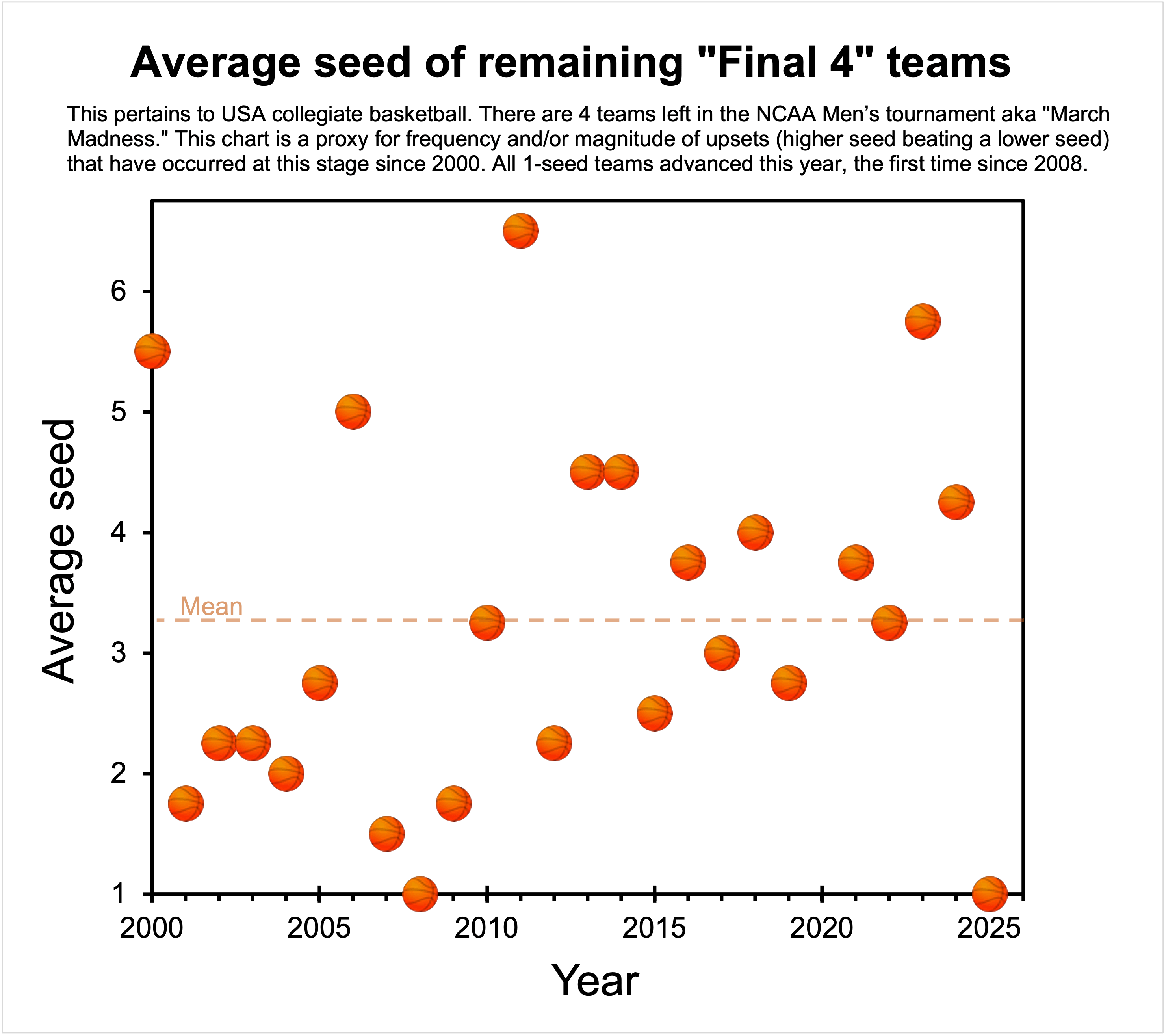
Interesting visualization! It would be great to see how the average seed has trended over time. Any noticeable patterns or outliers?
This data set violates pretty much every criterion for when average is a useful statistic of central tendency. The data is highly skewed, non symmetrical, has substantial outliers, and a very small sample size.
For example, does an average of 4 represent 1, 1, 1, 13 or 3, 4, 4, 5? Those imply very different things about who reached the Final Four, but would appear the same using this method. A year that was 2, 3, 3, 4 would have an average of 3 but qualitatively seems much closer to a year of 3, 4, 4, 5 than 1,1,1,13 does. Similarly, 1,1,1,9 has an average of 3, but again seems a lot closer to 1,1,1,13 than 2,3,3,4
If you’re trying to investigate trends or otherwise understand patterns in this data, this visualization really doesn’t do much to help.
![March Madness: Average seed of Final 4 teams 2000-2025 [OC]](https://www.europesays.com/wp-content/uploads/2025/03/wvxf8z7txwre1-1920x1024.png)
3 comments
Men’s tournament data: NCAA.com
Tool: Excel
To see data for the Sweet 16 stage of the tournament, check out my previous post: https://www.reddit.com/media?url=https%3A%2F%2Fi.redd.it%2F3tii03of2uqe1.jpeg
Interesting visualization! It would be great to see how the average seed has trended over time. Any noticeable patterns or outliers?
This data set violates pretty much every criterion for when average is a useful statistic of central tendency. The data is highly skewed, non symmetrical, has substantial outliers, and a very small sample size.
For example, does an average of 4 represent 1, 1, 1, 13 or 3, 4, 4, 5? Those imply very different things about who reached the Final Four, but would appear the same using this method. A year that was 2, 3, 3, 4 would have an average of 3 but qualitatively seems much closer to a year of 3, 4, 4, 5 than 1,1,1,13 does. Similarly, 1,1,1,9 has an average of 3, but again seems a lot closer to 1,1,1,13 than 2,3,3,4
If you’re trying to investigate trends or otherwise understand patterns in this data, this visualization really doesn’t do much to help.
Comments are closed.