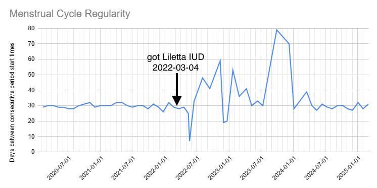
I’m not a doctor, but just based on these personal observations, it appears that the hormones released by the device had a de-stabilizing effect on my body’s hormones, and it took my system about two years to get used to it and re-stabilize. Pretty fascinating. Maybe someone else here has insight on why/how this effect occurs.
Posted by AdeleHare
6 comments
I used Google Sheets to make this. Here is how you can replicate it.
1. in column A, put in all the start dates of your periods. The format YYYY-MM-DD works.
2. in cell B2, type =DATEDIF(A1, A2, “D”)
3. this will give you the number of days between cell A1 and A2. Select the cell, click the bottom right corner of the cell, and drag it down to the rest of column B. This will copy the same formula down for the rest of the column, showing you all of your menstrual cycle lengths.
4. Select all the data in both columns, click insert, and click chart. It should automatically give you a line chart, but if it gives you something weird, you can double-click the chart and manually select line chart. You can then also adjust gridlines and stuff.
5. Optionally, select column B and select “Column stats” This will give you other cool info like your overall average and standard deviation.
Interesting.
Do you think it would have the same effect if removed? Would it take as long to restabilize? Could be cool to track mood during that as well
this makes sense given the data on IUDs showing that women tend to get inconsistent periods that then re-normalize again eventually
Hormonal IUDs can cause irregular periods initially as your body adjusts to the new hormone levels. This adjustment period varies, but your experience of taking about two years to stabilize is within the range of normal.
Wow, what a range. It looks like 7 days minimum to 80 days maximum.
In about 25 or so more years, you won’t have to worry about it. We feel fortunate that we managed to have one child before my wife stopped being able to and was too late for IVF. I’m an old Dad, my kid’s schoolmates think I’m his grandfather.
A line chart doesn’t feel like the right method of displaying this data… I think it would actually make more sense if you just did it as a point chart, as that would make clear that the data happens at specific points in time. With the line chart, the rise from 1/2023 to 4/2023 looks like a trend of some sort, but in reality it is one long instance. There isn’t actually a value for 2/2023… It is between events. A line chart implies continuous values between samples.
Comments are closed.