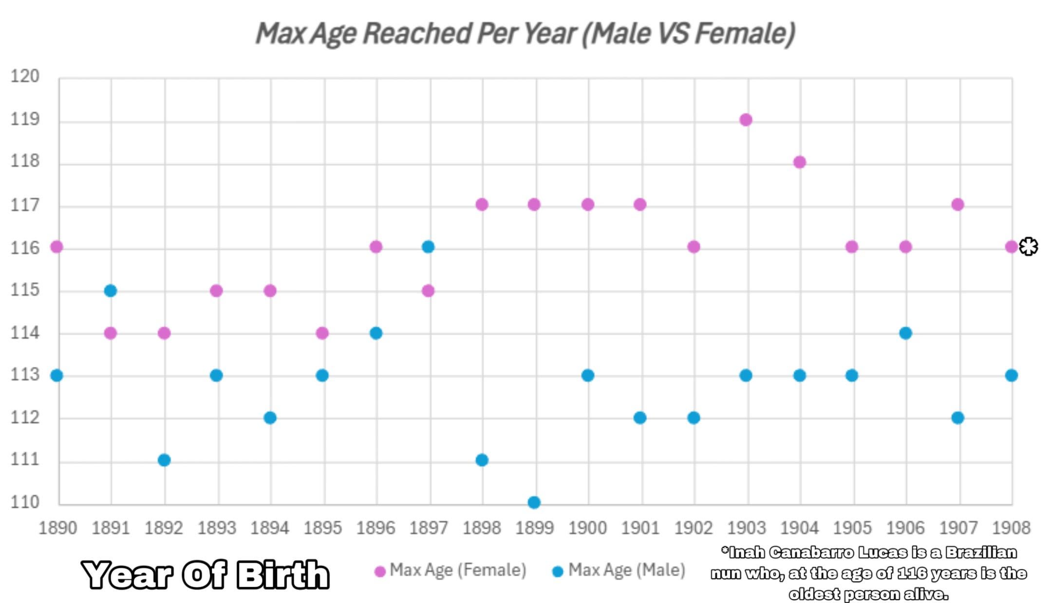
Each year represents the maximum lifespan reach by a person born in that year.
SOURCE: https://gerontology.fandom.com/wiki/Oldest_validated_person_by_year_of_birth
TOOLS: EXCEL
Posted by JakeIsAwesome12345
![Maximum Age reached by year of birth [OC]](https://www.europesays.com/wp-content/uploads/2025/04/gqoptxk1a6se1-1920x1024.jpeg)
Each year represents the maximum lifespan reach by a person born in that year.
SOURCE: https://gerontology.fandom.com/wiki/Oldest_validated_person_by_year_of_birth
TOOLS: EXCEL
Posted by JakeIsAwesome12345
8 comments
Interesting visualization! It would be great to see any trends or patterns in the data over time.
Proves the point,why do men die before women?
Answer: because they want to!
Am I stupid or is the change from 1902 to 1903 impossible?
Edit to add: The change for women
Edit 2: I did not read the chart description properly, please ignore
Why did I just check the graph for my year of birth?
Any chance you could extend it to include the 1920’s?
Pretty wild to me that there’s a gerontology fandom site.
How would I get my great grandfather on this list he was born in 1882 and died in 1992 but was in a rural part of the world all that we have to go by would be his gravestone.
As someone with slight color blindness, please choose more different colors next time, I had to look real close to tell there were 2 different colors.
Comments are closed.