I sourced the data from Quiver Quantitative's Congress Live Net Worth Tracker (www.quiverquant.com/congress-live-net-worth). The website provides live net worth estimates for members of the U.S. Congress based on their publicly disclosed financial information. Net worth information for some members was not available, and thus those individuals were not included in the analysis.
I cleaned the dataset and organized into structured columns—such as name, chamber (Senate or House), party affiliation (Democrat, Republican, Independent), state, and net worth—in a Google Sheets document.
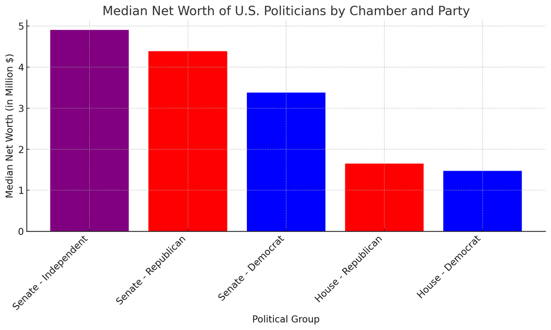
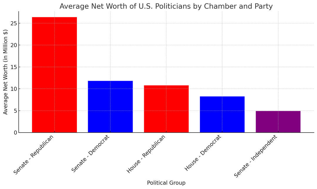
Edit: I am reposting it since in the earlier post, I only included the graph with an average net worth. Many Redditors rightly suggested to use median since data is highly skewed.
Posted by Creative_soja
3 comments
I like seeing the side by side of these two charts, because it really shows the impact that a few guys worth 200+ million makes on the numbers. And the Independents is a funny anomaly, because you’re forced to average just two people: One with a net worth of 8.8 million and another with a net worth of 1 million.
I need to save this to explain average vs medians in the future.
That’s why they need to look like NASCAR drivers. Companies that own them would have logos on their clothes. Best Government money can buy.
Comments are closed.