![[OC] 2 years of solar production shows the sun's strength rising and falling](https://www.europesays.com/wp-content/uploads/2025/04/8fivr2avj1ue1-1920x1024.png)
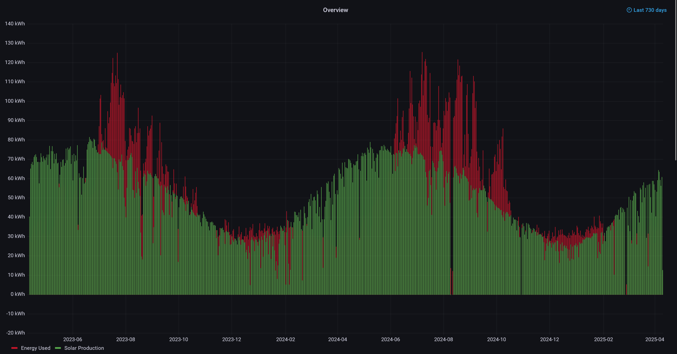
This is my home's solar energy production (in green) and total home consumption (in red), for each day, over the last two years.
The sinusoidal pattern in the green production bars demonstrates the change in the sun's power as we move through seasons, which I find super fascinating!
The red bars are the total energy that my home consumed per day.
Data was collected and visualized by my very own open source Raspberry Pi based power monitor:
Posted by decreddave
9 comments
This is my home’s solar energy production (in green) and total home consumption (in red), for each day, over the last two years.
It’s collected by a project I created several years ago – a Raspberry Pi based power monitor. The project is a combination of a Raspberry Pi 4, a custom designed PCB, and up to 6 current sensors + 1 AC voltage input for highly detailed monitoring of up to six circuits. The data collected here were taken from my electrical service mains and my solar inverter’s AC output.
More details on my power monitor project are here:
[https://david00.github.io/rpi-power-monitor/](https://david00.github.io/rpi-power-monitor/)
Wow. That is a textbook example of a crystal clear and nicely defined seasonal variation!
How do you use that much electricity? That`s 10x of the electricity of our household.
I am honestly surprised the green is quite so regular – you must live somewhere with relatively few clouds.
So on days that don’t have a red line does that mean you were in an energy surplus?
Don’t you need to open the heater from Dec to Feb? The usages are almost under 40kW.
It’s probably not worth the money considering how much power consumption is covered by your solar setup, but if you were looking to dramatically cut power consumption without QOL, you might want to consider getting acrylic inserts for the windowpanes you don’t open up on a regular basis, 4″ XPS boards up against your rafters, and switching to heat pumps.
That’s a sweet set of graphs.
How hard was it to hook your setup up to the power main? Diy or had an electrician?
you might have realized this, but the red graph is roughly sinusoidal as well and lagging behind the green graph by several weeks — that is “seasonal lag”. Basically the “inertia” it takes to heat or cool the environment. It’s why the hottest day is typically several weeks after the solstice, and on a smaller scale why 3-6p in the afternoon is hotter than noon (peak intensity).
If you plotted outdoor temps, you’d see another sinusoid rougly in phase with your red graph.
Cool to see!
One thing I notice, it looks like late summer/fall must have been hotter in 2024 than in 2023 (if the greater energy use was from running AC)
Comments are closed.