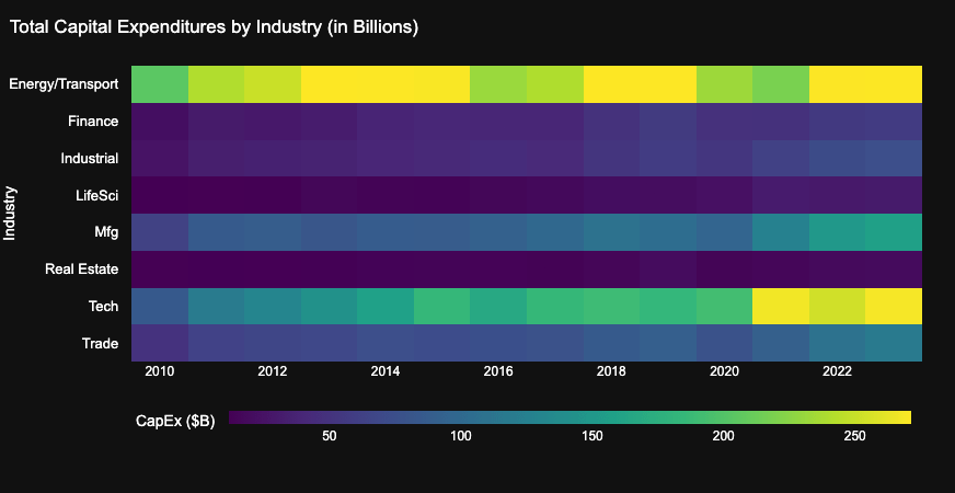
Explore how different U.S. industries allocated their capital expenditures over the past 13 years, based on data from SEC EDGAR filings. Built using ClickHouse for data warehousing and Plotly for visualization.
This is an original analysis covering trends like the post-COVID digital boom, and energy sector volatility following geopolitical events.
Interactive visualization and full writeup here:
Data Source: SEC EDGAR
Tools Used: ClickHouse, Plotly (Python), Dash
Posted by kevinlim186
1 comment
Nothing really trends downwards / darker which makes it harder to see where the losers were against the winners. Is this data adjusted for inflation?
Comments are closed.