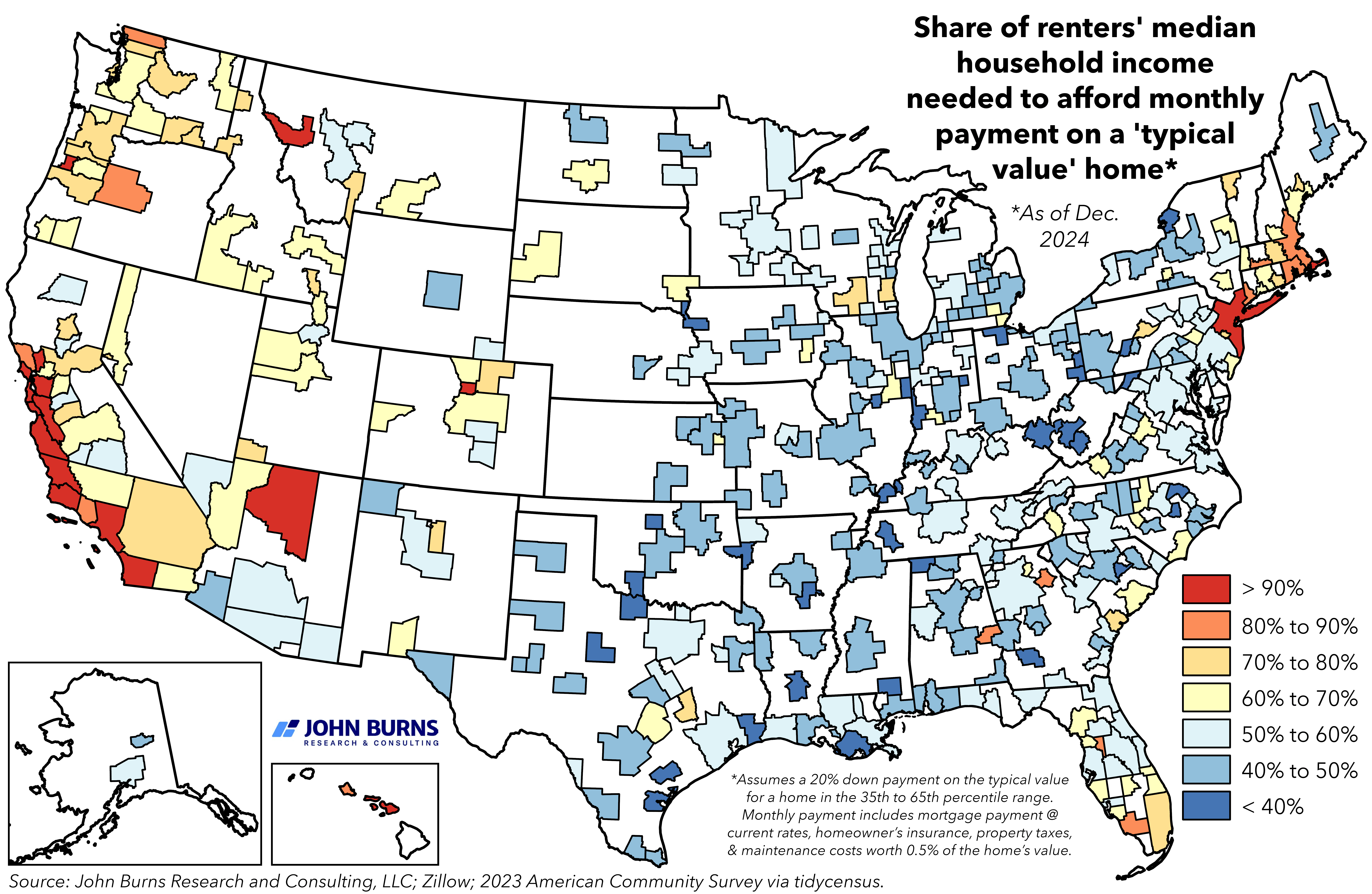
Housing affordability maps often use median income as a benchmark, but that measure usually includes homeowners, which can blur the picture for renter households. So, where is housing affordability most strained among the renter population?
Sources: John Burns Research and Consulting, LLC; Zillow; 2023 American Community Survey via tidycensus.
Posted by SweetYams0
26 comments
Sedona up there wrecking Arizona
I’m sure these correlate to municipalities with the most red tape to build new housing
Sioux Falls and Denver in the same category is wild to me
It’s odd to use blue (cool color) to represent the low end of this scale when only the darkest blue is a reasonable amount of money to spend for renting.
More of a sad comment on housing costs than any issue with the map though.
As someone who lives in a blue area and looked for a house last year, this only tells part of the story, mainly the assumption of a 20% down payment.
Saving up a 20% down payment on a house that isn’t 50 years old and needs a ton of work is hell. At the same time, the insurance cost on the ~3% down payment loans is equally hell.
Edit: Ok the PMI cost may not be equally hell, but it’s no fun for sure.
Half of my state being in the red certainly hits hard.
What’s up with that spot in Montana?
People usually use the term “housing affordability” to mean the affordability of housing in general, which includes rental housing.
It looks like you are using it to mean something more like “first home purchase affordability”.
You should also disclose the actual mortgage interest rate that was assumed – that can change within a year, and even within December 2024 it changed significantly.
Chicago being blue is a surprise. It’s not the most overpriced city but it’s not cheap
Surprising Tennessee is shown as so affordable. The Nashville area here is insanely expensive
This is America teetering on the brink of collapse. Throw on 10-20% increase due to tariffs and you will start to see the dominos fall.
America: Go West Young Man! Strike out for luck and fortune in new places!
Also America: please don’t move to *my* town
Gotta say this isn’t so much “dataisbeautiful” but kinda ugly. Are these supposed to be counties, or combinations of counties? Regions? Even if so, the geography is very incorrect. That section of Texas that’s orange-ish is like in the middle of nowhere — it’s too far east to be the Austin area, too far north and west to be the Houston area and too far south to be DFW. That area on an actual map is extremely rural and probably doesn’t cost very much to live in.
In inland Northern CA it’s not as bad as the coast of CA but it’s pretty bad. Plus we actually have to use air conditioning in the summer.
Now consider that it’s recommended to keep this payment at 30% or lower…
What does the median income mean? What does typical home mean?
Take the 90% number for New York – what does that actually mean? People aren’t spending 90% of their income on rent – they may be commuting to Manhattan from Brooklyn or queens or maybe they’re outside of New York City altogether
and is all of New York City or New York State being lumped together?
Is white just no data? This is not beautiful.
Interesting, I’m in WA and I thought the Tri-Cities was a bastion of affordability (basically the place you go if you ONLY care about COL in order to raise a family, because the nature sucks and it’s an ugly sprawling mess). But the affordability index is worse than Seattle’s. Maybe because homes are affordable out there (by Seattle standards), the people renting are mostly low-paid service workers?
Kinda weird to use the typical value home and not lower end homes. Most people’s first home is going to be on the lower end.
Also with the vast areas of no data it makes things look very cherry picked.
Oh wow DC’s not doing that bad!
My county is an interesting case. While county level data is probably right for this, the southern half of my giant county with its big city is spot on for being light blue. Northern half of the county, should be white. I could half my rent/house payment if I moved 100 miles in any direction, even if I stayed in the same county.
For that, this map probably mostly matches an urban population or population density map.
Interesting how the desirability of where to live is still mostly where the jobs are even as remote work has become more popular.
This is why I left San Diego all those years ago. When I moved there, rent was affordable. When I was looking at changing jobs and taking a pulse on where I would live if I did (I liked to live within bicycle riding distance of work), I realized that even on a 6-figure income I’d barely be able to afford rent on another place and my landlady was ancient, so that could be forced on me at any moment.
Not many of those blue areas I would ever care to drive through let alone live I.
I find the term “typical value home” to be strange. It should be purchasing the same type of property and square footage as the one they’re renting.
Just buy. We did. In South Carolina.
[I live in a single room above a bowling alley, and below another bowling alley.](https://youtu.be/axHoy0hnQy8?si=VRps_DYsDUl7Em8e&t=44)
Comments are closed.