![[OC] Map of Transportation Method Variations Across Canadian Ridings](https://www.europesays.com/wp-content/uploads/2025/04/2psjcw06efwe1-1860x1024.png)
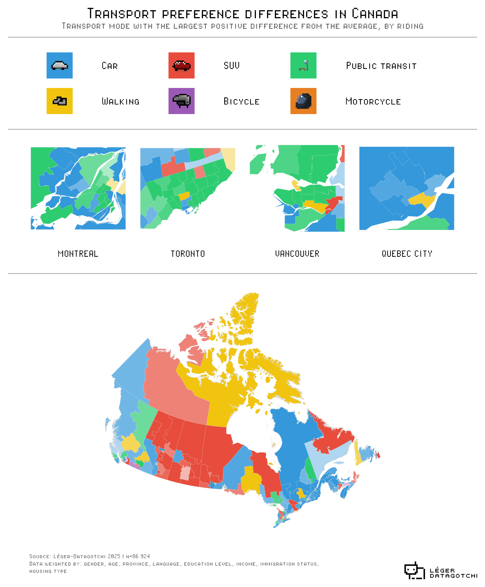
No surprise here, Car is the method of transportation of choice for the average Canadian.
However, we looked at which method of transportation had the highest positive difference from the national average per riding. It gives interesting results.
Our data comes from the 2025 federal election Datagotchi, which is still accessible here canada.datagotchi.com
We used R, ggplot and magick to design this graph.
Ask away if you have any question.
Posted by Lowstack
8 comments
Data comes from the 2025 Canadian federal election Datagotchi Survey. This one: [canada.datagotchi.com](http://canada.datagotchi.com)
It was done using R, ggplot2, Magick, and let’s be transparent, Claude as an AI assistant!
I find Claude the best LLM when it comes to ggplot2.
I mean, you’re going to get public transit bias in the cities compared to the national average simply based on the fact that public transit doesn’t really exist outside of cities. It’s going to have a positive bias just from the *existence* of public transit itself.
This data makes no sense. How is downtown Toronto the only part of the city where car is most popular, and the rest of the city is transit? All other data sources show its the exact opposite. Also distinguishing between car and SUV makes no sense. Why don’t you distinguish between subway or bus by that same logic?
You mean…. in places without cities and just hundreds of millions of acres, they’re don’t have public transit?
While I like the map, it might be better just to show the top 15 cities and see what areas of the cities have what transportation preferences (if said data exists)
why the heck is there an inset for Quebec City, but not for Calgary, Edmonton and Ottawa?
Sees “walking” for west coast of Newfoundland.
Is from Newfoundland.
Knows this data has to be absolute garbage.
I’m surprised public transit is so dominant on the West Island before the REM is open.
Why is Quebec city highlighted but not substantially larger cities like Ottawa, Calgary and Edmonton?
Comments are closed.