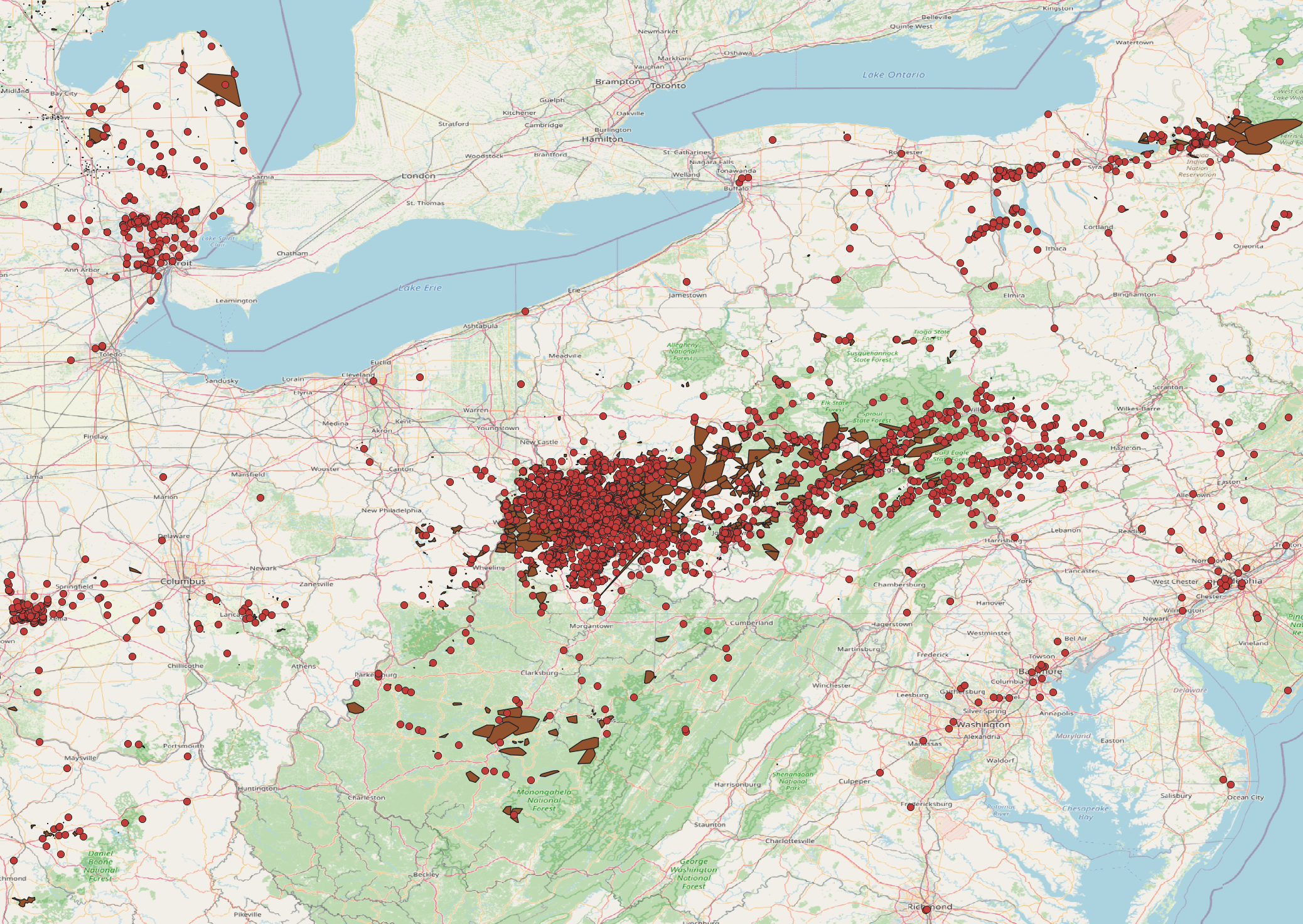
[OC] Geospatial representation of the current 500k power outages in Pennsylvania. Posted by vonadz Tags:DataData Is BeautifulDataIsBeautiful 5 comments Nothing some more wind can’t fix! Power outage? So it’s largely a map of population density “Geospatial representation” sounds so much fancier than “map”. What does a dot represent? Whats the dark color shapes? Why not just bin it into a heatmap? Is this related to Spain n Portugal at all? And that dip in UK? Comments are closed.
![[OC] Geospatial representation of the current 500k power outages in Pennsylvania.](https://www.europesays.com/wp-content/uploads/2025/04/1745996470_fe2ejjltswxe1-1920x1024.png)
5 comments
Nothing some more wind can’t fix!
Power outage? So it’s largely a map of population density
“Geospatial representation” sounds so much fancier than “map”.
What does a dot represent? Whats the dark color shapes?
Why not just bin it into a heatmap?
Is this related to Spain n Portugal at all? And that dip in UK?
Comments are closed.