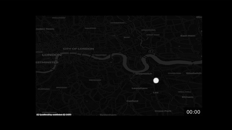
I wanted to visualise all of the participants of the London Marathon as if they all set off at the same time (including the elites)
So I scraped each participant’s splits from the results page, interpolated their position along the route, and plotted a dot for each runner at regular intervals.
I added some random noise and transparency so that the distribution of runners was a little easier to see.
3 comments
I wanted to visualise all of the participants of the London Marathon as if they all set off at the same time (including the elites)
So I scraped each participant’s splits from the results page, interpolated their position along the route, and plotted a dot for each runner at regular intervals.
I added some random noise and transparency so that the distribution of runners was a little easier to see.
**Data source:**
[https://results.tcslondonmarathon.com/2025](https://results.tcslondonmarathon.com/2025)
**Tools:**
– Python
– Pandas / NumPy / gpxpy (for the data)
– Matplotlib (for plotting)
– contextily (for the map)
Worst search algorithm ever
More people done by 2:30hr than I expected
That’s fast as hell
Comments are closed.