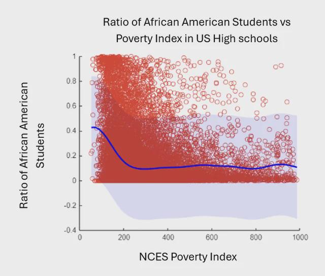
Gaussian Process Regression (GPR) machine learning model applied. Blue line is model result, with light blue being the 95% confidence interval (there is a lot of uncertainty, make sense because race isn't the only factor to poverty.)
It "seems" that higher ratio of African students tend to be far lower on the poverty scale.
Just thought it would be interesting to share.
Dataset of 19000 public high schools (2018-2019) filtered from below sources.
https://catalog.data.gov/dataset/public-school-characteristics-2018-19-c4a71
https://catalog.data.gov/dataset/school-neighborhood-poverty-estimates-2018-19-2347e
Posted by LasKometas
9 comments
Why does your ratio scale go into the negatives?
this data is ugly. 1) the x axis is unclear. which side is more poor? 2) the red dots are all over the place and overlapping in places, biasing the viewer towards outliers. a heat map would be better. How the blue line is constructed is not clear.
I am sorry this doesn’t qualify for /dataisbeautiful
We knew this, on average African Americans are more likely to live in poverty than most other racial groups in the US due to the long term effects of slavery and inspirational/structural racism
This is a terrible visualization. Just because you made a graph doesnt mean it’s beautiful
Data is very badly presented. The y axis for one should absolutely not go below 0, how do you have negative Black students?
False. Nobody is suffering the “long term effects of slavery” anymore, and the only racism being practiced in America these days is against White men, Asians and Christians.
African Americans are less likely to succeed because they are much more likely to grow up without a father to raise them in a traditional nuclear family.
Without a comparison it’s hard to draw conclusions.
If you are doing this for black, then do white, and Latino. Those are big 3 in US.
Ill leave this post up, because I want to convey the information, but I’m going to do a repost with the following improvements:
1.Creating a heatmap based on data points, though that might get noisy with sheer quantity of data.
2. Mentioning that the NCES scale is from 0 (poorest school neighborhood) and 1000 (think hollywood public schools). Government source of evaluating this metric.
[https://nces.ed.gov/programs/edge/docs/EDGE_SIDE1317_PUBSCH1617_FILEDOC.pdf](https://nces.ed.gov/programs/edge/docs/EDGE_SIDE1317_PUBSCH1617_FILEDOC.pdf)
3. Cutting y axis to be from 0 to 1. The scale is below zero because the “95% confidence” is symmetric about the model. But there is no data below zero, I’ll cut it off that’s not pertinent.
4. I can apply multiple races to the same graph, that would be interesting.
5. Blue line is constructed using a Gaussian Process Regression (GPR) model. I can cite my code, and a useful reading reference, but mathematically it is too complicated to explain in a comment.
(edited)
Is there an ugly map sub you can post to instead?
Comments are closed.