Looked quickly at the source – Are people in the US spending $6k a month and paying it off (in which case cool) or are they carrying an average of $6k and paying off the minimum (in which was WTF America!)
So the majority of the united states is 9% +/- 1%? Not a huge spread.
Oh uh I just noticed I forgot to include Arkansas. The % for Arkansas is 10.2%
Huh! Why is Alabama so much greener than the states around it?
Friendly feedback, Colors pallet is not great
Color coding could be a bit better but yikes
Interesting the delta between credit card debt and overall debt. Funny tho, UT tops it in both (I live here) and the trend is to “out-do the Smiths”
OP hates colorblind people.
darker meaning higher would be more intuitive imo (which you basically did for orange/red, making it extra misleading)
The data is interesting but I’m a little worried about the color scheme being misleading. Why does the color scale change abruptly from green to red? Judging by color the similarity of a pair of states doesn’t seem related to the difference numerically. Two states at 9.6% and 7.6% would both be green but two states at 9.6% and 10.6% would have completely different colors despite being closer numerically.
You picked very poor colors for this. It should be an intuitive transition across a spectrum to go from high to low.
You picked a dark red color and got lighter before switching to light green and then got dark again. God help the colorblind. Pick a color and use a gradient or maybe go from warm colors to cooler colors – something your brain can immediately understand.
More sunshine. More spending. More debt.
This perfectly shows why California, Washington, New York and Massachusetts are better than most people think for standard of living.
Some people will disagree, but earning more money is worth the increased taxes and higher cost of living that those states impose. At the end of the day you will still likely have more money leftover (disposable income) and less debt.
A Toyota Camry, new iPhone, random gadget from Amazon, a vacation to Europe, etc. all cost basically the same whether you live in Seattle making $150k or Mississippi make 65k, you just spend a much smaller portion of your income on those things in the higher income states.
Places with higher mortgages are harder to get more credit card debt than places with smaller mortgages.
Can we add a sidebar about visualizations that lack basic characteristics like their source data?
Is this average debt per household? Just total credit card debit/GDP?
It’s an interesting idea, but I would hope that any client who received this would not be happy with it.
The fact that the wealthiest states are the greenest doesn’t mean the average citizen is better off, likely the extremes pulling it up
Why do you think they’re called Red States?
I’m shocked Alabama is so low.
Gotta take into account purchasing power in each state.
What actually is this? It doesn’t say how it’s calculated? Is it average? Is it median?
I’d be curious to see this but for Canada.
oof, I dont know that green properly conveys the situation
Who would think the best states in education
So republican states are more irresponsible with their money?
Oh look, it’s those red states again.
Funny how no matter what the graphic represents, the south is always the worst.
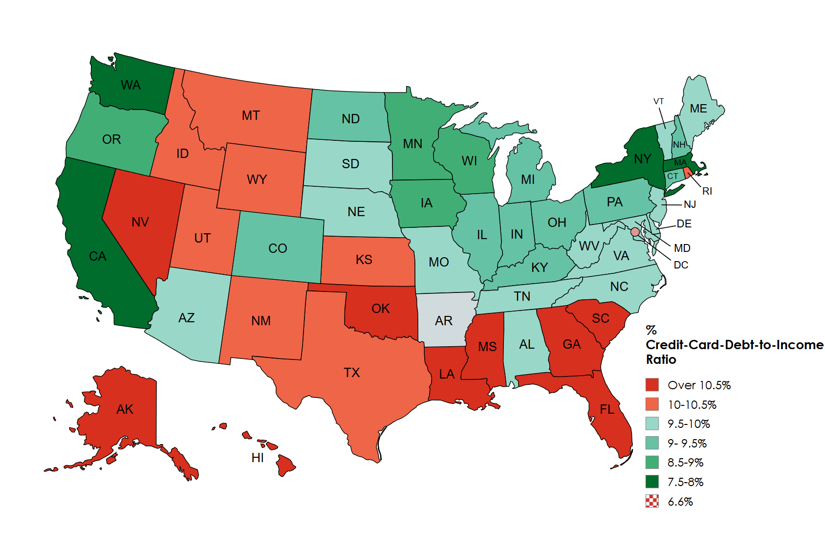
![[OC] Credit card debt to income](https://www.europesays.com/wp-content/uploads/2025/05/ydxdr7zqy80f1-1688x1024.png)
31 comments
Tools used : mapcharts.net
Source : https://www.experian.com/blogs/ask-experian/state-of-credit-cards/
Something something Republicans fiscal responsibility something something
What’s going on in Rhode Island?
Looked quickly at the source – Are people in the US spending $6k a month and paying it off (in which case cool) or are they carrying an average of $6k and paying off the minimum (in which was WTF America!)
So the majority of the united states is 9% +/- 1%? Not a huge spread.
Oh uh I just noticed I forgot to include Arkansas. The % for Arkansas is 10.2%
Huh! Why is Alabama so much greener than the states around it?
Friendly feedback, Colors pallet is not great
Color coding could be a bit better but yikes
Interesting the delta between credit card debt and overall debt. Funny tho, UT tops it in both (I live here) and the trend is to “out-do the Smiths”
OP hates colorblind people.
darker meaning higher would be more intuitive imo (which you basically did for orange/red, making it extra misleading)
The data is interesting but I’m a little worried about the color scheme being misleading. Why does the color scale change abruptly from green to red? Judging by color the similarity of a pair of states doesn’t seem related to the difference numerically. Two states at 9.6% and 7.6% would both be green but two states at 9.6% and 10.6% would have completely different colors despite being closer numerically.
You picked very poor colors for this. It should be an intuitive transition across a spectrum to go from high to low.
You picked a dark red color and got lighter before switching to light green and then got dark again. God help the colorblind. Pick a color and use a gradient or maybe go from warm colors to cooler colors – something your brain can immediately understand.
More sunshine. More spending. More debt.
This perfectly shows why California, Washington, New York and Massachusetts are better than most people think for standard of living.
Some people will disagree, but earning more money is worth the increased taxes and higher cost of living that those states impose. At the end of the day you will still likely have more money leftover (disposable income) and less debt.
A Toyota Camry, new iPhone, random gadget from Amazon, a vacation to Europe, etc. all cost basically the same whether you live in Seattle making $150k or Mississippi make 65k, you just spend a much smaller portion of your income on those things in the higher income states.
Places with higher mortgages are harder to get more credit card debt than places with smaller mortgages.
Can we add a sidebar about visualizations that lack basic characteristics like their source data?
Is this average debt per household? Just total credit card debit/GDP?
It’s an interesting idea, but I would hope that any client who received this would not be happy with it.
The fact that the wealthiest states are the greenest doesn’t mean the average citizen is better off, likely the extremes pulling it up
Why do you think they’re called Red States?
I’m shocked Alabama is so low.
Gotta take into account purchasing power in each state.
What actually is this? It doesn’t say how it’s calculated? Is it average? Is it median?
I’d be curious to see this but for Canada.
oof, I dont know that green properly conveys the situation
Who would think the best states in education
So republican states are more irresponsible with their money?
Oh look, it’s those red states again.
Funny how no matter what the graphic represents, the south is always the worst.
Look at all those red states!
Wow the south is terrible at managing debt.
Comments are closed.