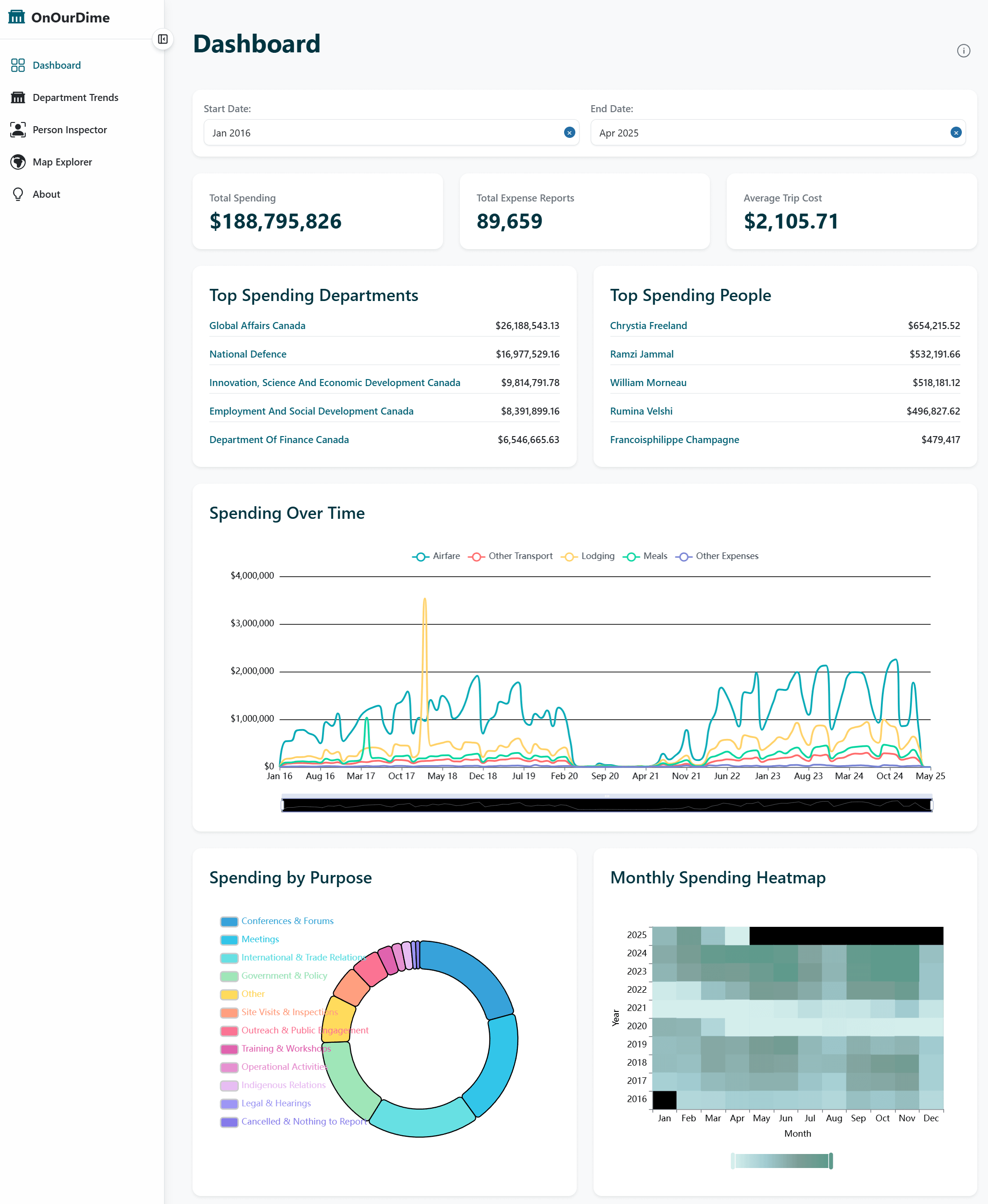
Hey I wanted to share OnOurDime, a project I've been working on recently. It's and interactive dashboard that visualizes Canadian Federal travel expenses from the Open Data Portal. Happy to get some constructive criticism!
Posted by pakeboo
![[OC] OnOurDime: Visualizing Canadian Federal Government Travel Expenses](https://www.europesays.com/wp-content/uploads/2025/05/jf07cy5vnm0f1-1920x1024.png)
Hey I wanted to share OnOurDime, a project I've been working on recently. It's and interactive dashboard that visualizes Canadian Federal travel expenses from the Open Data Portal. Happy to get some constructive criticism!
Posted by pakeboo
4 comments
Data: [Open Data Portal: Travel Expenses](https://open.canada.ca/data/en/dataset/009f9a49-c2d9-4d29-a6d4-1a228da335ce/resource/8282db2a-878f-475c-af10-ad56aa8fa72c)
Made with [React](https://react.dev/), [Apache ECharts](https://echarts.apache.org/en/index.html), [Leaflet](https://leafletjs.com/)
This is cool. Is there a data dimension that would list the title or department of the “top” travellers? It would give context to their work portfolios. I’d expect more travel from Foreign Affairs than Heritage, for example.
This looks AI generated. Looking at the account I’m suspicious.
Edit: Looks like some of the charts are broken. Exploring it more it seems a lot of stuff is not functional.
“On our dime” Yes, let’s get mad at our government for doing its job. /S
Comments are closed.